Results
- SIMATIC Performance Insight V1.17
- Preface
- What's new?
- Get to know Performance Insight
- Configuring the Performance Insight
- Adapting the app
- Configuring types
- Setting parameters
- Parameters in Performance Insight
- Displaying a parameter list
- Displaying current values of a parameter
- Editing settings for variables
- Editing settings for KPI instances
- Saving the values of a KPI in a variable
- "Activate notifications" for variables with numerical data type and KPI instances
- "Activate notifications" for variables of the data type "Bool" and "String"
- "Counter" acquisition category
- Aggregation functions
- Operation
- Presenting the productivity of a plant transparently (OEE analysis)
- Configuring a step time analysis
- Configuring multivariable regression
- Evaluating the production of individual batches
- Creating user-defined dashboards
- Creating a dashboard
- Structure of the dashboards
- Creating widgets
- Introduction to widgets
- Create a widget
- Visualizing correlations (Diagram)
- Visualizing values (Value)
- Visualizing machine statuses (Gantt)
- Visualizing the violation of limit values (gauge)
- Visualizing the distribution of consumptions or quantities (Pie chart)
- Visualizing the intensity of data values (Heatmap)
- Visualizing relationships in 3D (3D bars)
- Linking an image for presentation
- Preview a widget
- Working with widgets
- Widget views
- Adapting a user-defined dashboard
- Exporting and importing dashboards
- Analyzing data
- Creating reports
- Quality codes
- Appendix
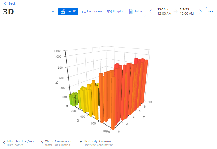
Visualizing relationships in 3D (3D bars)
Description
Procedure
To define widget-specific display options, follow these steps:
-
Create a new widget or edit an existing one.
-
In step 2 "Parameters", select exactly 3 parameters whose relationship is to be visualized.
The values of the selected parameters must be available with the same time stamp.
-
In step 3 "Details", you define the KPI calculation period.
You assign a parameter to each axis.
You assign a name for each axis and determine the low limit and high limit.
You specify the color in which the different intensities are displayed.
Result
The values are visualized in different views.
3D bar
The selected parameters are visualized in the detail view of the widget.
-
To rotate the view, hold down the mouse button and move the mouse pointer over the view.
-
To zoom in the view, use the mouse wheel.
Chap. 5.5.3.9