Results
- SIMATIC Performance Insight V1.17
- Preface
- What's new?
- Get to know Performance Insight
- Configuring the Performance Insight
- Adapting the app
- Configuring types
- Setting parameters
- Parameters in Performance Insight
- Displaying a parameter list
- Displaying current values of a parameter
- Editing settings for variables
- Editing settings for KPI instances
- Saving the values of a KPI in a variable
- "Activate notifications" for variables with numerical data type and KPI instances
- "Activate notifications" for variables of the data type "Bool" and "String"
- "Counter" acquisition category
- Aggregation functions
- Operation
- Presenting the productivity of a plant transparently (OEE analysis)
- Configuring a step time analysis
- Configuring multivariable regression
- Evaluating the production of individual batches
- Creating user-defined dashboards
- Creating a dashboard
- Structure of the dashboards
- Creating widgets
- Introduction to widgets
- Create a widget
- Visualizing correlations (Diagram)
- Visualizing values (Value)
- Visualizing machine statuses (Gantt)
- Visualizing the violation of limit values (gauge)
- Visualizing the distribution of consumptions or quantities (Pie chart)
- Visualizing the intensity of data values (Heatmap)
- Visualizing relationships in 3D (3D bars)
- Linking an image for presentation
- Preview a widget
- Working with widgets
- Widget views
- Adapting a user-defined dashboard
- Exporting and importing dashboards
- Analyzing data
- Creating reports
- Quality codes
- Appendix
Visualizing the violation of limit values (gauge)
Description
The gauge (Gauge) visualizes limit values through colors. The gauge helps you recognize at a glance whether or not limits are being exceeded.
The following views are available for the gauge:
Procedure
To define widget-specific display options, follow these steps:
-
Create a new widget or edit the existing one.
-
In step 3 "Details", the limit values from the general display options are applied if you have already defined them there.
Specify the value with which the display of the gauge scale starts and ends.
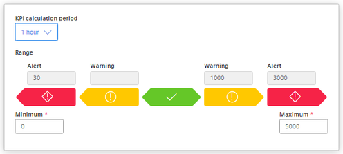
For KPI instances, specify the calculation period.
Result
The gauge in the example shows that the limit value has been exceeded.
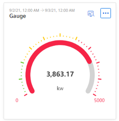
The detail view shows the sequence and the defined limit values.
Chap. 5.5.3.6