Results
Visualizing correlations (Diagram)
Description
The "Chart" widget displays the value of parameters as a diagram over time.
You can select a type of visualization for each parameter.
The following views are available in the detail view for the "Diagram" type:
Use of variables of "String" and "Bool" type
To show more non-numeric information in the Tooltips, select string or bool-type variables. In this way, you can also visualize text for each data point, e.g. a batch number or the customer of a batch.
Procedure
To define widget-specific display options, follow these steps:
-
Create a new widget or edit the existing one.
-
In step 2, select a parameter which is visualized in the widget.
-
Click
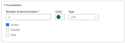
 and open the "Visualization" area.
-
For variables, you specify how many decimal places are displayed.
-
Select the color for the display of the parameter.
-
Select the type of the visualization.
-
Line chart (Line)
-
Spline curve
-
Area chart (Area)
-
Bar chart (Bar)
The columns of several parameters are displayed stacked.
-
Scatter chart (Scatter)
-
-
Activate further options:
-
Select whether the value is to be visible.
-
With the bar chart, you can select whether the value is to be displayed stacked.
-
-
In step 3 "Details", you define the display of the y axes.
For KPI instances, select the calculation period.
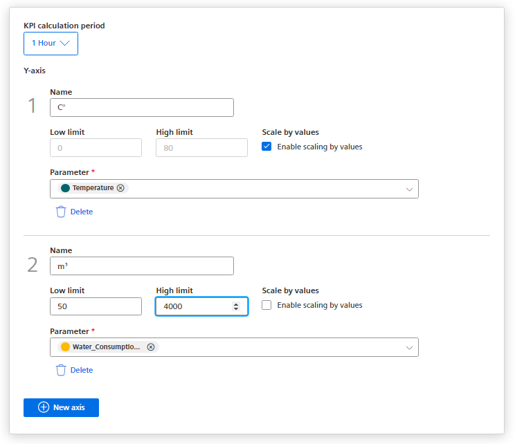
A y-axis is created for every unit that is assigned to a parameter. A maximum of 5 y axes can be defined per widget.
Each parameter is automatically assigned to a y axis. However, you can also manually assign the parameters to a different y axis.
You can define a low and high limit for each y axis. This means that you can only display a section between specific values in the widget.
Alternatively, you can enable "Scale by values". When the display is zoomed, the Y-axis adapts to display the range of values present.