Results
Visualizing MVR on the dashboard
Display MVR dashboard
The MVR dashboard is available when at least one model has been created for the asset.
-
Select an asset in My Plant.
An overview of the dashboards available on the asset is displayed.
-
Click "Multivariable regression".
The dashboard is displayed.
Visualizing multivariable regression
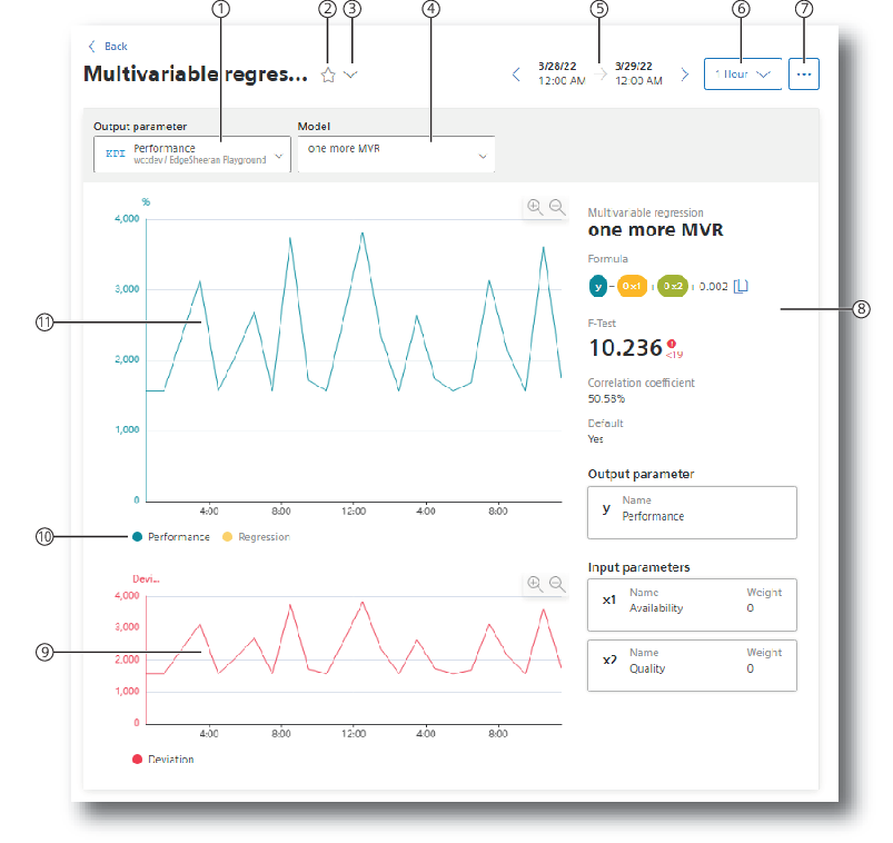
|
① |
Selection of the output parameter |
|
② |
Marking the dashboard as Favorite |
|
③ |
Displaying more dashboards on the asset |
|
④ |
Selection of a model that describes the output parameter |
|
⑤ |
Selection of the time range for the analysis |
|
⑥ |
Selection of the calculation interval |
|
⑦ |
Menu: "Multivariable regression list", "Edit selected multivariable regression", "Export data" |
|
⑧ |
Characteristics of the model: Formula, F-test, correlation coefficient |
|
⑨ |
Graphic display of the deviation |
|
⑩ |
Showing and hiding the individual parameters and the limit values |
|
⑪ |
Graphic representation of the output parameter and the regression |
To visualize the multivariable regression in the dashboard, follow these steps:
-
Select the output parameter.
-
Select a model that describes this parameter.
-
Select the period for which the multivariable regression is visualized.
You can apply the model to any time range in the past.
See also: User-defined periods.
-
Select the calculation interval.
With the calculation interval you determine the granularity of the visualization. You determine, for example, whether data values of each minute or of each hour are considered.
-
Select which trends you want to show or hide.
The following trends are offered:
-
the value trend of the output parameter
-
the regression
-
the deviation of the actual values from the model (Deviation)
-
Dashboard features
-
Display of the existing models
To display the list of the existing models and potentially create a new model, click
 and select "Multivariable regression list".
-
Description of the model
The characteristics that describe the model are displayed:
-
Formula
-
F-test
-
Correlation coefficient
You can copy the formula to the clipboard by means of
 .
.
-
-
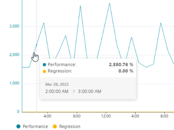
Detail view with mouseover
When you move the mouse pointer over the graphic, the details of individual data points are displayed in the tooltip.
-
You can find information on adjusting the displayed area in section "Navigation in the app".
NOTE
If the selected period for the dashboard or one of the widgets is in the future, the dashboard automatically updates every 30 seconds.