Results
- SIMATIC Energy Manager V1.17
- Preface
- What's new?
- Get to know Energy Manager
- Configuring the Energy Manager
- Adapting the app
- Configuring types
- Setting parameters
- Parameters in the Energy Manager
- Displaying a parameter list
- Displaying current values of a parameter
- Editing settings for variables
- Editing settings for KPI instances
- Saving the values of a KPI in a variable
- "Activate notifications" for variables with numerical data type and KPI instances
- "Activate notifications" for variables of the data type "Bool" and "String"
- "Counter" acquisition category
- Aggregation functions
- Managing energy data
- Operation
- Displaying the energy media analysis
- Configuring multivariable regression
- Evaluating the production of individual batches
- Creating user-defined dashboards
- Creating a dashboard
- Structure of the dashboards
- Creating widgets
- Introduction to widgets
- Create a widget
- Visualizing correlations (Diagram)
- Visualizing values (Value)
- Visualizing machine statuses (Gantt)
- Visualizing the violation of limit values (gauge)
- Visualizing the distribution of consumptions or quantities (Pie chart)
- Visualizing the intensity of data values (Heatmap)
- Visualizing relationships in 3D (3D bars)
- Visualizing energy flows (Sankey)
- Visualizing a chart sorted by size (Duration curve)
- Linking an image for presentation
- Preview a widget
- Working with widgets
- Widget views
- Adapting a user-defined dashboard
- Exporting and importing dashboards
- Analyzing data
- Create reports
- Quality codes
- Appendix
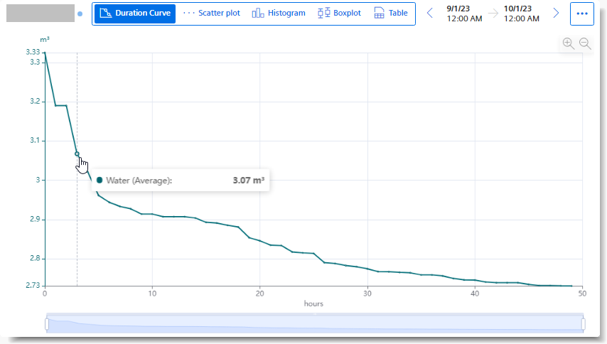
Visualizing a chart sorted by size (Duration curve)
Description
You can use the Duration Curve to display a chart sorted by size.
In the Duration Curve, the measured values of a specific period are displayed collected and sorted. The highest value is displayed on the far left, and the lowest value on the far right.
This way you can see, for example, how high the highest value was and how long this value was present. If you want to reduce the highest value to a lower value, you can see in the Duration Curve how often you must switch off the supply object every month for 15 minutes (active load management), for example, to achieve the lower value and thus conserve energy.
The following additional views are also available in the Duration Curve:
Procedure
To define widget-specific display options, follow these steps:
-
Create a new widget of the type "Duration Curve" or edit the existing one.
-
In the "Details" area, you specify the maximum number of values to be displayed.
Result
The Duration Curve shows which value the parameter has assumed in the selected period for how long a time.
Chap. 5.4.3.11