Results
- MindSphere app SIMATIC Energy Manager V1.11
- Legal information
- What's new in Energy Manager?
- Introduction to the Energy Manager
- Configuring types
- Setting parameters
- Parameters in the Energy Manager
- Displaying a parameter list
- Displaying current values of a parameter
- Editing settings for variables
- Editing settings for KPI instances
- "Activate notifications" for variables with numerical data type and KPI instances
- "Activate notifications" for variables of the data type "Bool" and "String"
- "Counter" acquisition category
- Aggregation functions
- Managing energy data
- Configuring multivariable regression
- Evaluating the production of individual batches
- Creating user-defined dashboards
- Creating a dashboard
- Structure of the dashboards
- Creating widgets
- Introduction to widgets
- Create a widget
- Visualizing correlations (Diagram)
- Visualizing values (Value)
- Visualizing machine statuses (Gantt)
- Visualizing the violation of limit values (gauge)
- Visualizing the distribution of consumptions or quantities (Pie chart)
- Visualizing the intensity of data values (Heatmap)
- Visualizing energy flows (Sankey)
- Visualizing a chart sorted by size (Duration curve)
- Working with widgets
- Adapting a user-defined dashboard
- Create reports
- Appendix
Using favorites
Description
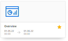
You can mark user-defined dashboards as "Favorite".
Favorite dashboards are prominently displayed in overviews. This makes it easier to access dashboards that are relevant to a user.
Procedure
-
To mark a dashboard as a favorite, click in the star on the dashboard.
-
To unmark it as a favorite, click the star again.
Chap. 3.2.5