Results
Energy Meters Dashboard
This dashboard allows you to monitor the selected Energy meter. The available information is represented using gauges, and charts.
It has the below mentioned tabs:
Overview
The below list of parameters for the selected devices are represented as gauges:
-
Total Active Power
-
Total Apparent Power
-
Total Power Factor
The Min and Max values in the guages are calculated based on the data available from last 15 minutes. Advanced guages will deliver these values directly from all-time recorded high or low. Later the adjustment of these values can be done with powerconfig PC software.
"Activate limits for the gauges" button allows you activate the threshold limits.
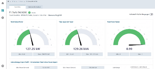
The colors represented in the gauges are described in the below table:
|
Color |
Total Active Power |
Total Apparent Power |
Total Power Factor |
|---|---|---|---|
|
Green |
First 70% |
First 10% |
0.85 to 1 |
|
Yellow |
70% - 85% |
10% - 90% |
0.7 to 0.85 |
|
Red |
Last 15% |
Last 10% |
0 to 0.7 |
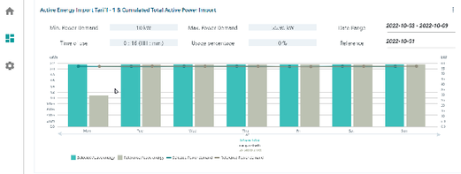
Active Energy Import Tariff-1 & Cumulated Total Active Power Import
"Active Energy Import Tariff-1" and "Cumulated Total Active Power Import" chart displays the
following:
-
Imported energy as bar chart for both selected and referenced period.
-
Maximum power demand as line chart for both selected and referenced period.
-
Important power management KPI figures for the selected period.
Min. Power Demand: Displays the minimum values recorded by the device in the selected date range.
Max. Power Demand: Displays the maximum values recorded by the device in the selected date range.
Date range: Displays the date range for which the values are plotted
-
Last month is preset by default
-
You can select a custom date range using this drop down
-
If the range covers more than 30 days, th data will be aggregated to one week.
Time of use (ToU): This value is represented as below,
Total Energy (kWh) / Total average power demand (kW) = hh:mm
Usage percentage: This value is a calculated parameter which states the uniformity of power consumption, it is calculated as:
Hours (hh) / Time-of-use (hh)
Reference: Displays the start date for reference period (for comparison). If comparision is not required, then select a date in the future.
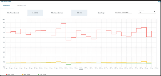
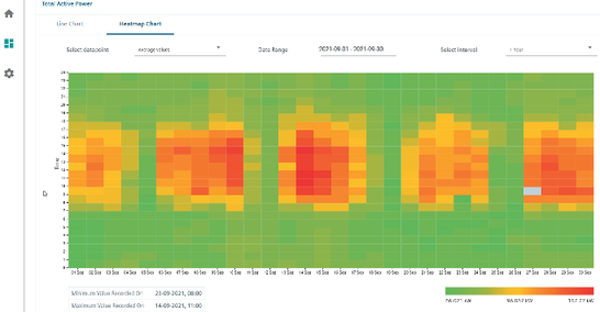
"Total Active Power" is displayed as a "Line Chart" and "Heatmap Chart".
Line Chart
Min. Power Demand: Displays the minimum power demand for the selected period.
Max. Power Demand: Displays the maximum power demand for the selected period.
Date Range: Displays the selected period. You can select a custom period (full days) or last month/week.
The maximum range is 31 days.
Interval: 15 minutes, 1 hour or 1 day, availability is dependent on selected data range.
For days without data: Line between days with data is directly drawn.
You can export the data in the form of a .csv file by clicking on the csv icon.
Heatmap Chart
-
Select datapoint: Allows you to select the datapoint to be displayed in the heatmap.
-
Date Range: Allows you to select the date range for the heatmap.
-
Select interval: Allows you to select the display interval for the heatmap.
-
Minimum Value Recorded On: Displays the date and time on which the minimum value was recorded.
-
Miximum Value Recorded On: Displays the date and time on which the miximum value was recorded.
-
Color Gradient: Displays the minimum and maximum values varying from green to red. Green displays the minimum and red the maximum.
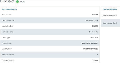
Device Information
This tab display "Device Identification" and "Expansion Module" details.