Results
- SIMATIC Performance Insight V1.16
- Legal information
- What's new in Performance Insight?
- Introduction to Performance Insight
- Configuring types
- Setting parameters
- Parameters in Performance Insight
- Displaying a parameter list
- Displaying current values of a parameter
- Editing settings for variables
- Editing settings for KPI instances
- Saving the values of a KPI in a variable
- "Activate notifications" for variables with numerical data type and KPI instances
- "Activate notifications" for variables of the data type "Bool" and "String"
- "Counter" acquisition category
- Aggregation functions
- Presenting the productivity of a plant transparently (OEE analysis)
- Configuring a step time analysis
- Configuring multivariable regression
- Evaluating the production of individual batches
- Creating user-defined dashboards
- Creating a dashboard
- Structure of the dashboards
- Creating widgets
- Introduction to widgets
- Create a widget
- Visualizing correlations (Diagram)
- Visualizing values (Value)
- Visualizing machine statuses (Gantt)
- Visualizing the violation of limit values (gauge)
- Visualizing the distribution of consumptions or quantities (Pie chart)
- Visualizing the intensity of data values (Heatmap)
- Visualizing relationships in 3D (3D bars)
- Preview a widget
- Working with widgets
- Widget views
- Adapting a user-defined dashboard
- Exporting and importing dashboards
- Analyzing data
- Creating reports
- Appendix
Time model
Description
-
Click
 "Details" in the OEE analysis at the widget "Machine status".
The "Gantt" view is displayed.
-
Select the "Time model" view.
The view shows an overview of the time categories used, such as the total calendar time, the shares of planned and unplanned downtime, etc.
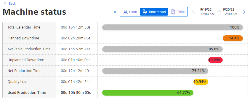
The quality loss is calculated based on the quality rate.
Example: If the net production time is 60% and the quality rate is 90%, then the quality loss is 60*(1-0.9) = 5.4%).
Chap. 6.3.3.2