Results
- MindSphere app SIMATIC Performance Insight V1.10
- Introduction
- Structure of the app
- Show user profile
- Quality codes
- Presenting the productivity of a plant transparently (OEE analysis)
- Variable declarations
- Introduction to variable declarations
- Variable declarations on the asset
- "Activate notifications" for variables of the data type "Integer" and KPI instances
- "Activate notifications" for variables of the data type "Bool" and "String"
- Variable declaration in the widget
- "Counter" acquisition category
- Aggregation functions
- Data analysis
- Introduction to data analysis (widgets)
- Create a widget
- Visualizing correlations in the diagram (Diagram)
- Visualizing individual values (Value)
- Visualizing machine statuses (Gantt)
- Creating status mappings for the "Gantt" widget
- Visualizing the violation of limit values (gauge)
- Visualizing the distribution of consumptions or quantities (Pie chart)
- Visualizing the intensity of data values (Heatmap)
- Editing widgets
- Copying widgets
- Export widget data
- KPI calculations (KPIs)
- Creating multivariable regression
- Creating reports
- Creating dashboards
- Widget views
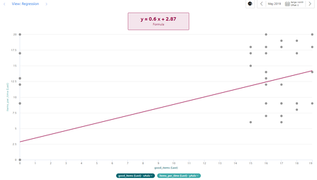
Regression analysis
Description
In the x-y display, the production amount is mapped on the x-axis and the energy consumption is mapped on the y-axis. By using the regression line, you can determine, for example, whether too much energy is being consumed for a specific production amount. This is the case when the dot is above the regression line.
The regression analysis is available for the widgets "Pie chart" and "Diagram":
Chap. 12.3