
Web Components for Insights Hub and Industrial IoT
Time Series Chart
The TimeSeries Chart displays a line graph of aggregated or raw time series data for the variables of a selected aspect during a specific date/time range. Based on the component's configuration (e.g. zoomDisabled, wheelZoom), the user can change the selected range interactively by dragging or zooming in and out.
A developer can select a data provider Aggregates or Raw. Furthermore he can select Auto, which switches automatically between the two modes depending on the timerange.
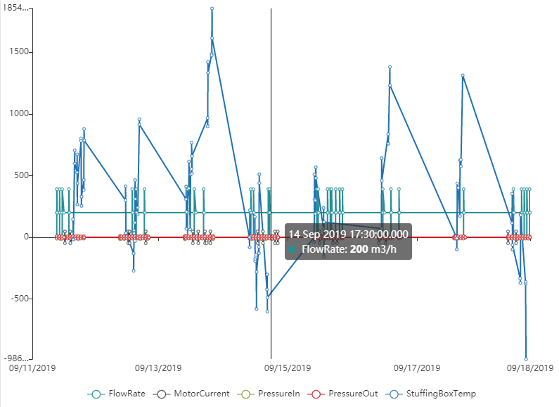
In Aggregates mode, the chart displays the first value, last value, minimum, and maximum sorted by timestamp for each aggregate and connects them by one line per variable.
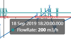
In Raw mode, the chart displays the last 2000 values. If there are more data points available in the selected time range, it is indicated by using a dotted line.
The TimeSeries Chart supports the following:
- Data types long, double, int, boolean
- Simultaneous display of variables from different assets and different aspects
- String variables are shown with a symbol in the chart. The related value can be shown in the tooltip.
- [Experimental] Manipulating the chart for your custom needs by using the
chartOptionsFormatter
Example
Interface
Selector
<mdsp-time-series-chart></mdsp-time-series-chart>
Properties
| Name | Type | Corresponding attribute | Default | Description | Allowed Values |
|---|---|---|---|---|---|
| additionalAggregates | boolean | additional-aggregates | false | Loads additional aggregates data from backend to prepend and append them on the chart if set to true. | |
| context | string | context | Configures the context of the component. See also here. | ||
| dataProvider | ChartDataProvider | data-provider | Auto | Specifies the behavior which time-series-api should be accessed. In Auto mode the chart switches to TimeSeries mode if the date range is less then 2 minutes. | - Auto - Aggregates - TimeSeries |
| dateRange | TimeZoneDateRange | Specifies the date range using from, to, isAllDay and timeZone properties. | |||
| dragMode | ChartDragMode | drag-mode | Move | Specifies the behavior when dragging. Via Select zooming into specified area is triggered.With Move the chart can be moved while dragging. | - Move - Select |
| errorNotification | boolean | error-notification | Enables error control if an error is thrown. This can be used for debug purposes. For productive use, the error event should be caught and handled in the application. See also here. | ||
| highlightMode | boolean | highlight-mode | false | If true, enables highlighting lines on chart for double, long and integer variable types. | |
| legendDisabled | boolean | legend-disabled | false | Disables legend for the chart if true. | |
| locale | string | locale | Specifies the locale in which the component is displayed. The locales en and de are provided by default.See also here. | ||
| localeManager | LocaleManager | Returns a LocaleManager object. This can be used to add locales or to get the locale settings. See also here. | |||
| model | IDataModel | Returns an object for data model handling, refer to IDataModel model. | |||
| sharedAssets | boolean | shared-assets | false | Specifies whether shared assets from other tenants are supported. | |
| showSwitchToRawButton | boolean | show-switch-to-raw-btn | false | Shows a button within the empty-state if set to true and no data is present and current data provider is set to "Aggregates". | |
| timeZone | TimeZone | time-zone | Specifies the selected time zone. | ||
| variablePaths | TimeSeriesPath | Specifies an array of objects which defines the variables to be displayed in the chart. Refer to the snippets below. | |||
| variablesLimit | number | variables-limit | undefined | Specifies the allowed variables count limit. If the limit is exceeded error-event will be triggered with theinformation, which variables could not be added. | 1-25 |
| variableStyleOptions | VariableStyleOption[] | Specifies the color, line style and symbol of specific variables displayed in the chart. | |||
| view | IChartViewModel | Returns an object for view handling, refer to IChartViewModel model. | |||
| wheelZoom | boolean | wheel-zoom | false | Enables zoom control by mouse wheel if true. Otherwise, the control key must be pressed for zooming.Requires that zoom-disabled is false. | |
| zoomDisabled | boolean | zoom-disabled | false | Disables zooming for the chart if true. |
Events
| Name | Type | Description |
|---|---|---|
| dateRangeChanged | EventEmitter<IDateRange> | Triggered when the date range changes, e.g. when the user zooms or moves inside the chart. |
| aggregationLevelChanged | EventEmitter<AggregationLevelInfo> | Triggered when the aggregation level changes - also triggered if chart switches to use raw time series data. |
| dataProviderChanged | EventEmitter<ChartDataProvider> | Triggered when the data provider state is changed |
| connected | EventEmitter<any> | Triggered after the component is created, initialized and appended to the DOM tree. |
| error | EventEmitter<MdspUiError> | Triggered when an error occurs in the component or while accessing APIs. See also here. |
Models
TimeZoneDateRange
interface TimeZoneDateRange {
    from: Date;
    to: Date;
    isAllDay: boolean;
    timeZone: TimeZone;
}
IDataModel
interface IDataModel {
  // forces reload of data, e.g. re-loading the chart
  refresh(): void;
}
IViewModel
interface IViewModel {
  refresh(): void;
}
IChartViewModel
interface IChartViewModel extends IViewModel {
    readonly chartInstance: ECharts;
    chartOptionsFormatter: (chartOptions: EChartsCustomOptions) => {};
}
AggregationLevelInfo
interface AggregationLevelInfo {
  level?: string;
  levelTranslated?: string;
  value?: number;
}
ChartLineMode
enum ChartLineMode {
    linear = 'linear',
    noLine = 'noLine',
    stepStart = 'stepStart',
    stepMiddle = 'stepMiddle',
    stepEnd = 'stepEnd',
    smooth = 'smooth',
}
ChartSymbol
enum ChartSymbol {
    circle = 'circle',
    rectangle = 'rectangle',
    triangle = 'triangle',
    diamond = 'diamond',
    emptyCircle = 'emptyCircle',
    emptyRectangle = 'emptyRectangle',
    emptyTriangle = 'emptyTriangle',
    emptyDiamond = 'emptyDiamond',
}
TimeZone
enum TimeZone {
    Local = 'Local',
    UTC = 'UTC',
}
Remarks
- For performance reasons, it is recommended to limit the number of variables displayed in the TimeSeries Chart to 10.
Roles
mdsp:core:iot.tsaUser(IoT Aggregates API V4 is used)mdsp:core:iot.timUser(IoT TimeSeries API is used)
Snippets
Display all Variables of an Aspect
You can either pass an object to specify the aspect or provide the full path.
timeSeriesChart.variablePaths = [
   // Show all variables of a given aspect
   {
      assetId: '89bba0c1e19c4884bce75d8bcc3773e5',
      aspectName: 'AspectNameX'
   }
];
timeSeriesChart.variablePaths = [
   // Convenient Syntax: write the path to the assetId/aspect
   '89bba0c1e19c4884bce75d8bcc3773e5/AspectNameX'
];
Display Specific Variables
You can either pass an object to specify the variables to be displayed or provide the full path.
timeSeriesChart.variablePaths = [
   // Show specific variables of an aspect
   {
      assetId: 'f9f1ff3ccaa1401a98cf37d0c9144c7e',
      aspectName: 'AspectNameX',
      variables: ['VariableName1', ...,'VariableNameN']
   }
];
timeSeriesChart.variablePaths = [
   // Convenient Syntax: write the path to the assetId/aspect/variableName1&variableName2.. etc.
   'f9f1ff3ccaa1401a98cf37d0c9144c7e/AspectNameX/VariableName1&...&VariableNameN'
];
Update the Variables using an Aspect Variable Selector
Use the event triggered by an Aspect Variable Selector to update the variables to be displayed in the Time Series Chart. A more detailed code sample is given here.
aspectVariableSelectorComp.addEventListener('selectedAspectsAndVariablesChanged', function (eventParams) {
            timeSeriesChart.variablePaths = eventParams.detail;
        });
Change the Timestamp Format in the Overlay
const timeSeriesChart = document.querySelector('mdsp-time-series-chart');
const localeSettings = chartComp.localeManager.getLocaleSettings();
localeSettings.tooltipTimestampFormat = "DD MM YY HH:mm:ss.SSS";
timeSeriesChart.localeManager.addLocale("en-custom", localeSettings);
timeSeriesChart.locale = "en-custom";
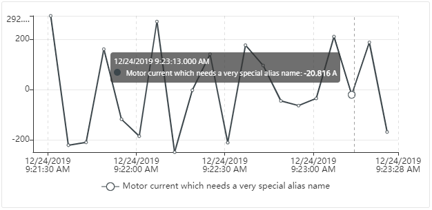
Change the variable name in the chart using an alias for a variable
const timeSeriesChart = document.querySelector('mdsp-time-series-chart');
timeSeriesChart.variablePaths = [{
   assetId: '730540babbb44fe58f24cc71c04fd1fc',
   aspectName: 'aspect_pump',
   variables: [{
      name: 'MotorCurrent',
      alias: 'Motor current which needs a very special alias name'
   }]
}]
Change the drag mode of the Time Series Chart
<mdsp-time-series-chart drag-mode="Select"></mdsp-time-series-chart>
Drag mode Select allows the user to drag and select an area in order to zoom into the chart. Drag mode Move will move the chart while dragging.
Select the data provider of the Time Series Chart
The Time Series Chart supports 3 different modes for the data providers
- Auto: Switches automatically to
TimeSeriesmode if the date range is less then 2 minutes - Aggregates: Shows data of IoT Aggregates V4 API. The aggregation level is currently chosen depending on the selected time range.
- TimeSeries: Shows data of IoT TimeSeries V3 API. Due to performance reasons, only the last 2000 values in the selected time range. If there is more data detected, the line will be displayed in a dotted style to indicate that a user can zoom in to get more data.
<mdsp-time-series-chart data-provider="TimeSeries"></mdsp-time-series-chart>
Manipulating the chart
Info
The following feature is experimental and require knowledge about the ECharts library.
You need more and want for example manipulating the chart to draw a separate line or change the look of the chart? The chartOptionsFormatter can be used to achieve that. Via this property you get access to the ECharts functionality which is used in the background.
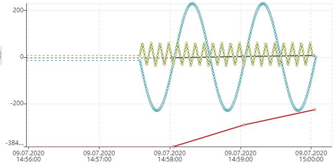
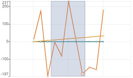
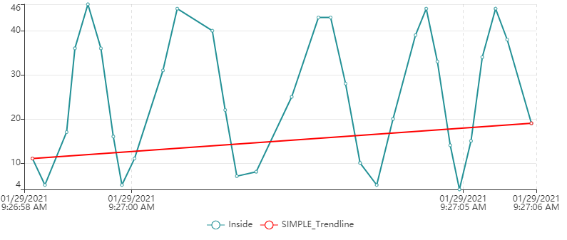
In the following example a simple trend line is added to the chart, which just draw a separate line from the first to the last value of a given series.
About the different attributes and their possibilities you can learn in the official ECharts-documentation.
document.querySelector('mdsp-time-series-chart').view.chartOptionsFormatter = (c) => {

    console.log(c);
    // Example:
    // - push to series property a new entry like the following
    // - adjust id to be unique from the already existing ids
    // - define the name
    c.series.push({
        "id": "840d8a440128428eb16fc7bed9fcc40d/All/Long_SIMPLE_Trendline",
        "name": "SIMPLE_Trendline",
        "type": "line",
        "showSymbol": true,
        "hoverAnimation": true,
        "xAxisIndex": 0,
        "data": [
            c.series[0].data[0],
            c.series[0].data[c.series[0].data.length - 1]
        ],
        "animation": true,
        "animationDuration": 0,
        "color": "rgb(255,0,0)",
        "seriesType": "line",
        "itemStyle": {
            "normal": {
                "lineStyle": {},
                "color": "rgb(255,0,0)"
            }
        },
        "yAxisIndex": 0
    });
    c.legend.data = ["Inside", "SIMPLE_Trendline"];
};
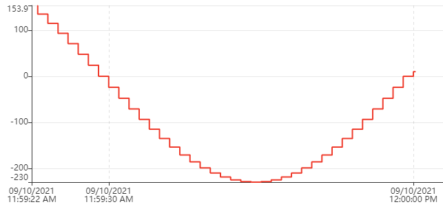
Using different line modes in the chart
With the following snippet the time-series-chart can be changed to use a step line. Also other different line mode can be used.
    var chartComponent = document.querySelector('mdsp-time-series-chart');
    chartComponent.variableStyleOptions = [{
        variablePath: 'myAssetId/myAspectName/myVariableName', // to be replaced
        lineMode: 'stepStart',
    }];
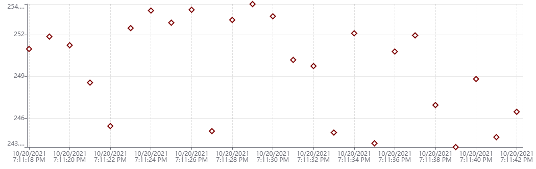
Using symbols in the chart without a line and different color
Sometimes only the data points are interesting without drawing a line - also the color can be adapted using variableStyleOptions.
    var chartComponent = document.querySelector('mdsp-time-series-chart');
    chartComponent.variableStyleOptions = [{
        variablePath: 'myAssetId/myAspectName/myVariableName',  // to be replaced
        lineMode: 'noLine',
        symbol: 'emptyDiamond',
        symbolSize: 10,
        color: {red: 125, green: 0, blue: 0}
    }];
Using custom limits for the y-axis
By default, the y-axis are scaling to the min and max values of the current loaded data. In case you need custom limits, e.g. to avoid scaling of the chart in case of high peaks, you can configure the limits of the chart.
    var chartComponent = document.querySelector('mdsp-time-series-chart');
    chartComponent.chartStyleOptions = {
        viewMode: "Stacked",
        crossRuler: true,
        scaleOptions: {
            "scale_1": {
                valueRange: {
                    min: -100,
                    max: 100,
                },
            },
            "scale_2": {
                valueRange: {
                    min: -10,
                    max: 10,
                }
            }
        }
    };
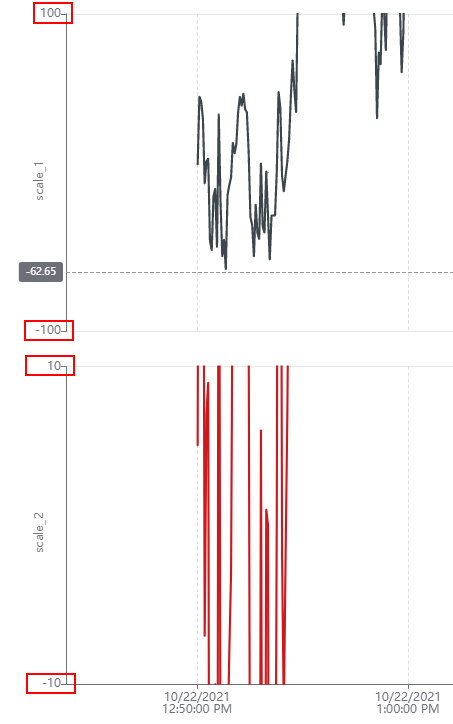
If there is only on scale (y-axis), you can configure the limit of the default y-axis like this:
    var chartComponent = document.querySelector('mdsp-time-series-chart');
    chartComponent.valueRange = {
        min: -100,
        max: 100,
    };
Highlight variables while hovering
Differentiate between multiple lines in the chart by hovering over a specific line:
    var chartComponent = document.querySelector('mdsp-time-series-chart');
    chartComponent.highlightMode = true;
<<<<<<< HEAD 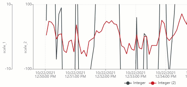
Switch to raw time series data
In some cases aggregates are not built yet, e.g if you're looking on 1 hour aggregates, but the data was injected in the last seconds. In this case the charts shows an empty state No aggregated data for selected variables or given variables. You can enable a button in this empty state, to switch to raw time series data.
    var chartComponent = document.querySelector('mdsp-time-series-chart');
    chartComponent.showSwitchToRawButton = true;
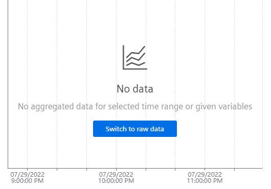
If you provide an UI element like a dropdown for selecting the mode, you can use the dataProviderChanged event to update the used data provider.
Except where otherwise noted, content on this site is licensed under the Development License Agreement.