
Web Components for Insights Hub and Industrial IoT
IDL List View
Info
This component requires access to a package of Integrated Data Lake (IDL) - see for example the IDL Essential.
Furthermore the related roles have to be assigned to the application when this component is used.
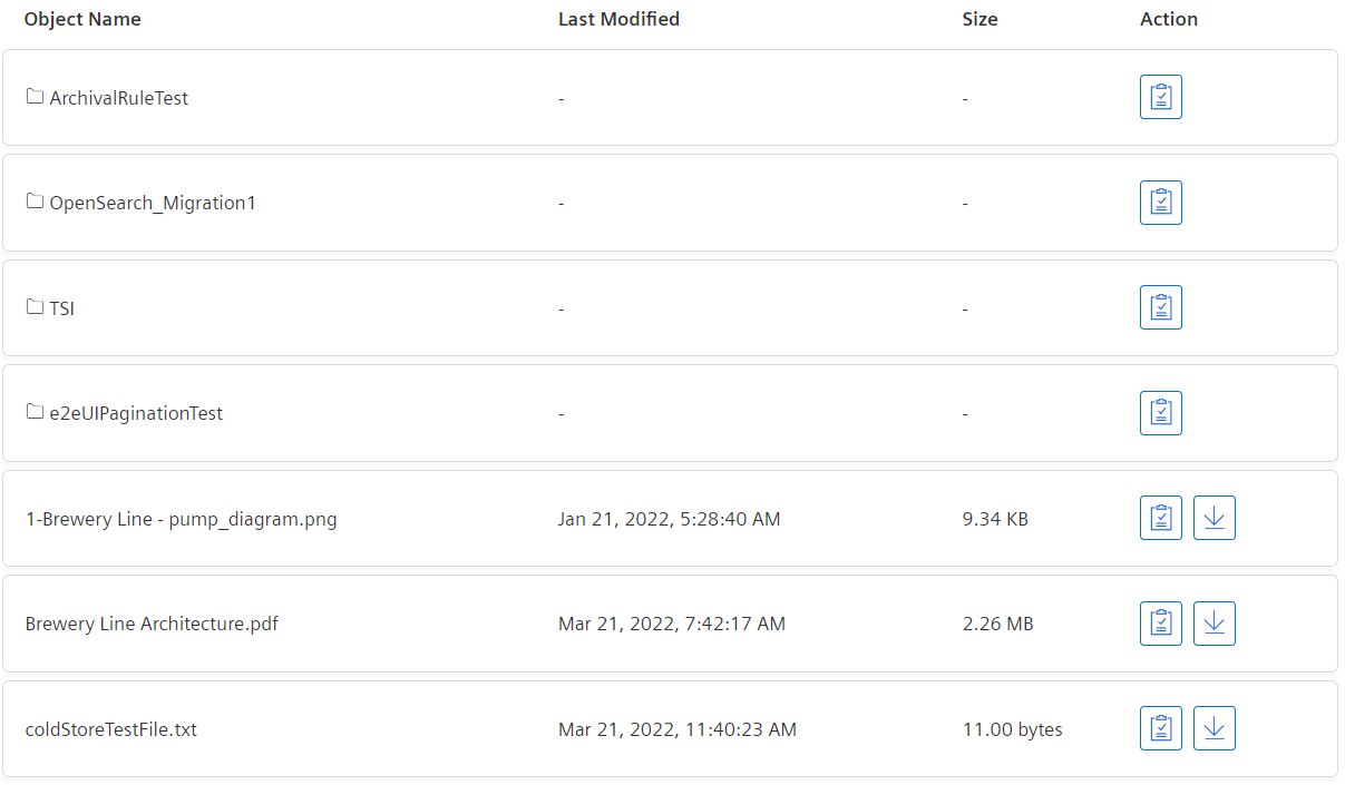
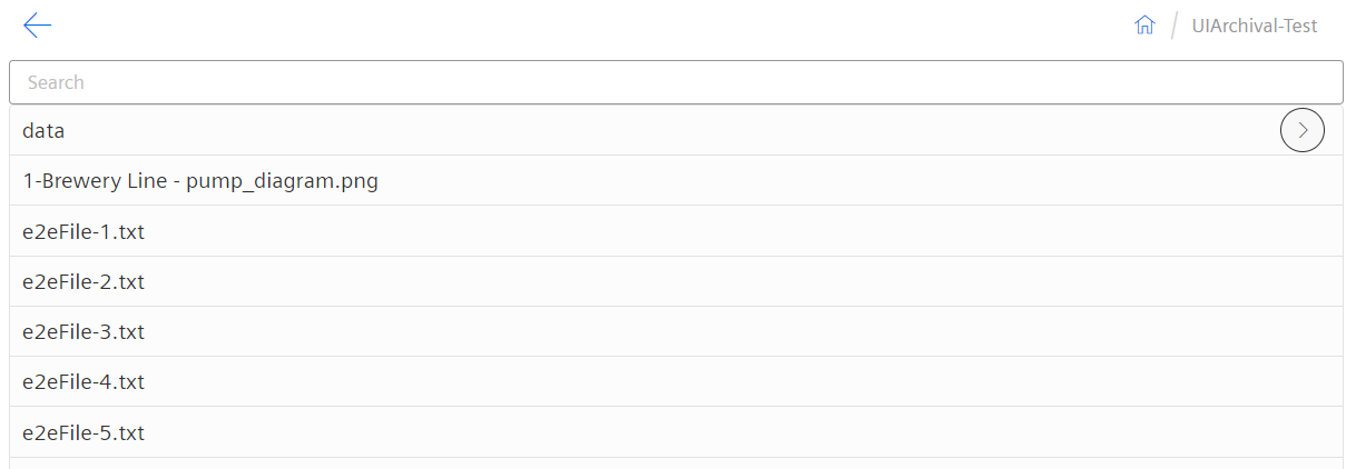
The Integrated Data Lake (IDL) List View displays a list of objects/folders for given or default bucket storage path. This view component provides feature like download objects and copy path. Note that download object is available for objects only, not for folders.
By default the root storage path i.e. '/' will be taken to display object/folders on first load.
This component has two types of view modes: 'Table' and 'List'. See details below.
Examples
Interface
Selector
<mdsp-idl-list-view></mdsp-idl-list-view>
Properties
| Name | Type | Corresponding attribute | Default | Description | Allowed Values |
|---|---|---|---|---|---|
| context | string | context | Configures the context of the component. See also here. | ||
| errorNotification | boolean | error-notification | Enables error control if an error is thrown. This can be used for debug purposes. For productive use, the error event should be caught and handled in the application. See also here. | ||
| folderOnly | boolean | folder-only | false | Shows only folders if the value is true, else folders and objects on the current path will be shown. | |
| hideBackButton | boolean | hide-back-button | false | Hides Back button from list view if true. | |
| hideListBreadcrumb | boolean | hide-list-breadcrumb | false | Hides breadcrumb if true. | |
| locale | string | locale | Specifies the locale in which the component is displayed. The locales en and de are provided by default.See also here. | ||
| localeManager | LocaleManager | Returns a LocaleManager object. This can be used to add locales or to get the locale settings. See also here. | |||
| model | IdlListDataModelProxy | Returns an object for data model handling, refer to IdlListDataModelProxy model. | |||
| multiSelectable | boolean | multi-selectable | false | Enables selection of multiple events at once if true. | |
| searchHidden | boolean | search-hidden | false | Hides the search field if true. | |
| selectable | boolean | selectable | false | Enables the checkbox if value is true. | |
| selectedObjectPath | string | selected-object-path | '/' | Specifies selected path when item is selected. | |
| showCopyPath | boolean | show-copy-path | true | Hide copy path overlay if value is false. | |
| showEmptyState | boolean | show-empty-state | false | Display default component empty state area if no data found. | |
| storagePath | string | storage-path | '/' | Configures storage path to fetch folders/objects. | |
| subtenantId | string | subtenant-id | undefined | Specify subtenant ID for Tenant behalf of subtenant use case to fetch folders/objects. | |
| viewMode | ViewMode | view-mode | Table | Configures the view mode to render component in Table or List mode. | - List - Table |
Events
| Name | Type | Description |
|---|---|---|
| listItemSelected | EventEmitter<ExplorerListItem> | Triggered when item is clicked. |
| downloadObjectClicked | EventEmitter<DownloadObject> | Triggered when download object from table view clicked. |
| listDataLoaded | EventEmitter<ListResponse> | Triggered when list/table view data loaded. |
| breadcrumbClicked | EventEmitter<string> | Triggered when breadcrumb navigation from table view is clicked. |
| itemChecked | EventEmitter<ExplorerListItem[]> | Triggered when the checkbox is checked. Only visible if multiSelectable is set to true. |
| itemUnchecked | EventEmitter<MultiSectionChanged> | Triggered when the checkbox is unchecked. Only visible if multiSelectable is set to true. |
| copyPathClicked | EventEmitter<string> | Triggered when copy path is clicked. |
| backButtonClicked | EventEmitter<BackButtonModel> | Triggered when back button from List view mode is clicked. |
| searchFilterEnabled | EventEmitter<boolean> | Triggered when search filter applied. |
| selectedObjectPathChanged | EventEmitter<string> | Triggered when object path is set using selectedObjectPath property. |
| connected | EventEmitter<any> | Triggered after the component is created, initialized and appended to the DOM tree. |
| error | EventEmitter<MdspUiError> | Triggered when an error occurs in the component or while accessing APIs. See also here. |
Models
ListObjectsResponse
interface ListObjectsResponse {
    storageAccount: string;
    storagePath: string;
    objects: {
        files: StorageObject[];
        folders: StorageObject[];
    };
    page: {
        size: number;
        nextToken: string;
    };
    isTruncated: boolean;
}

interface StorageObject {
    key: string;
    lastModified?: string;
    contentSize?: number;
    storageClass?: string;
}
ExplorerListItem
interface ExplorerListItem {
    isSelected?: boolean;
    isExpanded?: boolean;
    isFolder?: boolean;
    label?: string;
    path: string;
    routerLink?: string[];
    queryParams?: { path: string };
    storagePath?: string;
    size?: number;
    displaySize: string;
    type: string;
    lastModified?: Date | string;
    metadataTags?: string[];
    storageClass?: string;
    pathLabel?: string;
}
ViewMode
export enum ViewMode {
    LIST = 'List',
    TABLE = 'Table'
}
DownlaodObject
interface DownlaodObject {
    path: string,
    isObjSizeExceeded: boolean
}
ListResponse
interface ListResponse {
    isDataLoaded: boolean;
    items?: ExplorerListItem[];
}
ContractDetails
interface ContractDetails {
    key?: string;
    value?: string;
    folderName: string;
    fullPath: string;
    storagePathQueryParams?: { selected: string, path: string };
}
Roles
mdsp:core:idlmanager.xxx
Snippets
Default view to display objects/folders for root storage path
<mdsp-idl-list-view [storage-path]="'/'"></mdsp-idl-list-view>
const idlListViewComp = document.querySelector('mdsp-idl-list-view');
idlListViewComp.storagePath = '/test';
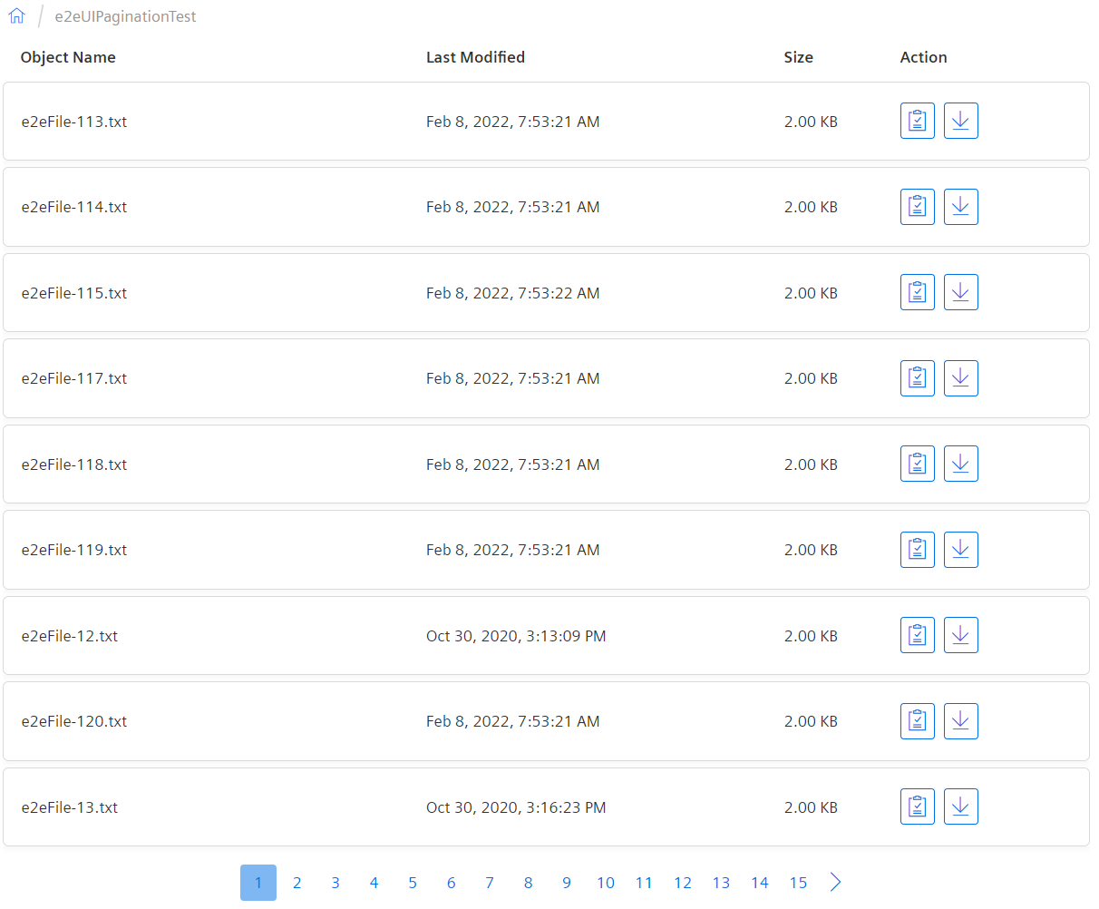
Table View
View mode can be selected by using viewMode property. The default value for viewMode is Table. Pagination is enabled by default and will be visible if page more than 1.
<mdsp-idl-list-view #mdspIdlViewComponent
                    [storage-path]="'/'"
                    error-notification="false"
                    view-mode="Table"
                    pager-mode="Hidden"
                    show-empty-state="false">
</mdsp-idl-list-view>
List View
To select list view mode, viewMode property should be set to List.
Basic configuration
<mdsp-idl-list-view #mdspIdlViewComponent show-empty-state="false" [path]="'/'"
                    view-mode="List"
                    (itemChecked)="onItemChecked($event)"
                    (itemUnchecked)="onItemUnchecked($event)"
                    (objectListLoaded)="objectListLoaded($event)">
</mdsp-idl-list-view>
Advanced configuration
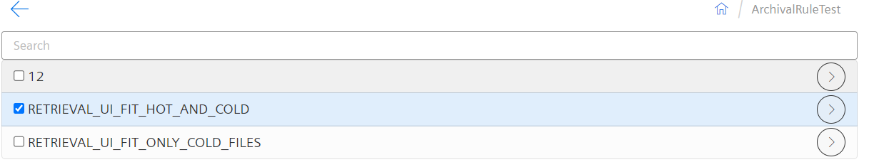
Additional properties like selectable, folder-only can be set/configured.
- Setting selectable property value as 'true' will enable checkbox. Default value is false.
- Setting folder-only property value as 'true' will display only folders in list view. Default value is false.
<mdsp-idl-list-view #mdspIdlViewComponent show-empty-state="false" [path]="'/'"
                    selectable="true" view-mode="List" folder-only="true"
                    (itemChecked)="onItemChecked($event)"
                    (itemUnchecked)="onItemUnchecked($event)"
                    (objectListLoaded)="objectListLoaded($event)">
</mdsp-idl-list-view>
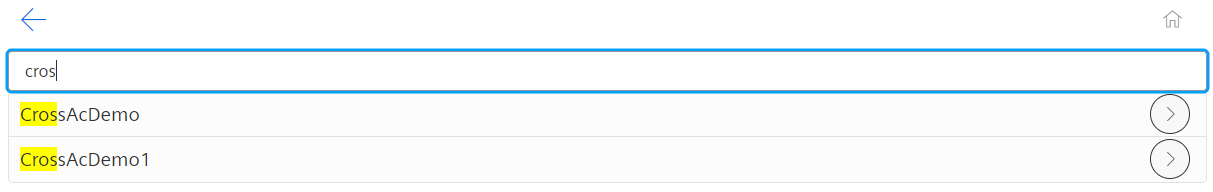
Search Filter
By default, Search filter is enabled in List mode. To hide search filter, set search-hidden to true.
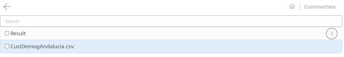
Set object path using property
Use selected-object-path prperty to set paht adn redirect to it directly.
document.querySelector('mdsp-idl-list-view').selectedObjectPath = 'data/ten=punvs1/CustomerData/CustDemogAndalucia.csv';
Listening to Events
The following sample configuration for how to listen to events sent by web component. See Events table for more details.
<mdsp-idl-list-view #mdspIdlViewComponent
    [storage-path]="'/'"
    error-notification="false"
    view-mode="Table"
    pager-mode="Hidden"
    show-empty-state="false"
    (downloadObjectClicked)="downloadObjectClicked($event)"
    (listItemSelected)="onListItemSelected($event)"
    (breadcrumbClicked)="onBreadcrumbClick($event)">
</mdsp-idl-list-view>
Use Simple Paging
By default a pagination component will be shown if records are more than 100.
<mdsp-idl-list-view [storage-path]="'/'"></mdsp-idl-list-view>
Refresh the IDL list view
The data model of the IDL list view can be refreshed to get the latest objects/folders, for example to update the view cyclically.
idlListViewComp.model.refresh();
Example: Assign unique id to component selector as shown below
<mdsp-idl-list-view #mdspIdlViewComponent
    [storage-path]="'/'"
    error-notification="false"
    pager-mode="Hidden"
    show-empty-state="false"
    (downloadObjectClicked)="downloadObjectClicked($event)"
    (listItemSelected)="onListItemSelected($event)"
    (breadcrumbClicked)="onBreadcrumbClick($event)">
</mdsp-idl-list-view>
Add following code in typescript:
@ViewChild('mdspIdlViewComponent', {static: false })
public idlViewComponent!: ElementRef;
this.idlViewComponent?.nativeElement?.model?.refresh();
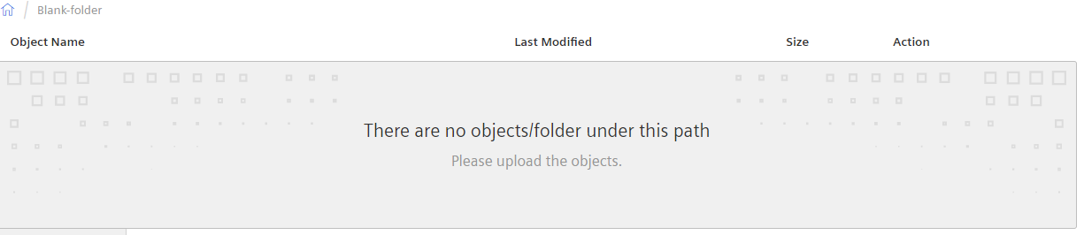
Show/Hide empty state area
Default value for show-empty-state is 'true'. In this case the component will show default empty state as below.
<mdsp-idl-list-view [storage-path]="'/'"></mdsp-idl-list-view>
This property if set to 'false', default empty state box (No record found section) will be hide. A consumer application can add their own logic to implement.
<mdsp-idl-list-view [storage-path]="'/'" show-empty-state="false"></mdsp-idl-list-view>
Except where otherwise noted, content on this site is licensed under the Development License Agreement.