
Web Components for Insights Hub and Industrial IoT
Date Time Range Picker
The Date Time Range Picker allows users to select a date/time range. Time ranges can be defined by start and end times in UTC or local time, or using quick ranges.
Example
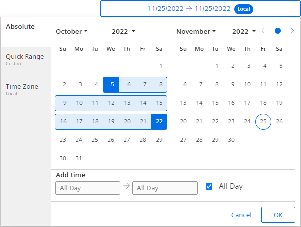
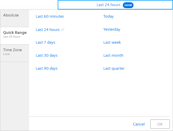
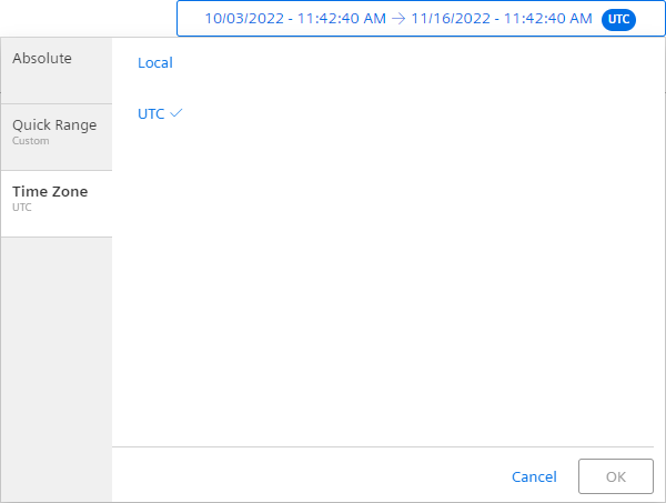
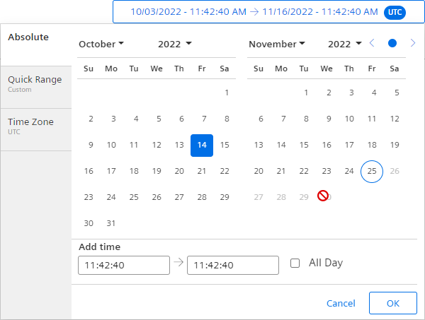
The following pictures show the different tabs of the Date Time Range Picker.
Calender View
Quick Ranges View
Time Zone View
Interface
Selector
<mdsp-date-time-range-picker></mdsp-date-time-range-picker>
Properties
| Name | Type | Corresponding attribute | Default | Description | Allowed Values |
|---|---|---|---|---|---|
| allDay | boolean | all-day | Ignores timestamps if true. | ||
| context | string | context | Configures the context of the component. See also here. | ||
| dateRange | TimeZoneDateRange | Specifies the date range using from, to, isAllDay and timeZone properties, refer to IDateRange model. | |||
| errorNotification | boolean | error-notification | Enables error control if an error is thrown. This can be used for debug purposes. For productive use, the error event should be caught and handled in the application. See also here. | ||
| fixedMode | boolean | fixed-mode | Specifies if the menu is displayed in a fixed position style. | ||
| locale | string | locale | Specifies the locale in which the component is displayed. The locales en and de are provided by default.See also here. | ||
| localeManager | LocaleManager | Returns a LocaleManager object. This can be used to add locales or to get the locale settings. See also here. | |||
| relativeRange | RelativeRange | relative-range | Specifies the selected relative range. | ||
| rightAligned | boolean | right-aligned | Specifies if the component is used right-aligned in the application. The component will open to the left side if set to true. | ||
| timeZone | TimeZone | time-zone | Specifies the selected time zone. | ||
| validDateRange | ValidDateRange | Specifies the date range a user can select in the user interface. Days outside this range will be disabled. Depending on the length of the selected time range, related quickRanges are disabled. |
Events
| Name | Type | Description |
|---|---|---|
| dateRangeChanged | EventEmitter<TimeZoneDateRangePicker> | Triggered when the selected date range changes. |
| connected | EventEmitter<any> | Triggered after the component is created, initialized and appended to the DOM tree. |
| error | EventEmitter<MdspUiError> | Triggered when an error occurs in the component or while accessing APIs. See also here. |
Models
TimeZoneDateRange
interface TimeZoneDateRange {
    from: Date;
    to: Date;
    isAllDay: boolean;
    timeZone: TimeZone;
}
ValidDateRange
interface ValidDateRange {
    min?: Date;
    max?: Date;
}
RelativeRange
enum RelativeRange {
    Custom = 'Custom',
    Last60Min = 'Last60Min',
    Last24Hours = 'Last24Hours',
    Last7Days = 'Last7Days',
    Last30Days = 'Last30Days',
    Last90Days = 'Last90Days',
    Today = 'Today',
    Yesterday = 'Yesterday',
    PreviousWeek = 'PreviousWeek',
    PreviousMonth = 'PreviousMonth',
    PreviousQuarter = 'PreviousQuarter',
}
TimeZone
enum TimeZone {
    Local = 'Local',
    UTC = 'UTC',
}
Remarks
- The time range for a full day is defined as midnight to midnight, e.g. 31/01/2019 00:00.00 - 01/02/2019 00.00.00.
This definition is aligned with the IoT Time Series Service or IoT Aggregate Service.
Roles
- This component does not require a specific role.
Snippets
Open to different directions
Configure the alignment parameter of the Date Time Range Picker based on its position. If the Date Time Range Picker is right-aligned as shown below, it unfolds to the left side.
<mdsp-date-time-range-picker from-date="2019-01-07T00:00:00.000Z" to-date="2019-01-09T23:59:00.000Z" error-notification="true" right-aligned="true"></mdsp-date-time-range-picker>
Limit selectable range
For limiting the selectable date range, e.g. to prohibit selecting a future date, the validDateRange-property can be applied.
// disable future dates
dateTimeRangePicker.validDateRange = {max: new Date()}
Last update: February 23, 2024
Except where otherwise noted, content on this site is licensed under the Development License Agreement.