
Web Components for Insights Hub and Industrial IoT
Custom Map
The Custom Map displays assets of the current tenant based on their hierarchy level. The background image for each level can be uploaded by a user. The position of the assets can be changed by drag and drop.
Example
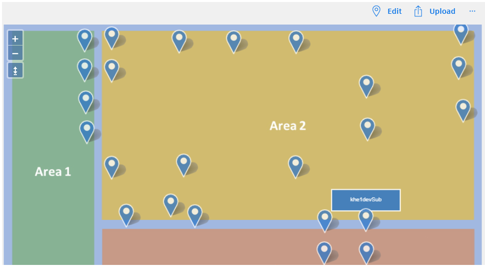
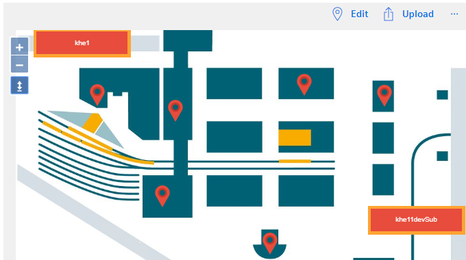
Component with an uploaded custom image
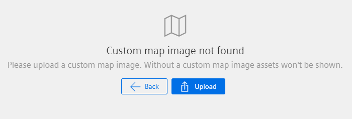
Empty component
Interface
Selector
<mdsp-custom-map></mdsp-custom-map>
Properties
| Name | Type | Corresponding attribute | Default | Description | Allowed Values |
|---|---|---|---|---|---|
| assetClickHandler | AssetClickHandlerType | asset-click-handler | Custom | Configures the event handler type for when the user selects an asset or asset group. | - Custom: Performs custom actions that you have implemented. - SelectionList: Opens an embedded pop up. |
| assetId | string | asset-id | ID of the asset of which the custom map is shown | ||
| clusterDistance | number | cluster-distance | 40 | Configures the minimum distance between clusters in pixels. Disables clustering if set to 0. | |
| context | string | context | Configures the context of the component. See also here. | ||
| customFilter | any | undefined | [EXPERIMENTAL] Specifies a custom filter which influences the displayed assets | ||
| disableDeepNavigation | `` | false | [EXPERIMENTAL] disables deep navigation on childless assets. | ||
| draggable | boolean | draggable | Enables dragging of the image if true. | ||
| errorNotification | boolean | error-notification | Enables error control if an error is thrown. This can be used for debug purposes. For productive use, the error event should be caught and handled in the application. See also here. | ||
| hierarchyClusterDistance | number | hierarchy-cluster-distance | 60 | Configures the minimum distance between clusters in pixels. Disables clustering if set to 0. | |
| hierarchyMarkerStyle | MapHierarchyMarkerStyle | Returns an object for customizing the hierarchy marker, refer to MapHierarchyMarkerStyle model. | |||
| locale | string | locale | Specifies the locale in which the component is displayed. The locales en and de are provided by default.See also here. | ||
| localeManager | LocaleManager | Returns a LocaleManager object. This can be used to add locales or to get the locale settings. See also here. | |||
| markerStyle | MapMarkerStyle | Returns an object for customizing the marker, refer to MapMarkerStyle model. | |||
| searchText | string | search-text | Specifies the text assets on the map are filtered for (read or write). | ||
| selectedAsset | IAsset | The asset that is selected on the map | |||
| selectedAssetId | string | selected-asset-id | ID of the asset that is selected on the map | ||
| sharedAssets | boolean | shared-assets | false | Specifies whether shared assets from other tenants are displayed. | |
| statusFilter | AssetStatusFilter | undefined | [EXPERIMENTAL] Specifies a filter for the displayed assets according to different values of the AssetStatus enum | ||
| statusIndicator | boolean | status-indicator | false | Specifies whether status information about assets should be displayed. | |
| subtenantFilter | string | subtenant-filter | null | Specifies whether only assets of a specific subtenant should be displayed. | |
| toolbarMode | CustomMapToolbarMode | toolbar-mode | Default | Defines toolbar type. | - None: hides embedded toolbar. - Default: shows the embedded toolbar. |
| view | IMapViewModel | Returns an object for view handling, refer to IMapViewModel model. | |||
| wheelZoom | boolean | wheel-zoom | false | Enables zoom control by mouse wheel if true. Otherwise, the control key must be pressed for zooming. | |
| zoomLevel | number | zoom-level | 0 | Specifies the zoom level of the map. | 0 - 20 |
Events
| Name | Type | Description |
|---|---|---|
| searchTextChanged | EventEmitter<string> | Triggered when the search text changes. |
| statusFilterChanged | EventEmitter<AssetStatusFilter[]> | Triggered when the status filter changes. |
| selectedAssetChanged | EventEmitter<IAsset> | Triggered when a new asset or asset cluster is selected. This event is only triggered if SelectionList is configured in assetClickHandler. |
| assetsClicked | EventEmitter<AssetClickEvent> | Triggered when an asset or asset cluster is clicked. This event is only triggered if Custom is configured in assetClickHandler. |
| viewChanged | EventEmitter<IMapViewState> | Is triggered when map view is changed. |
| connected | EventEmitter<any> | Triggered after the component is created, initialized and appended to the DOM tree. |
| error | EventEmitter<MdspUiError> | Triggered when an error occurs in the component or while accessing APIs. See also here. |
Models
IAsset
interface IAsset {
  assetId: string;
  tenantId: string;
  name: string;
  etag: number;
  externalId: string;
  t2Tenant: string;
  subTenant: string;
  description: string;
  parentId: string;
  typeId: string;
  location: ILocation;
  variables: any[];
  aspects: any[];
  deleted: string;
  sharing?: ISharing;
  fileAssignments: any[];
  locks: any[];
  timezone: string;
  twinType: string;
  _links: any;
}
ILocation
interface ILocation {
  country: string;
  region: string;
  locality: string;
  streetAddress: string;
  postalCode: string;
  longitude: number;
  latitude: number;
}
ISharing
interface ISharing {
  modes: SharingMode[];
}
SharingMode
enum SharingMode {
  Sharer = "SHARER",
  Receiver = "RECEIVER"
}
MapHierarchyMarkerStyle
class MapHierarchyMarkerStyle {
    public set default(style: any);
    public set selected(style: any);
    public set clustered(style: any);
    public set clusteredSelected(style: any);
}
MapMarkerStyle
class MapMarkerStyle {
    public set default(style: any);
    public set selected(style: any);
    public set clustered(style: any);
    public set clusteredSelected(style: any);
}
Remarks
- The Custom Map supports up to 2,000 markers if
clusterDistanceis set to 0. - It is recommended to adapt the
clusterDistancebased on the pin size and number of assets in a tenant. - For shared assets from other tenants the background image and the position of the assets cannot be modified.
Roles
One of the following roles is required:
mdsp:core:assetmanagement.adminmdsp:core:assetmanagement.standardusermdsp:core:assetmanagement.subtenantuser
Snippets
Use full-featured custom map
The following snippet will enable most common features of the custom map.
<mdsp-custom-map wheel-zoom="true" draggable="true" asset-click-handler="SelectionList"></mdsp-custom-map>
Use Custom Markers
By utilizing custom markers, you have the ability to configure the visual representation of markers on a map. You can either assign specific marker images directly to corresponding marker types or utilize a callback function. The callback function allows you to define conditions that determine what should be displayed when a particular marker needs to be rendered on the map.
Direct assignment of images to marker types
This sample uses PNG images.
    const customMapComp = document.querySelector('mdsp-custom-map');
    customMap.markerStyle.default = { src: './lib/pin_red.png'};
    customMap.markerStyle.selected = { src: './lib/pin_red_selected.png'};
    customMap.markerStyle.clustered = { src: './lib/clustered.png'};
    customMap.markerStyle.clusteredSelected = { src: './lib/clustered_selected.png'};
    customMap.hierarchyMarkerStyle.default = { src: './lib/rect_red.png'};
    customMap.hierarchyMarkerStyle.selected = { src: './lib/rect_red_selected.png'};
    customMap.hierarchyMarkerStyle.clustered = { src: './lib/rect_clustered.png'};
    customMap.hierarchyMarkerStyle.clusteredSelected = { src: './lib/rect_clustered_selected.png'};
Assignment of a callback to marker types
This sample uses PNG images and is only overriding the default marker type.
const customMapComp = document.querySelector('mdsp-custom-map');
customMapComp.markerStyle.default = (feature) => {
  // feature parameter has all the data and information regarding the marker.
  // Attention: the property path to the asset model in custom map differs from the asset-map feature so be aware of that.
  const typeId = feature.data.item.typeId; // is the typeid of the underlying asset object
  const name = feature.data.item.name; // name of the asset
  // define marker image depending on asset typeId and name. Use the asset object information to build your own conditions.
  // the return object should contain at least these two properties.
  // src: is the path to your custom marker images
  // styleCacheId: is a unique cache id which is used to cache the provided image and marker configuration within the map.
  if(typeId==='tenant.Automotive'){
    if(name === 'Green Car Model'){
      return {src: './assets/green-car.png', styleCacheId:'green-car'};
    }else if(name === 'Red Car Model'){
      return {src: './assets/red-car.png', styleCacheId: 'red-car'};
    }else if(name === 'Yellow Car Model'){
      return {src: './assets/yellow-car.png', styleCacheId: 'yellow-car'};
    }else if(name === 'Blue Car Model'){
      return {src: './assets/blue-car.png', styleCacheId: 'blue-car'};
    }
  }
  // provide always a default src and styleCacheId
  return {src: './assets/default.png', styleCacheId:'default-car'};

};

Please note that in order to achieve the same effect for clustered markers, it is also necessary to provide the callback function for the clustered marker types. This ensures consistent customization for both individual and clustered markers on the map.
Hide assets with a custom filter
In some use cases, you might want to hide specific assets. For this, the customFilter can be used.
  document.querySelector('mdsp-custom-map').customFilter = function(a){
  return a.filter(b=>b.name.includes('M') || b.name.includes('m'));
};
As a result, only the assets which include 'M' or 'm' in the asset name will be displayed. To reset the filter, set the customFilter to undefined.
Except where otherwise noted, content on this site is licensed under the Development License Agreement.