
Web Components for Insights Hub and Industrial IoT
Asset View
The Asset View displays assets available in the current tenant.
The view mode can be configured to display the assets as listed items, in a responsive grid container, or as tree using the parentId property. A search field and an asset count field are displayed by default, but can be hidden.
Example
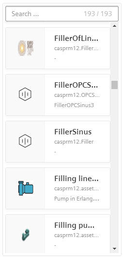
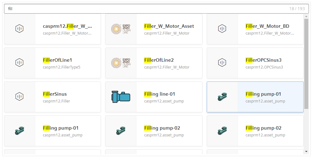
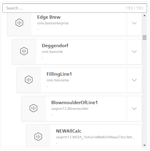
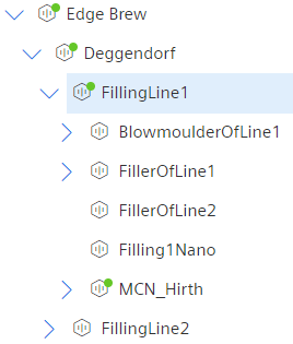
The following pictures show the Asset View in different view modes.
List
Cards
Tree
Compact Tree
Interface
Selector
<mdsp-asset-view></mdsp-asset-view>
Properties
| Name | Type | Corresponding attribute | Default | Description | Allowed Values |
|---|---|---|---|---|---|
| assetTypeFilter | AssetTypeFilter | Configures the asset types to be displayed, refer to AssetTypeFilter model. Note that viewMode=Tree does not work in combination with assetTypeFilter. | |||
| cardColumnCount | Number | card-column-count | 3 | Configures the number of cards per row if view-mode is Card. | 1-12 |
| context | string | context | Configures the context of the component. See also here. | ||
| countHidden | boolean | count-hidden | false | Hides the asset count field if true. | |
| customCardTemplateId | string | Specifies the element ID of a custom HTML template to be used for viewMode=Card. | |||
| customFilter | any | undefined | [EXPERIMENTAL] Specifies a custom filter which influences the displayed assets | ||
| customListTemplateId | string | Specifies the element ID of a custom HTML template to be used for viewMode=List. | |||
| customTreeTemplateId | empty | Specifies the element ID of a custom HTML template to be used for viewMode=Tree. | |||
| errorNotification | boolean | error-notification | Enables error control if an error is thrown. This can be used for debug purposes. For productive use, the error event should be caught and handled in the application. See also here. | ||
| leafAssetHidden | boolean | leaf-asset-hidden | false | hides leaf assets in CompactTree Mode if true. | |
| locale | string | locale | Specifies the locale in which the component is displayed. The locales en and de are provided by default.See also here. | ||
| localeManager | LocaleManager | Returns a LocaleManager object. This can be used to add locales or to get the locale settings. See also here. | |||
| model | IDataModel | Returns an object for data model handling, refer to IDataModel model. | |||
| multiSelectable | `` | multi-selectable | false | Enables selection of multiple assets at once if true. | |
| searchHidden | boolean | search-hidden | false | Hides the search field if true. | |
| searchText | string | search-text | Specifies the text in the search field (read or write). | ||
| selectedAsset | IAsset | Specifies the selected asset, refer to IAsset model. | |||
| selectedAssetId | string | selected-asset-id | Specifies the ID of the selected asset. If multi-selectable is active this will override selectedAssetIds with its own value. | ||
| selectedAssetIds | string | Specifies the IDs of the selected assets. This property is only considered if multi-selectable is true. | |||
| selectedAssets | IAsset | Specifies the selected assets, refer to IAsset model. This property is only considered if multi-selectable is true. | |||
| sharedAssets | boolean | shared-assets | false | Specifies whether shared assets from other tenants are displayed. | |
| showAssetImage | boolean | show-asset-image | false | Attribute to load asset-images if they exists. | |
| showChildrenCount | boolean | show-children-count | false | Displays asset children count in CompactTree Mode if true. | |
| showHierarchyPath | boolean | show-hierarchy-path | false | Displays the hierarchy path of the asset if true. | |
| statusFilter | AssetStatusFilter | undefined | [EXPERIMENTAL] Specifies a filter for the displayed assets according to different values of the AssetStatus enum | ||
| statusIndicator | boolean | status-indicator | false | Specifies whether status information about assets should be displayed. | |
| subtenantFilter | string | subtenant-filter | null | Specifies whether only assets of a specific subtenant should be displayed. Please use the subtenant ID and not an asset ID as the value. | |
| view | IViewModel | Returns an object for view handling, refer to IViewModel model. | |||
| viewMode | ViewMode | view-mode | List | Configures the view mode. | - List - Card - Tree - CompactTree [EXPERIMENTAL] |
Events
| Name | Type | Description |
|---|---|---|
| selectedAssetChanged | EventEmitter<IAsset> | Triggered when a new asset is selected and multi-selectable is false. |
| selectedAssetsChanged | EventEmitter<IAsset[]> | Triggered when a new asset is selected and multi-selectable is true. |
| assetsLoaded | EventEmitter<IAsset[]> | Triggered when assets loading is finished. Note: If custom filter is used, this response will be affected as well. |
| searchTextChanged | EventEmitter<string> | Triggered when the search text changes. |
| statusFilterChanged | EventEmitter<AssetStatusFilter[]> | Triggered when the status filter changes. |
| connected | EventEmitter<any> | Triggered after the component is created, initialized and appended to the DOM tree. |
| error | EventEmitter<MdspUiError> | Triggered when an error occurs in the component or while accessing APIs. See also here. |
Models
AssetTypeFilter
type AssetTypeFilter = AssetTypeFilterOptions | string[]
interface AssetTypeFilterOptions {
  supportedTypes: string[];
  includeInheritance?: boolean;
}
IAsset
interface IAsset {
  assetId: string;
  tenantId: string;
  name: string;
  etag: number;
  externalId: string;
  t2Tenant: string;
  subTenant: string;
  description: string;
  parentId: string;
  typeId: string;
  location: ILocation;
  variables: any[];
  aspects: any[];
  deleted: string;
  sharing?: ISharing;
  isShared: boolean;
  fileAssignments: any[];
  locks: any[];
  timezone: string;
  twinType: string;
  _links: any;
}
ISharing
interface ISharing {
  modes: SharingMode[];
}
SharingMode
enum SharingMode {
  Sharer = "SHARER",
  Receiver = "RECEIVER"
}
IDataModel
interface IDataModel {
  // forces reload of data, e.g. re-loading the assets
  refresh(): void;
}
ILocation
interface ILocation {
  country: string;
  region: string;
  locality: string;
  streetAddress: string;
  postalCode: string;
  longitude: number;
  latitude: number;
}
IViewModel
interface IViewModel {
  refresh(): void;
}
Remarks
- The Asset View currently supports up to 20,000 assets in list or tiles view mode.
- The tree view mode currently supports up to 1,000 assets.
- Virtually deleted assets are not displayed.
Roles
mdsp:core.AssetManagement.xxx(Asset Management API is used)
Snippets
Display Assets of a Specific Type
Use the assetypefilter parameter to only display assets of a specific type or of types derived from it.
// Set a filter for a specific asset type:
assetView.assetTypeFilter = ["core.mcnano"];
// This displays all assets of type 'core.mcnano'.
// Set a filter for multiple asset types:
assetView.assetTypeFilter = {
  supportedTypes: ["core.mcnano", "core.basicagent"]
};
// This displays all assets of type 'core.mcnano' or 'core.basicagent'.
// Set a filter to a specific asset type and all types derived from it:
assetView.assetTypeFilter = {
  supportedTypes: ["core.basicagent"],
  includeInheritance: true
};
// This displays all assets of type 'core.basicagent' and types derived from it.
Refresh
The data model of the component can be refreshed, for example to update the view cyclically to get the latest asset changes:
assetView.model.refresh();
Hide assets with a custom filter
In some use cases, you might want to hide specific assets. For this, the customFilter can be used.
document.querySelector('mdsp-asset-view').customFilter = function(a){
   return a.filter(b=>b.name.includes('M') || b.name.includes('m'));
};
As a result, only the assets which include 'M' or 'm' in the asset name will be displayed. To reset the filter, set the customFilter to undefined.
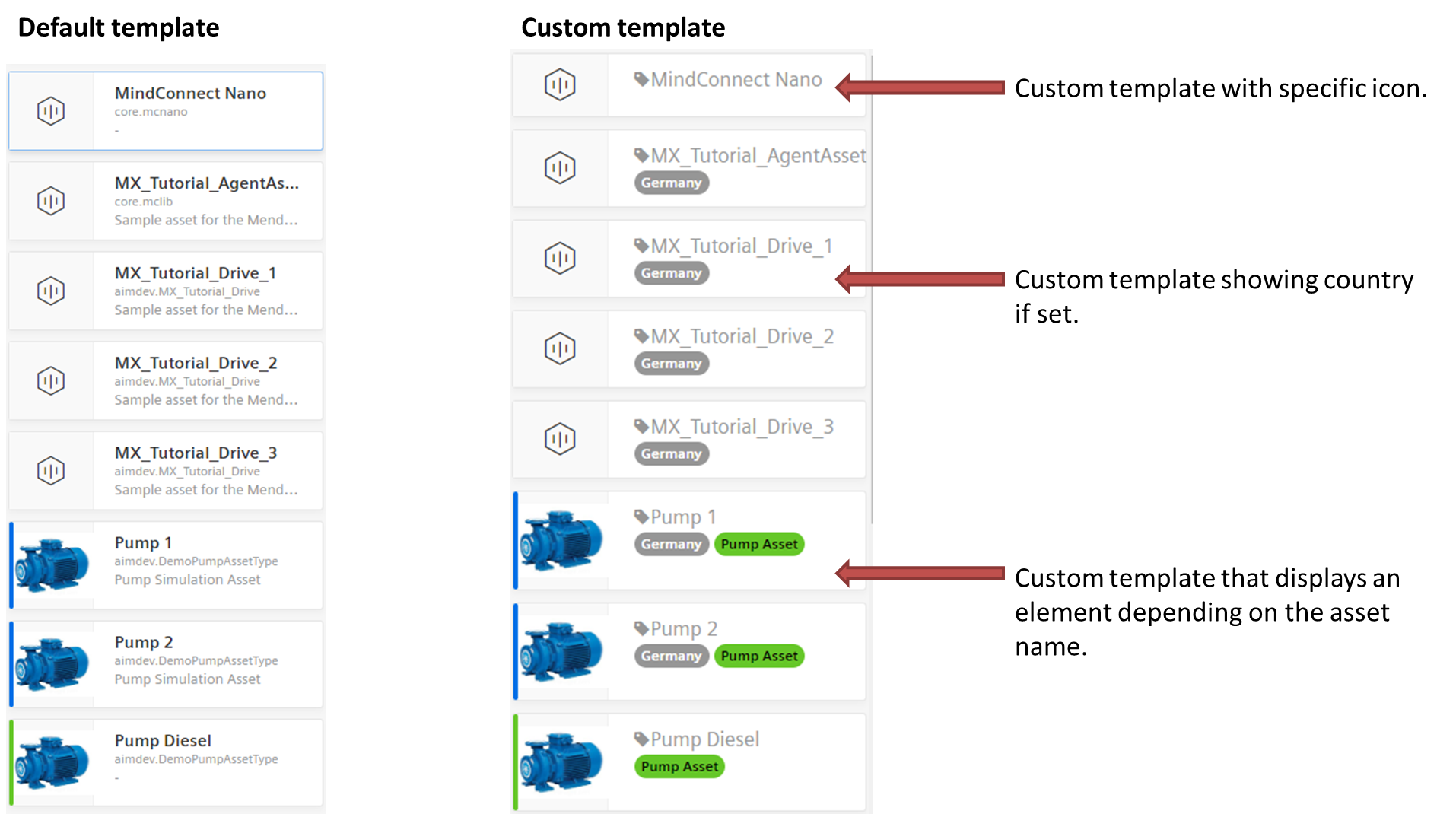
Use Custom Templates
With templates you can influence the view of the component. Change the layout and the properties displayed inside a list item using Angular syntax for the data binding (e.g. {{data.name}}). Refer to IAsset for available properties.
Add a HTML element to your index.html file and apply the custom template.
  <div id="customAssetViewTemplate" style="display: none;" class="mdsp mdsp-defaults">
    <em class="iconMdsp tag black"></em>
    <span class="h5">{{data.name}}</span>
    <div>
      <div class="{{data.location && data.location.country ? 'badge badge--dark' : 'hidden'}}">{{data.location && data.location.country}}</div>
      <div class="{{data.name.startsWith('Pump') ? 'badge has-bgColor-success has-color-base000' : 'hidden'}}">Pump Asset</div>
    </div>
  </div>
const assetView = document.querySelector('mdsp-asset-view');
// set ID of the custom HTML element
assetView.customListTemplateId = 'customAssetViewTemplate';
Except where otherwise noted, content on this site is licensed under the Development License Agreement.