Using standard dashboard nodes
Example scenario
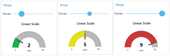
A linear gauge needs to display a specific data point, using a pointer. The pointer is required to move on a colored scale to indicate whether the monitored data is within the defined limits.
Objective
The gauge scale gives values between predefined minimum and maximum values. Within that scale, you can create various ranges to classify the data.
Requirements
- Standard dashboard gauge node
- Standard dashboard slider node
Procedure
- Select the slider node from the standard dashboard nodes. Configure the group and range of the node:
- Group name: Range [Measurements]
- Type: Gauge
- Label: Linear scale
- Range: Min 0, max 10
- Color gradient: Green, yellow, red
- Sectors: 0-3-7-10
- Select the gauge node from the same dashboard group. Configure the group, range and color gradient of the node:
- Group name: Range [Measurements]
- Label: Pointer
- Range: Min 0, max 10; Step 1
- Connect the slider to the gauge.
-
Save and deploy.

Result
To view the results, click the  icon and select "Open dashboard" from the menu.
You will be redirected to "https://visualflowcreatorURL.yyy.mindsphere.io/ui/dash/?user=username@email.com#/0" in a new tab.
Select the configured group left navigation window of the dashboard UI. The required dashboard flow will now be visible on the dashboard screen. You can slide the pointer and get the desired results: