User interface of Visual Flow Creator
You can operate Visual Flow Creator using the "main navigation", "node palette", "working area" and "info window".
Start screen
The following screenshot shows the different elements of the Visual Flow Creator user interface:

① Opens the Launchpad
② Node palette
③ Working area
④ Main navigation
⑤ Info window/ dashboard window/ debug window
Projects
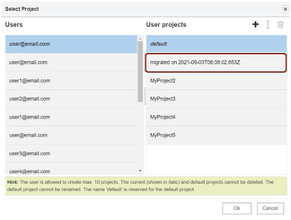
Projects allows you to separate your flows from other user flows and organize your flows into small logical coherent pieces based on your working tasks. You can create, rename, search and delete the "Projects" from the environment. A default project is already available for each user. You can also access the other user flows by selecting user from the list of "Projects". You can access "Projects" from the top left corner of the UI:
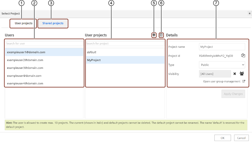
① User projects tab
② Search and select the user from "Users" list
③ Shared projects tab
④ Search and select the project from "User projects" list
⑤ Creates a new project
⑥ Deletes the selected project
⑦ Displays the selected project details
Note
- Up to 10 projects can be created per user including the "default" project.
- "Default" project cannot be renamed or deleted.
- If the user selects the project type as "Public" for the particular project, then it will be visible to the other users of the environment.
- If the user selects the project type as "Private" for the particular project, then it will not be visible to the other users of the environment.
| Project Properties | Description |
|---|---|
| Users | Displays the user's list and allows to search for the required. |
| User projects | Displays the "default" project and other projects list. |
| Shared projects | Displays the shared projects to other users of the environment. |
| Project name | Displays the project name and allows you to rename the project name. |
| Project id | Displays the "Project id" of the project. "Project id" is useful for accessing API of the particular Project. |
| Type | - Public: This type of project will be visible for all the other users of the environment. You can share public projects to the other user to edit the flows inside the project. - Private: Only visible for the creator and VFC admins of the environment. Note: Admin can change the project details. |
| Visibility | It allows to add or remove "user group" for the selected project. Note: To add the user group to the selected project, ensure the user group is already created in "Settings" application. |
| Open user group management | Navigates to the "User groups" feature in Settings application. For more information about managing "User groups" feature, refer to Managing user groups. |
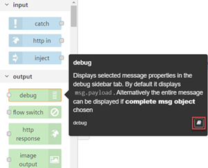
Node palette
The node palette is located on the left side of the editor. The palette shows you the different types of nodes available in the UI.
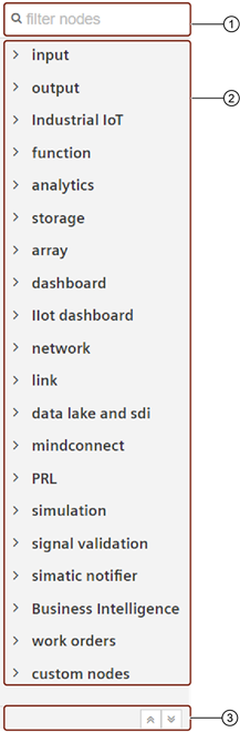
① Filter the list of nodes
② Node palette
③ Collapse or expand all categories
Working area
You can drag nodes from the palette and wire them to develop the flows in the working area.
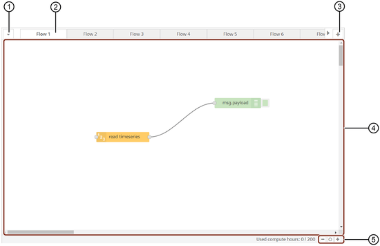
① Opens a dropdown in order to quickly navigate through all flows
② "Flow" tab with display of user email address
③ Creates a new tab. Multiple flows in one tab possible.
④ Working area
⑤ Zoom function/standard zoom level
Sidebar
"Visual Flow Creator" has the feature to allow you to view the information of the flows in different ways. You can use the sidebar window to configure the nodes and flows and view the results. It has three tabs:
- Info tab: It shows information of the nodes of the current project as well as node properties.
- Help tab: It displays node information about how to perform various functions.
- Dashboard tab: It displays the layout, site and theme of the nodes or flow.
- Debug tab: It displays the debug messages.

① Displays debug messages
② Displays information about the selected node in the node palette
③ Help tab
④ Dashboard tab
⑤ Filters debug messages
⑥ Deletes all debug messages
⑦ Filters the options
⑧ Log area
⑨ Pauses the display of new log messages
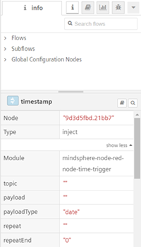
Info tab
The info tab shows the properties of the selected node as well as information on how to use the node. If no node is selected, the info window will show the properties of the current flow displayed in the workspace.
Help tab
The help tab shows the details about how to perform various functions of a selected node. If no node is selected, the help window will show the details of the current selected node displayed in the workspace.
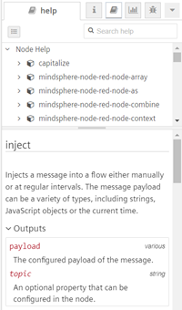
When a node is opted, it displays its description as well as a shortcut key to the help tab. To open the help tab, click  .
.
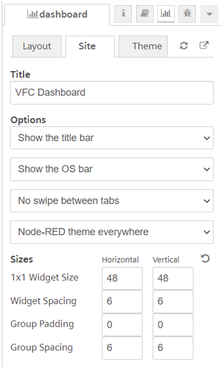
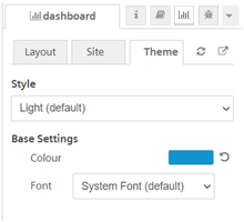
Dashboard tab
To know the working of the dashboard nodes, it is important to know some terms and their definitions:
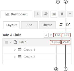
① Add tabs in the dashboard
② Add external web links to display in the dashboard
③ Edit tab properties in the dashboard
④ Add groups in the tab
- Tabs: Tab is created under dashboard tab. You can add groups, edit groups and edit the group properties under the tab. You can add or edit multiple groups in the tab.
- Group: A group is a container for multiple dashboard elements. You can add or edit a group for each flow and you can develop multiple groups under the tab.
- Links: You can create links to other web pages in the dashboard panel of the sidebar tab.
The dashboard window has three panels:
-
Layout: The layout defines the tabs (with containing dashboard elements) and links.
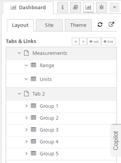
After creating tabs, you can add multiple groups in each of the tabs. The tabs allow you to reorder the tabs and groups. To add a new group, click the
 icon in the created tab. For editing any group, use the
  icon. The tabs and groups are expandable for editing as well as collapsible.
Similarly, you can define the properties of the created links by clicking
the button.For configuring a dashboard node, the groups and tabs created can be used to define the dashboard node properties. For more information, refer to Configure dashboard node properties

-
Site: The site panel allows you to configure the user interface behavior of the dashboard site.
You can also set the title of your dashboard here.
-
Theme: You can set the themes, style, color and font of the UI in the dashboard sidebar.
Note
The creation of groups / tabs / links are applicable only with the dashboard nodes.
For more information about creating and working of dashboard nodes, refer to Dashboard nodes.
Debug tab
You can inject the node and message payload is displayed in the Debug window.
This window display debug information for:
- IIoT
- Function
- Analytics
- Storage
- Array
- Simple anomaly
- Dashboard
- Custom
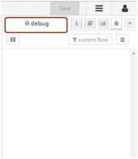
Click the "debug" window to view the message payload.
The "debug window" displays message payload of the nodes in the flows. The messages can be filtered using the node filter button. The node panel has the following filter options:
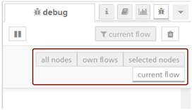
- All nodes: Displays all the messages.
- Own nodes: Displays the messages of the current user's nodes.
- Selected nodes: Displays messages only of the selected nodes from all the available nodes.
- Current flow: Displays the messages of the current working flow.
If there are large number of messages, the users have the possibility to filter them, in order to quickly find important debug information.
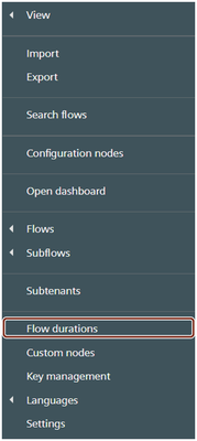
Flow durations
"Flow durations" displays the duration of the triggered flows in Visual Flow Creator by different users with time, user details and node information. Click  to access the "Flow durations":
You can find the list of triggered flows in Visual Flow Creator. You can filter by the user and redirect to the flows in Visual Flow Creator by clicking on the active node.

① Inactive node
② Active node
Note
- If the triggered flow is deleted from Visual Flow Creator, then the node will be inactive.
- The flow duration will be the sum of the maximum compute hours of a triggered flow and the list will be descending based on the duration.
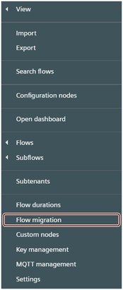
Flow migration
"Flow migration" allows you to migrate other user executed flows from the selected project in Visual Flow Creator. Click to access the "Flow migration":
You can select the user and project to migrate the flows from one user to another user by clicking "Migrate Flows".
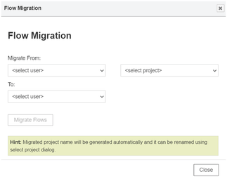
You can access the migrated flows from "Projects".
Note
- Only Visual Flow Creator admin can use "Flow migration" page.
- After migration, project name will be replaced with the Visual Flow Creator generated project name.
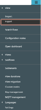
Export
"Export" allows you to copy or download the other user or "Projects" flows in Visual Flow Creator. Nodes and flows can be copied in the JSON format by clicking "Copy to clipboard" or you can download them by clicking the "Download" button. Click to access the "Flow migration":
You can export the single node, flows or all the flows of the current user or "Projects" in Visual Flow Creator.
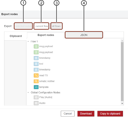
① Download or copy the selected node or flows
② Download or copy all flows the current tab
③ Download or copy the all nodes and flows
④ JSON preview tab
Groups
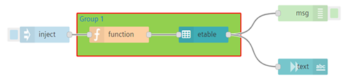
"Groups" allows you to combine the nodes into a group. It will create a boundary around the selected nodes and it can be moved, copied and perform other actions on the group.
You can create a flow and combine the nodes into a group as per the below example:
Click  to access "Groups":
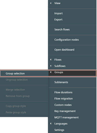
You can perform the following actions for the selected node:
- Group
- Ungroup
- Merge
- Remove
- Copy
- Paste
Edit Groups Properties
You can double click on the created "Groups" to change or update the properties of the Groups:
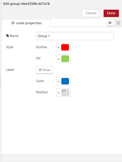
| Properties | Description |
|---|---|
| Style | Allows to change or update the outline and fill colors of the groups. |
| Label | Allows to change or update the color and position of the label. |