User Interface of Dashboard nodes output
The dashboard nodes provide a set of nodes for reading, visualizing and analyzing data on a live dashboard.
Flow of dashboard nodes output screen
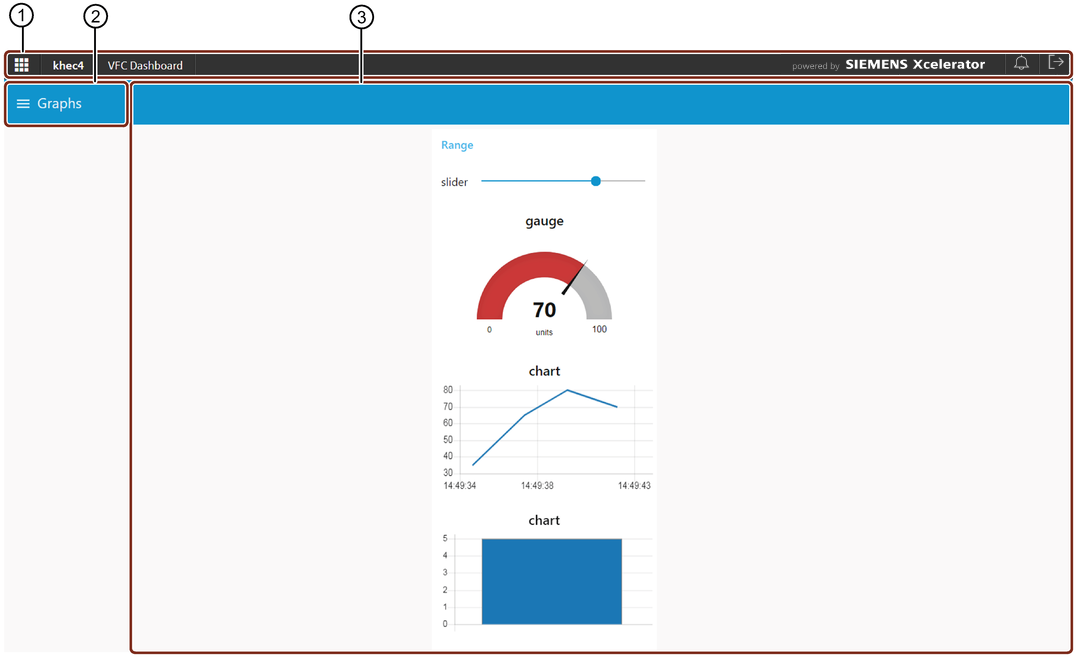
① OS bar
② Navigation drawer for tabs
③ Dashboard
User interface of group dashboard section
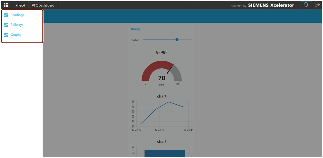
Select the required tab in the left panel to view the dashboard flow you have created.
To learn more about tab and group creation, refer to Create dashboard groups in the "Node properties" section.
For more information about how to get started with a dashboard in VFC, refer to VFC Dashboard - A Getting Started Example.
Last update: April 23, 2024