Custom nodes
The custom nodes helps to design and deploy your own customized nodes if any of the required nodes are not available in Visual Flow Creator.
Custom nodes are initially not available in the node palette with all the nodes in VFC. You need to create them first and then deploy. Thereafter, they will be automatically integrated in the palette.
Note
Custom nodes can access to context variables with limited for local and flow-context whereas global and environment context variables are not accessible.
Design custom nodes
Visual Flow Creator is composed into multiple components which are required for developing custom nodes. They are:
-
Editor component ("editor"): While deploying the custom node modules, files are populated to the editor. The frontend resources (HTML files, icons, language files) of the editor are delivered to the users' browser by integrating them in the requests, against which responses are generated.
-
Runtime component ("runtime"): The runtime is responsible for executing the flows by executing the backend code of each node. The runtime can access all provided files (HTML files, icons, Javascript files, etc.). When a node gets triggered, the message sent to the node is forwarded to the runtime which starts thereafter. The runtime executes the code and forwards the debug and status messages to the editor. It also forwards messages to the next connected nodes.
Note
The number of messages which a custom node can send / forward is restricted to 20 messages per execution.
You can create custom nodes at your convenience and then can use the nodes to design flows in the Visual Flow Creator.
The nodes have the possibility to integrate both frontend and backend functionalities. In special cases, the custom nodes they can use backend functionality if the functionality is provided by the user but cannot call custom backend functionalities.
Create a custom node
-
Open the menu button from the top right corner of the Visual Flow Creator screen.
-
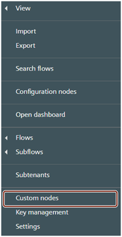
Select "Open custom nodes page" from the menu.
-
The custom node screen dialog is displayed:
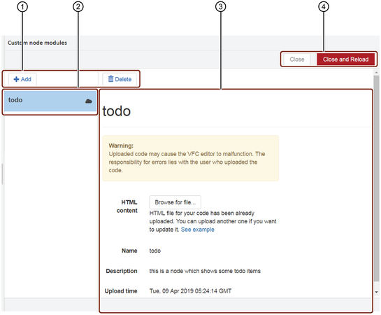
① Actions buttons
② Custom component window
③ Custom component details
④ Close / reload after uploads buttons
Note
Only users with the mdsp:core:vfc.admin permissions are allowed to access the custom nodes configuration screen.
4.Browse to upload the relevant zipped custom node content file which can contain multiple nodes. The file should be zipped and should have two or more files.
Configurations for Custom Nodes:
The zip archive should have three mandatory files - HTML node file, javascript file and the package.json file.
You can include other files in the zip archive like:
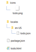
- Icon: The icons have to be in a directory called "icons".
- Language: The language files have to be in a directory called "locales/
", for example "locales/en-US".
The zip archive can also have multiple HTML node files.
The zip archive structure looks as shown below:
Configurations for special Custom Nodes:
The zip archive must have two mandatory files - HTML node file and the package.json file. Absence of the package.json file will throw an error.
You can include other files in the zip archive like:
- Icon: The icons have to be in a directory called "icons".
- Language: The language files have to be in a directory called "locales/
", for example "locales/en-US".
The zip archive can also have multiple HTML node files.
The archive is immediately uploaded to the server and validated.
The nodes are then extracted. The user always uploads "modules" which can contain multiple nodes. The following information is shown in the custom nodes overview:
- Name: Name of the new component.
- Description: Short summary of the component.
- Upload time: The field displays the current date and timestamp of the upload.
5.Click the "Close and reload" button at the top right corner to load the custom node. This displays the created node/(s) to Visual Flow Creator node palette.
Some of the node-red nodes available on the internet may have dependencies.
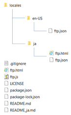
The zip archive structure looks as shown below:
These dependencies should be installed manually as below:
-
Download and extract the .zip package file.
-
Run npm install to install.
-
Create a new .zip archive.
Note
- Avoid the binary dependencies while creating custom nodes.
- Custom nodes can be created/ deployed maximum 12 times in 12 hours.
Result
The custom node is created with the chosen name under the designated section you have defined in the html file.
Ready-to-use nodes
The Ready-to-use nodes can be downloaded as described below:
-
They can be downloaded via the CLI with npm command 'npm pack packetName' and then the packetName.tgz file could be uploaded directly. You can find the nodes in Node-RED Library.
-
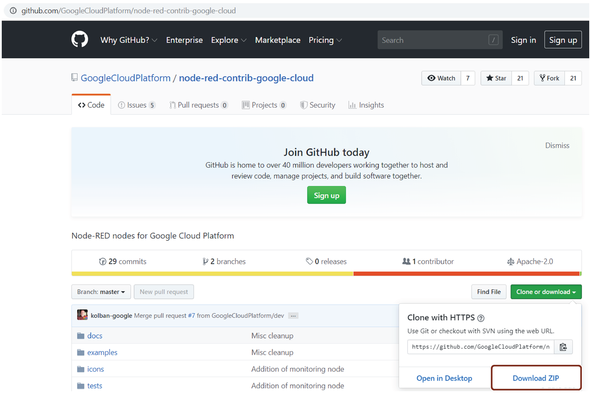
They can be cloned or downloaded from Github. Download repo and the zip archieve can be uploaded without modifications into custom nodes dialog. Example, Node-RED nodes for Google Cloud Platform and press on "Clone or download" and then "Download ZIP".
Custom node dependency
If the custom node has any external module dependencies, they must be installed in the dependencies section of its package.json file. You can follow below steps to install the dependency:
- Download the external module .zip file from the internet.
- Check for the dependecies in package.json file.
- To install the dependencies, enter "npm install" in CLI.
- After installing, zip the external module node file.
You can use this .zip file to create a custom node in Visual Flow Creator.
Note
Avoid using binary node dependecies.
Implement custom nodes - Example 1
Example scenario
Create a custom node to design flows where text inputs are displayed in upper case.
Objective
To convert a message payload into upper case characters.
Pre-requisites
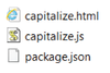
Create a directory having the following files:
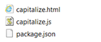
The example for the capitalize.html file is given below:
Example
    <script type="text/x-red" data-template-name="capitalize">
        <div class="form-row">
            <label for="node-input-name"><i class="fa fa-tag"></i> <span data-i18n="common.label.name">Name</span></label>
            <input type="text" id="node-input-name" placeholder="Name" maxlength="64">
        </div>
    </script>
    <script type="text/x-red" data-help-name="capitalize">
        <p>Capitalizes msg.payload</p>
    </script>
    <script type="text/javascript">
        RED.nodes.registerType('capitalize',{
            category: 'custom nodes',
            color:"#C0DEED",
            defaults: {
                name:   {value: "", required: false}
            },
            inputs: 1,
            outputs: 1,
            label: function() {
                return this.name || "capitalize";
            },
            labelStyle: function() {
                return this.name ? "node_label_italic":"";
            },
            paletteLabel: "capitalize",
            icon: "watch.png"
    });
    </script>
The example for the capitalize.js file is given below:
Example
    module.exports = function(RED) {
        class CapitalizeNode {
            constructor(config) {
                RED.nodes.createNode(this, config);
                this.on('input', this.onInput);
            }
            onInput(message) {
                message.payload = message.payload.toUpperCase();
                this.send(message);
            }
        }
        RED.nodes.registerType("capitalize", CapitalizeNode);
    }
The example for the package.json file is given below:
Example
    {
        "name": "capitalize",
        "version": "1.0.0",
        "description": "",
        "main": "capitalize.js",
        "node-red": {
            "nodes": {
                "capitalize": "capitalize.js"
            }
        }
    }
Upload the zipped file and create a custom node in the custom nodes page.
Procedure
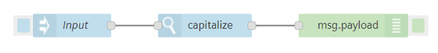
- Select the "Capitalize" node from the "custom nodes" section.
-
Connect an input node and input your string in the properties section. Connect the "Capitalize" node with a message payload as shown below:
-
Inject the timestamp.
Result
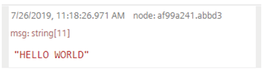
The output is displayed in the message payload:
Implement custom nodes - Example 2
Example scenario
A management team wants to read data from AWS S3.
Objective
To view the detailed event information including the actions and resources which the developers require.
Pre-requisites
Go to the website: Node-RED nodes for AWS.
Clone or download the repository and include all the files in the zip archive. Create a custom node "AWS" in the custom nodes page by browsing the zip archive.
Procedure
- Select the "AWS S3" node from the "AWS" section. Edit the node in the properties if required by setting its operation to "GetObject".
-
Connect the "S3 GetObject" node and attach the timestamp input and the message payload outputs as shown below:
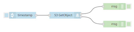
In this example, the node is configured in a way to pass correct data in one payload and throw error in the other if any. Hence, in the message payload, you get only one of the output results.
-
Inject the timestamp.
Result
The output will be visible in the message payload. As mentioned, the output would either be real data or an error.
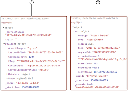
① Real time data
② Error data
Implement custom nodes - Remote backend functionality
Example scenario
Consider a new REST API example: TODO List. Click Todo List Rest API to view the complete list.
Objective
To get the TODO list from free REST API. This will display a list of users with their task list.
Pre-requisites
Create a custom node "todo" in the custom nodes page by browsing the zipped node file.
For your reference, the HTML code for "todo" is given below:
Code
    <script type="text/x-red" data-template-name="todo">
        <div class="form-row">
            <label for="node-input-todoId"><i class="fa fa-tag"></i> <span data-i18n="common.label.name">Todo ID</span></label>
            <input type="number" id="node-input-todoId" placeholder="Leave blank to get all entries">
        </div>
    </script>
    <script type="text/x-red" data-help-name="todo">
        <p>Gets todo list using the jsonplaceholder free API.</p>
    </script>
    <script type="text/javascript">
        RED.nodes.registerType('todo',{
            category: 'service nodes',
            color: '#C0DEED',
            icon: 'todo.png',
            defaults: {
                todoId: {value: '', required: false},
                requestParams: {
                    value: {
                        url: 'https://jsonplaceholder.typicode.com/todos'
                    }
                }
            }
            inputs: 1,
            outputs: 1,
            icon: 'c.png',
            label: function() {
                return 'todo';
            },
            paletteLabel: 'todo',
            oneditprepare: function() {
            },
            oneditsave: function() {
                this.requestParams.url = 'https://jsonplaceholder.typicode.com/todos/' + todoId;
            }
        });
    </script>
Note
HTML files follows the Node-RED format, except for request params which is shown in the above HTML code.
A sample package.json file is shown below:
    {
        "name": "todo",
        "version": "1.0.0",
        "description": "this is a node which shows some todo items",
        "main": "index.js"
    }
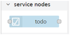
In this case, a custom node "todo" is created under the secton "service nodes" in the node palette of Visual Flow Creator.
Procedure
- Select the "todo" node from the "services nodes" section.
-
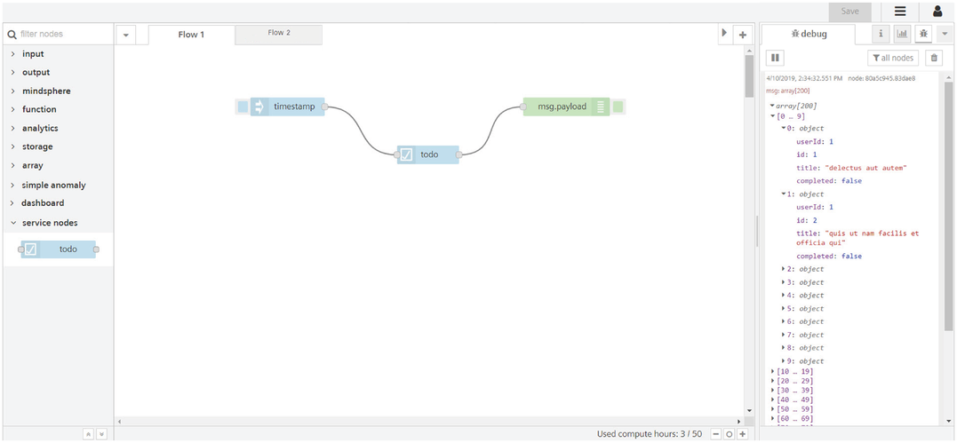
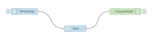
Connect the "todo" node and attach the timestamp input along with a message payload output. Edit the "todo" node in the properties if required. Refer to "Create custom nodes" section to view the HTML code.
-
Inject the timestamp.
Result
The output will be visible in the message payload: