"Dashboard" user interface
The "Dashboard" gives a quick overview of the usage and traffic of the applications, subscription details and the number of applications that are deployed on the Cloud Foundry (CF).
"Dashboard" screen
The following graphic shows the "Dashboard" of Operator Cockpit:

① Main navigation with five tab-categories:
- Dashboard
- Apps
- Services
- Inbox
- User Manual
- Settings
② Dashboard quick facts
③ Dashboard charts
Symbols
| Symbol | Description |
|---|---|
| View the Dashboard. | |
| View the status of the applications along with the application details. | |
| View the services provisioned by other operators. | |
| - Applications: View the list of applications assigned by the developer, along with the action list that enables you to accept the applications. - Messages: View the Notifications for the applications. - Archived: View the archived notifications. | |
| View the User Manual for Operator Cockpit. | |
| View the notification Settings window. |
Dashboard charts
The following graphic gives you a more detailed look at the dashboard charts of Operator Cockpit:
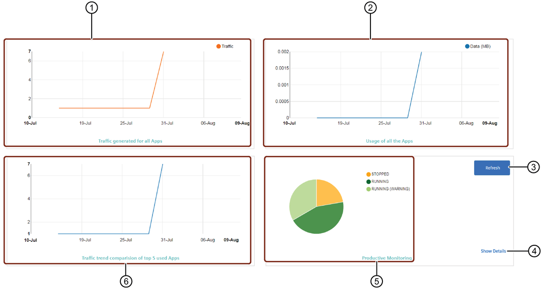
① App traffic diagram
② App usage diagram
③ Refreshes the pie chart
④ Opens the "My Applications" window
⑤ Productive monitoring pie chart
⑥ App traffic trend comparison diagram
Adjust Chart
You can adjust the pie chart by clicking on the productive status that is displayed next to the chart. This activates or deactivates the status and the pie chart changes accordingly.