Evaluate the Model training results
To view and evaluate the training results, follow these steps,
-
Model accuracy
Evaluate the model accuracy with selected metrics with Regression score(R2), Root Mean Square Error(RMSE) and Mean Absolute Error(MAE) for the training and testing data sets.
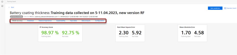
Upon completion of the training, the training results is available after a certain period of time. The status of the model changes to "Training Completed".
The model accuracy metrics is represented by the set of characteristics to quantify the quality of the model results aligned to the quality data for the training and testing data sets. The application uses 75% of the overall training data to train the model and remaining 25% to test the model accuracy.
The R2 accuracy score is a metric that quantifies the correlation between predicted and actual results. The values for the test dataset should be as high as possible, approaching 100% in the ideal case. The root mean square error and mean absolute error describing deviations of the predictions and true results should be as low as possible.
-
Prediction
Navigate to “Prediction” to review the training results.
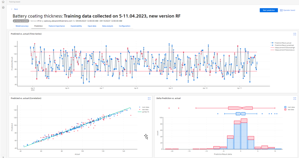
Review the comparison of prediction and true results for the training data set as Runtime chart, Scatter chart and Deviations histogram. The runtime chart displays predicted and actual quality results on a timeline. The correlation between prediction and actual results is visualized at the correlation chart, where each data point should be as close as possible to the green line representing a perfect fit.
The histogram on the chart displays statistical distribution of the deviations of predictions from the actual results. A well-trained model leads to acceptable level of prediction deviation and actual results without critical outliers.
If the accuracy metrics is not sufficient or the model generates too many outliers, Click “Edit" to adjust the model setting. Click "Save as new version" to save model, if the model accuracy and the visual results are acceptable.
Options "Save as new version" and "Edit" are available at the Training Board until the model is in the “Draft” mode.
-
Feature importance
Navigate to “Feature Importance” to review the impact of the selected process features on the quality result.
Review the analysis of the feature importance to define the process parameters having the major impact on the predicted quality result.

In the above shown image,
Importance chart displays the feature importance obtained by permutation of the input features.
Feature importance (SHAP-values) chart displays SHAP values for each input feature. The SHAP value reflects the how a single feature affects the prediction result. The process parameters with the highest importance and highest SHAP value have the most impact on the quality result. For more information refer evaluation of feature importance.
Feature effects (SHAP-values) chart displays the distribution of the SHAP values for each data point in the training data set. The color of the data point represents the feature value and the position on the axis refers to the positive or negative impact on the predicted result.
-
Explainability
Navigate to “Explainability” to analyze the impact of the input features on the prediction results.
In this section, the Parallel coordinate plot and the 3D Process chart are displayed and these graphs are interactive and enables the user to analyze the dependencies between the input features and the prediction results. This interactive evaluation of Parallel coordinate plot and the 3D Process chart allows the user to find the machine settings to achieve the optimal quality results and are explained below.

Parallel coordinate plot displays the actual quality parameter values alongside model-generated predictions for the training dataset. It features two right-side axes for this purpose. On the left, the values of the top five input features with the highest importance are displayed. Line color represents quality parameter value (yellow for high, blue for low). The chart allows for immediate assessment of prediction accuracy, horizontal line segments indicate close alignment between predictions and true results, while disparities reveal inaccuracies. It also helps to identify input feature ranges associated with highest and lowest quality parameter values.
3D Process chart displays the training dataset points along three axes, representing the top three important input features. Data point color indicates quality result values. Interactive features like zoom and rotation aid navigation helps the users to focus on specific points of interest and identify locations of highest or lowest values.
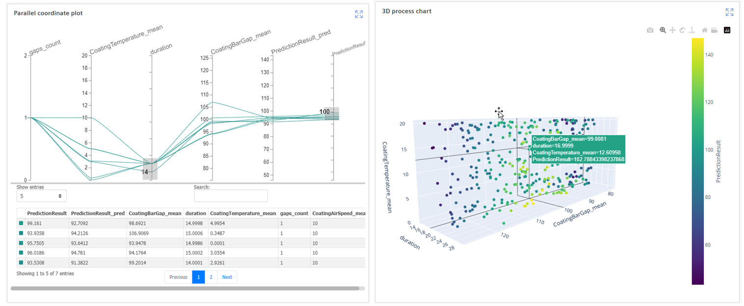
The interactive features of the parallel coordinate plot allow users to select datasets with quality parameters in a defined range. By choosing a range on the right axis(representing the target value), users can explore machine settings and input parameters required to achieve the target quality in a specified tolerance. This helps to identify the optimal machine configurations for manufacturing products with quality results at high, low or midpoint tolerance levels. Similarly, selecting a range on the process feature axes enables users to visualize corresponding quality results achievable with the specific machine settings.
-
Input Data
Navigate to “Input Data” to review the graphs of the process features and the quality results.
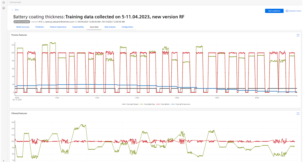
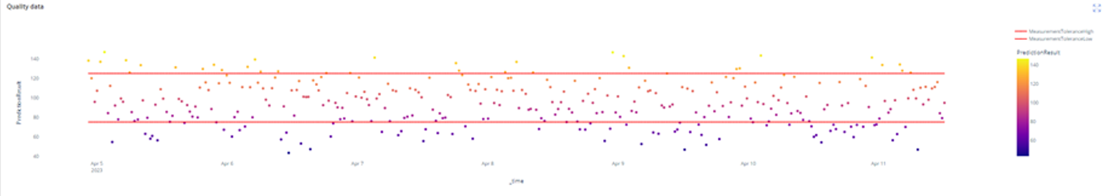
Proceed with analysis of the process parameters and quality results used for the model training as timeseries charts. The charts visualize the process and quality data used to train the model. The charts are interactive, magnifiable and navigate to functionalities to analyze the data points.
-
Data Analysis
Navigate to “Data Analysis” to analyze the distributions and correlation between the process features and quality result.
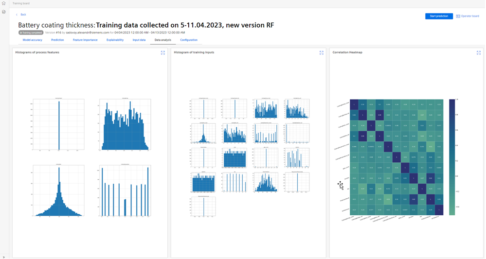
Review the distribution Histograms of the process features, Training inputs (represented by aggregated and additional features) and correlation heatmap showing the Correlation factor for the pair of parameters.
In case of any substantial outliers or unexpected parameter distribution are detected in the distribution charts, it is suggested to edit the model draft or to create new version to remove outliers by corresponding setting in the model setup.
-
Configuration
Navigate to "Configuration” to view the configuration parameters of the ML model.
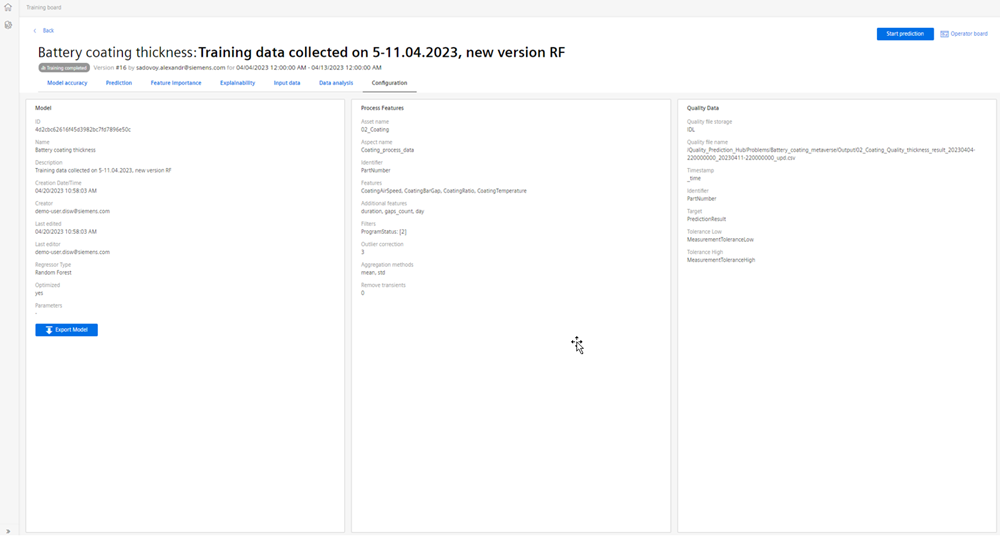
The whole set of the model parameters can be downloaded as a file with the export function.