Quality
The Quality page shows a detailed overview of the machine quality, its most relevant KPIs and the reject reasons if they are further specified.
Quality Visualizations
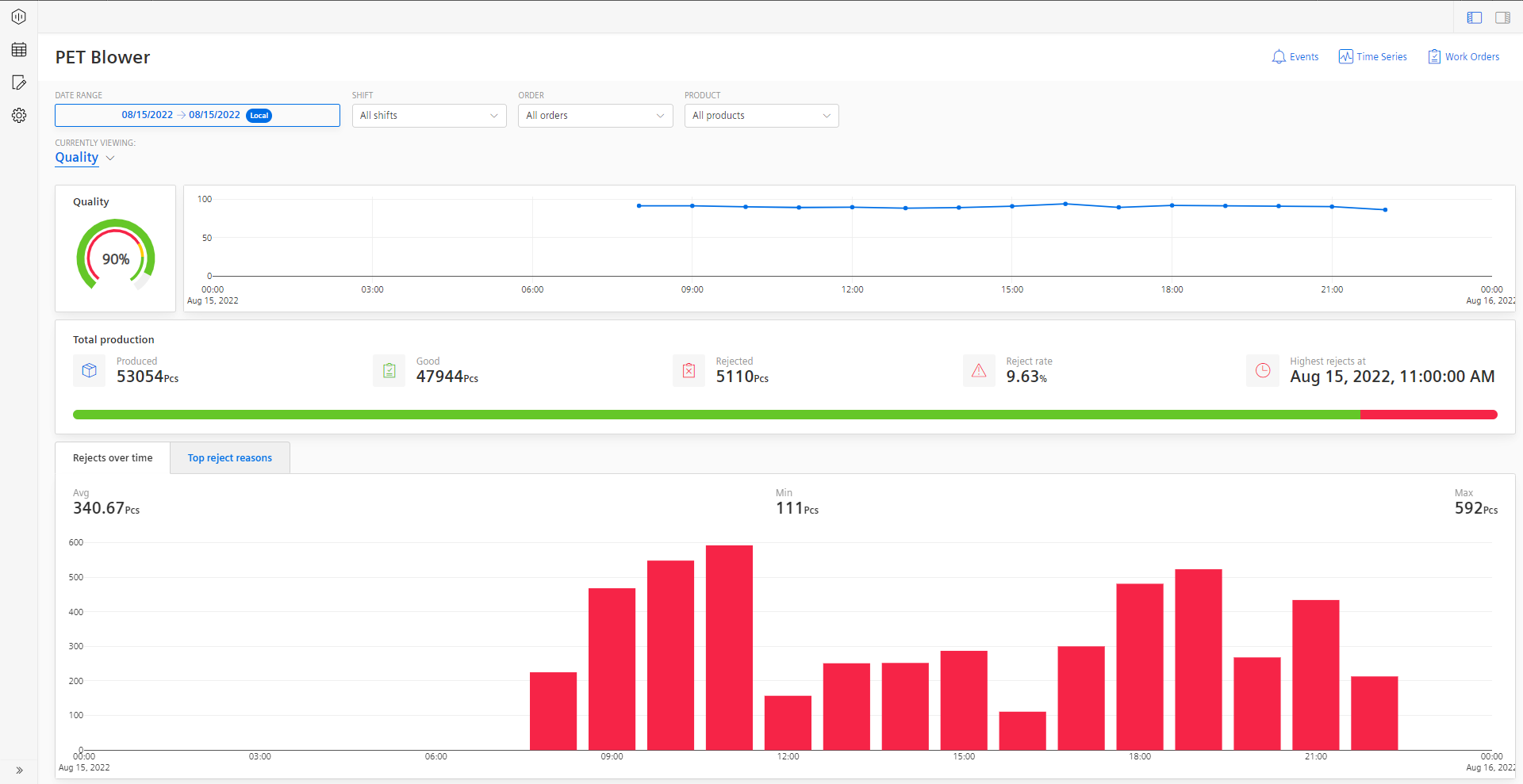
A semi-donut chart shows the Machine quality. The KPI is calculated based on the machine inputs. Depending on the configured limits for Error, Warning, and Success they are colored in Red, Yellow, and Green respectively.
A line-plot chart shows machine quality calculated based on the percentage of progress over time.

For other functionalities to explore the chart further, see section Visualization pane.
The Total production table shows the total quantity of products produced, the number of good and rejected parts, the percentage of rejections, when the highest amount of rejects occured in the specified time frame.

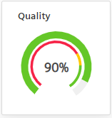
The bottom of the page covers the topic on rejects and reject reasons. Therefore, two views are implemented in this section. If you have not assigned a reject reason collection click on the "Top Reject Reason" tab, you will see an error message asking you to assign a collection. 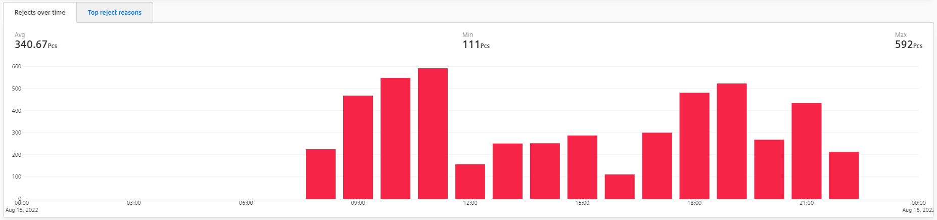
The "Rejects over time" chart shows the quantity of rejected products over time.  The "Top Reject Reasons" chart displays the top reject reasons of the asset, if further specified by the user via the manual inputs. Of course, filters can also be applied to both views.