Performance
The Performance page shows a detailed overview of the machine performance and its most relevant KPIs.
In this section, the following parameters are displayed:
-
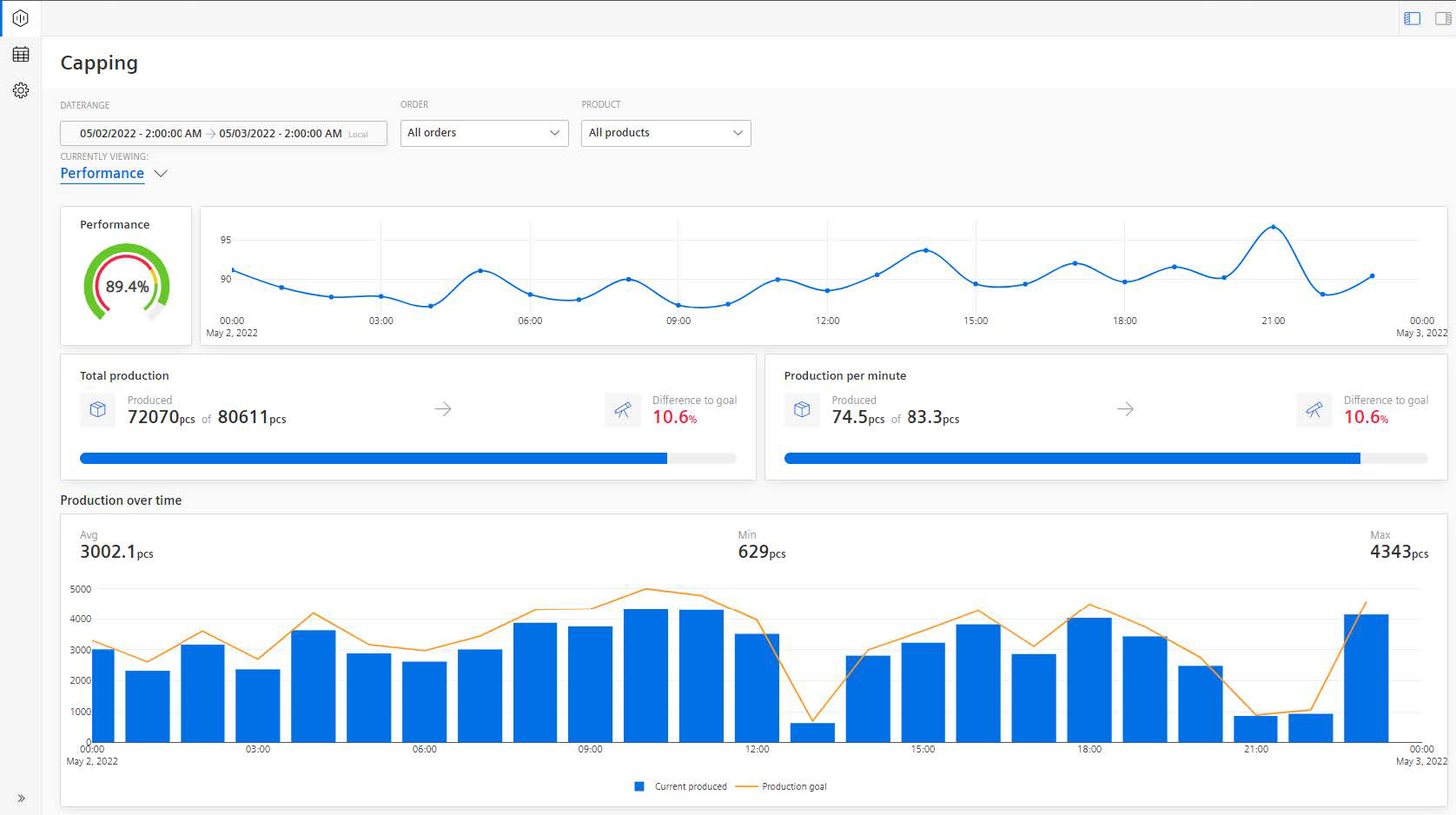
A semi-donut chart that shows the Machine performance. The KPI is calculated based on the machine inputs. Depending on the configured limits for Error, Warning, and Success they are colored in Red, Yellow, and Green respectively.
-
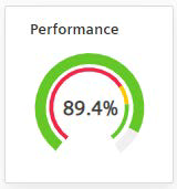
A line-plot chart shows Machine performance calculated based on the percentage of progress over time.
-
The Total Production and Production per minute KPIs show the quantitative analysis of machine performance and the difference in percentage to achieve the set target (goal). The target in this case is always the theoretically possible output. Here, the measured output and the theoretical output are displayed (Measured Output of Theoretical Output). In one chart the application displays total numbers for the selected time range and on the other chart, it is broken down into minute-by-minute intervals.

-
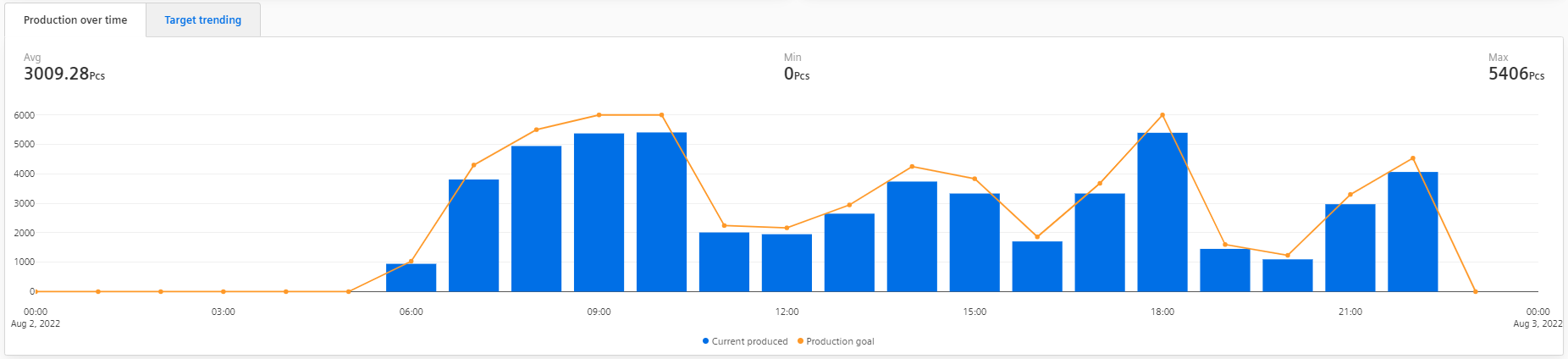
Production over time: This quantitative analysis chart is plotted between the products currently being produced versus the production goal. It shows how the production evolved over time, at which time there were the biggest losses, or where the production was able to catch up again.
For other functionalities to explore the chart further, see section Visualization pane.