Downtime analysis
The Downtime Analysis page is split into two main capabilities. In the top there are the Top 10 downtime reasons displayed in a list view and combined with a typical pareto chart. On the bottom the application has a drilldown capability included, which allows you to analyze your downtimes navigating through the different levels of your reason tree starting at the time categories and ending at the last leave of the tree. Both panels can either be viewed by duration or occurrence.
Top Ten Downtime Reasons
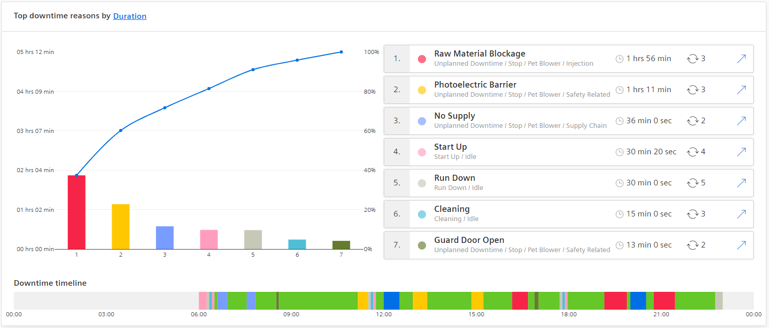
In the top section of the page the application shows the top 10 downtime reasons for the applied filter combination. On the left-hand side of the top section, you can see a typical representation of the downtime reasons in a pareto chart. Starting from the left in the chart you can see the most critical downtime reason and then going more to the right on the x-axis you can see them in a decreasing order. The left y-axis of the chart shows the time in hours. On the right y-axis you can see the percentage going from zero to 100%. Next to the chart, the application displays the list of top 10 downtime reasons that occurred for the selected filter combination. The columns of the chart can be identified either by the color code or by the number below it. Below the chart and table you can also see the typical machine status chart, this time colored with the colors of the top 10 downtime reasons. You can quickly spot by the colors when the downtimes occurred in the selected time period. A hover over the different elements of the chart, shows the downtime reason and the start and end time.
Reason Tree Drilldown
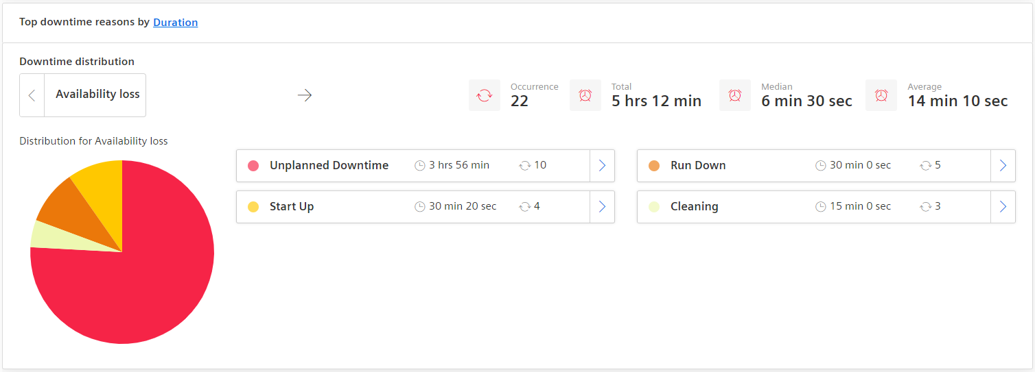
In the bottom section of the page, the application shows a drilldown for the underlying reason tree. This capability allows you to move through the different levels of the reason tree and shows the statistics of the selected level. The drilldown starts on the time categories of the type “Availability Loss” from which you then can move through the state and the different reason layers. To navigate through the different layers there are two options:
-
Navigate one level up: In the top left corner of the section, you can find the current selected level. If there is a left arrow next to reason, that means that you can navigate one level up. If there is no arrow, this means you reached the top level the Availability Loss categories again.
-
Navigate one level down: In the center of the section, you can find the underlying reasons of the selected reason. If there are further sub-levels of the displayed reasons, then a right arrow on the right of the item will show up. By clicking on the arrow, you can navigate one level deeper. If there is no arrow displayed, this means you reached the lowest level of this reason already. In general, the drilldown shows the following information. In top row of the section, you can see the selected reason on the left and information related to that reason, how many downtimes occurred in the selected reason layer, how long was the total downtime, the average downtime and median downtime. In the mid-section of the drilldown, you can see the distribution of the underlying reasons of the selected reason. On the left side, the reason distribution is displayed in a pie chart and on the right side you can see an overview of the different reasons and how much time they contributed to the overall downtime of the selected reason.