Availability
The Availability page provides a detailed overview of the machine availability and its most relevant KPIs.
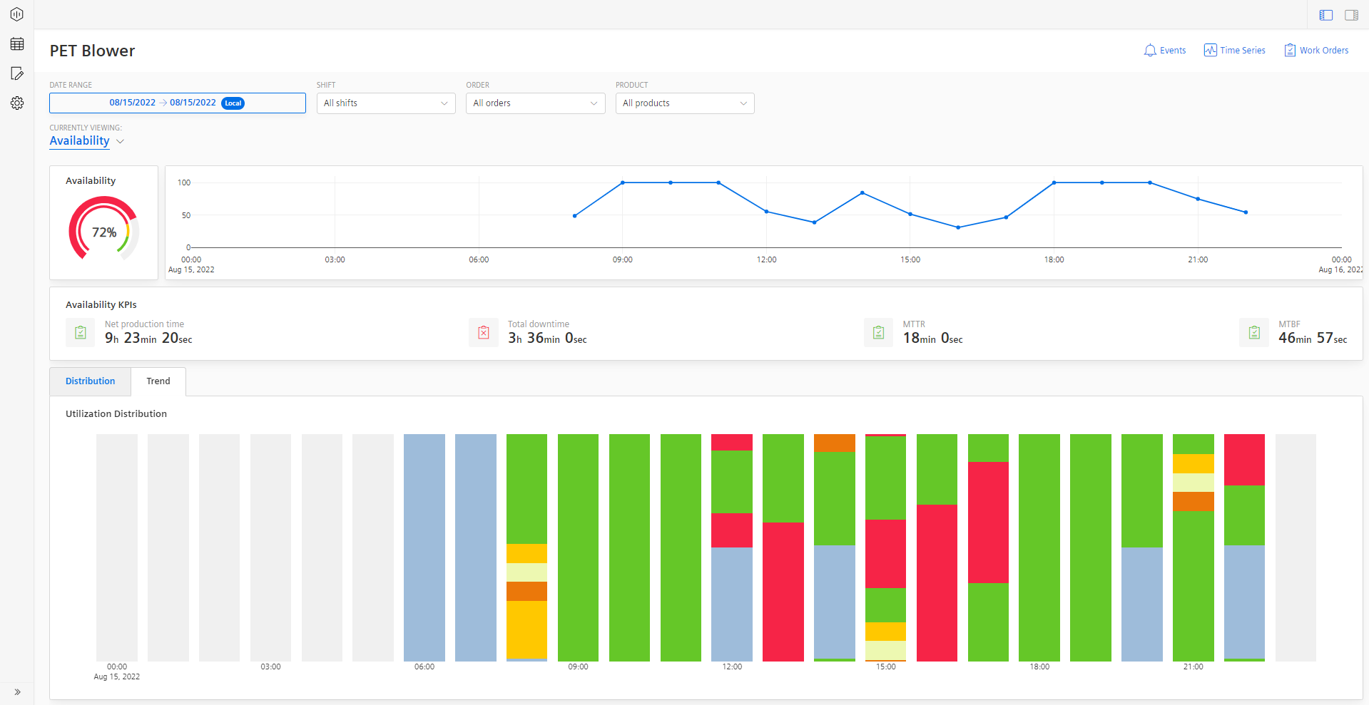
Availability Visualizations
A semi-donut chart shows the Machine availability. These KPIs are calculated based on the machine inputs. Depending on the configured limits for Error, Warning, and Success they are colored in Red, Yellow, and Green respectively.
A line-plot chart shows machine Availability that is calculated based on the percentage of progress over time.

For other functionalities to explore the chart further, see section Visualization pane.
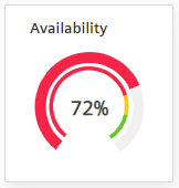
Availability KPIs: The Availability KPI table shows KPIs such as Net Production Time, Total downtime, Mean-Time-To-Repair (MTTR), and Mean-Time-Between-Failure (MTBF).

Distribution & Trend: At the bottom section of the page, there are two tabs available, one for the status distribution and one for the trend. The distribution shows how the time is distributed across the different time categories that you configured. The view can be also be altered to show the distribution by occurrence. Of course, you can also navigate through the different layers by clicking on the arrows in the visualization. This allows you either to go one level deeper in the reason tree or one level up, when you click on the arrow in the upper left corner of the chart.
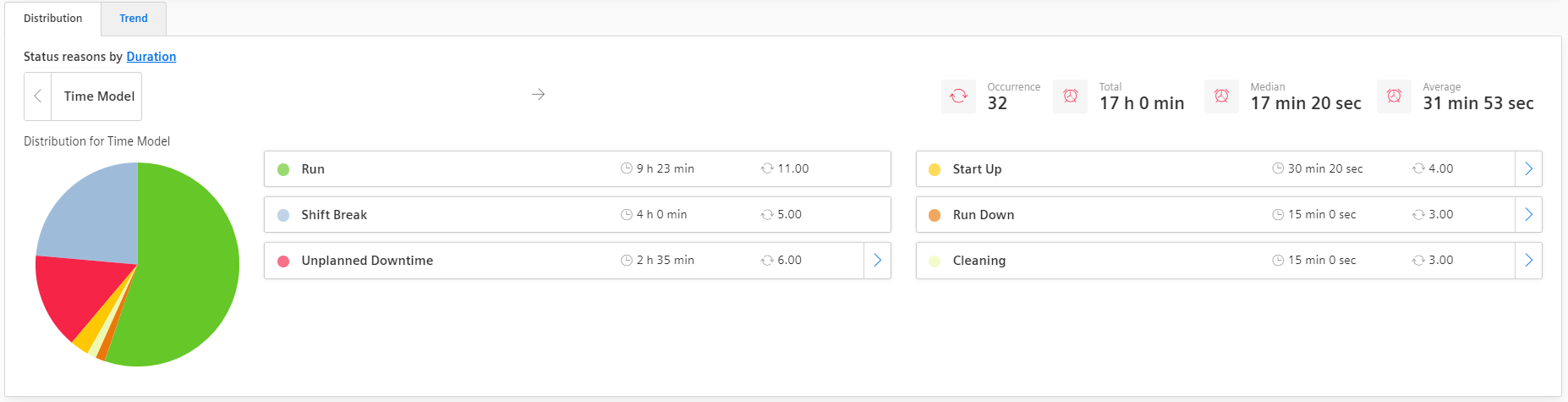
The trend shows the utilization distribution of the selected asset over time. This chart visualizes the same information as the machine status chart on the overview page but allows it more space for details. Similar to the machine status charts, different time categories over time are displayed here. Similar to the machine status chart, the color-coding depends on the configured colors of the time categories.
Behavior of trend and distribution
The distribution and trend also feature some special behavior. The trend is not available when the status is entered manually. Then only a distribution is shown. When the status changes too frequently in a given time range, that it can not be displayed properly in the charts anymore, then the page will first only show the distribution. In case, you also want to see the trend of the machine states then you can still load that manually. The main reason for this is to improve performance especially when longer time ranges are selected by the user.