Analysis Overview
The overview page provides a comprehensive overview of the line and machine KPIs and status.
In this section, the following parameters are displayed:
-
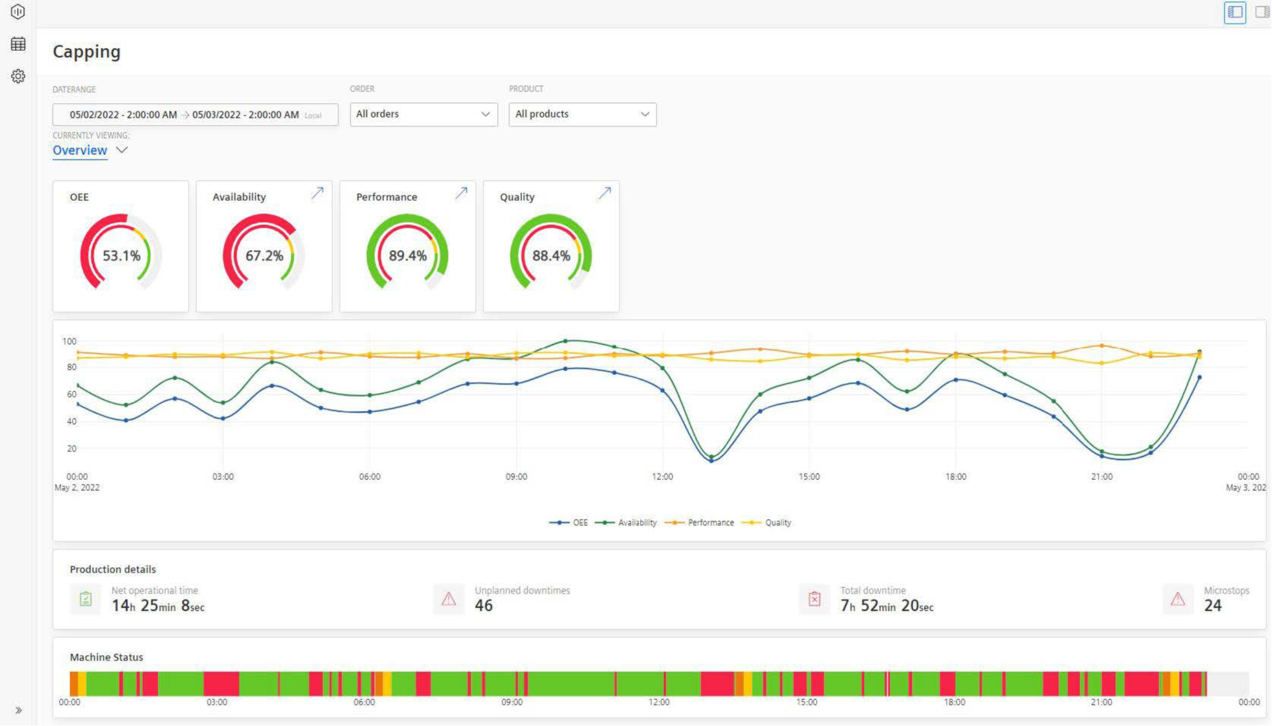
Four semi-donut charts show the parameters such as OEE, Availability, Performance, and Quality. These KPIs are calculated based on the machine inputs. Depending on the configured limits for Error, Warning, and Success they are colored in Red, Yellow, and Green respectively.
The arrows
 provided on the top-right corner of the Availability, Performance and Quality cards allow the user to navigate directly to the respective sub-pages.
 -
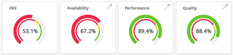
A line-plot chart shows the parameters OEE, Availability, Performance, and Quality calculated based on the percentage of progress over time.
Here, the lines are connected by points that represent the percentage of a parameter at a given time.
To improve visibility, it is possible to hide a particular line or multiple lines by clicking the label at the bottom.
-
Production details: A table shows the Net operational Time, number of Unplanned downtimes, Total downtime, and number of Microstops based on the filter configuration. A microstop is defined as a stop that is shorter than 5 minutes.

-
Machine Status: A timeline chart that shows the chronological order of the series of events that occurred on a time scale. The color-coding of the chart depends on the machine or line status and always shows the configured time categories. For a more detailed analysis on downtimes, see the Downtime Analysis page.

For other functionalities to explore the chart further, see section Visualization pane.