Designing Widgets (Visualizations)
Widget Settings
Visualization settings allow you to specify the visual characteristics for a widget, from its title and visual appearance, to the chart properties and axis titles. All visualization settings are optional.
The dashboard visualization settings allow users to:
- Read data from various sources and write the data into dashboards where it can be refined, filtered and configured for use
- Drag and drop data source variables and widgets to dashboards
- Specify ranges, filters, and units of measure
- Shrink a widget to one block, or enlarge to a full page
Widget Parameters
Line Chart Widget Design Options
The following fields are completed in an earlier step, when you add a data source to the line chart widget:
- Title: title to appear in the widget (required)
- Subtitle: subtitle to appear below the title (optional)
- Description: free-form field to describe widget content, purpose, etc. (optional)
Customizing Your Widget (optional)
You can accept the Dashboards defaults for the fields below or configure them as much as you want:
General
- Chart Type: display the chart data as lines, vertical bars, horizontal bars, or area
- Stacked: stack data results in one line
- Split Y-Axis: display two attributes on the Y axis
- Show Legend: display a list of descriptors for each bar/line/area/sector of a chart
- Legend Position: position the legend on top, bottom, left, or right of chart
- Font Size: font size of widget and axis titles
Vertical Axis
- Title: title to display on the Y-Axis
- Show Grid Lines: display vertical grid lines in the widget chart
Horizontal Axis
- Title: title to display on the X-Axis
- Show Grid Lines: display horizontal grid lines in the widget chart
Widget Appearance
- Hide Header: hide the widget title and subtitle
- Align Title: position the title to the left, right, or center.
- Title Color: select a color, or enter RGB color values
- Show Border: render a border around the widget
- Show Maximize: display a full-screen icon in the widget
Bar Chart Widget Design Options
The following fields are completed in an earlier step, when you add a data source to the bar chart widget:
- Title: title to appear in the widget (required)
- Subtitle: subtitle to appear below the title (optional)
- Description: free-form field to describe widget content, purpose, etc. (optional)
Customizing Your Widget (optional)
You can accept the Dashboards defaults for the fields below or configure them as much as you want:
General
- Chart Type: display the chart data as lines, vertical bars, horizontal bars, or area
- Stacked: stack data results in one line
- Split Y-Axis: display two attributes on the Y axis
- Show Legend: display a list of descriptors for each bar/line/area/sector of a chart
- Legend Position: position the legend on top, bottom, left, or right of chart
- Font Size: font size of widget and axis titles
Vertical Axis
- Title: title to display on the Y-Axis
- Show Grid Lines: display vertical grid lines in the widget chart
Horizontal Axis
- Title: title to display on the X-Axis
- Show Grid Lines: display horizontal grid lines in the widget chart
Widget Appearance
- Hide Header: hide the widget title and subtitle
- Align Title: position the title to the left, right, or center.
- Title Color: select a color, or enter RGB color values
- Show Border: render a border around the widget
- Show Maximize: display a full-screen icon in the widget
Area Chart Widget Design Options
The following fields are completed in an earlier step, when you add a data source to the area chart widget:
- Title: title to appear in the widget (required)
- Subtitle: subtitle to appear below the title (optional)
- Description: free-form field to describe widget content, purpose, etc. (optional)
Customizing Your Widget (optional)
You can accept the Dashboards defaults for the fields below or configure them as much as you want:
General
- Chart Type: display the chart data as lines, vertical bars, horizontal bars, or area
- Stacked: stack data results in one line
- Split Y-Axis: display two attributes on the Y axis
- Show Legend: display a list of descriptors for each bar/line/area/sector of a chart
- Legend Position: position the legend on top, bottom, left, or right of chart
- Font Size: font size of widget and axis titles
Vertical Axis
- Title: title to display on the Y-Axis
- Show Grid Lines: display vertical grid lines in the widget chart
Horizontal Axis
- Title: title to display on the X-Axis
- Show Grid Lines: display horizontal grid lines in the widget chart
Widget Appearance
- Hide Header: hide the widget title and subtitle
- Align Title: position the title to the left, right, or center.
- Title Color: select a color, or enter RGB color values
- Show Border: render a border around the widget
- Show Maximize: display a full-screen icon in the widget
Pie Chart Widget Design Options
The following fields are completed in an earlier step, when you add a data source to the pie chart widget:
- Title: title to appear in the widget (required)
- Subtitle: subtitle to appear below the title (optional)
- Description: free-form field to describe widget content, purpose, etc. (optional)
Customizing Your Widget (optional)
You can accept the Dashboards defaults for the fields below or configure them as much as you want:
- Title: title to appear in the widget
- Subtitle: optional subtitle to appear below the title
- Description: free-form field to describe widget content, purpose, etc.
General
- Chart Type: display the chart data as a pie or donut
- Hide Labels: display or hide labels
- Show Legend: display a list of descriptors for each bar/line/area/sector of a chart
- Legend Position: position the legend on top, bottom, left, or right of chart
- Font Size: font size of widget and axis titles
Widget Appearance
- Hide Header: hide the widget title and subtitle
- Align Title: position the title to the left, right, or center.
- Title Color: select a color, or enter RGB color values
- Show Border: render a border around the widget
- Show Maximize: display a full-screen icon in the widget
Pareto Chart Widget Design Options
The Pareto widget is different from other chart widgets in that it displays two different visual representation of data:
- Bars: vertical bars display causes on the x-axis, and count of occurrences on the left y-axis, in descending order.
- Line: tracks cumulative percentages of causes on the right y-axis, in ascending order toward 100 percent.
The modes are displayed at the top of the widget so you can toggle between views:
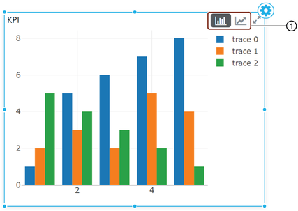
① Switch between Bar and Pareto chart views
The following fields are completed in an earlier step, when you add a data source to the bar chart widget:
- Title: title to appear in the widget (required)
- Subtitle: subtitle to appear below the title (optional)
- Description: free-form field to describe widget content, purpose, etc. (optional)
Customizing Your Widget (optional)
You can accept the Dashboards defaults for the fields below or configure them as much as you want:
General
- Stacked: stack data results in one line
- Show Legend: display a list of descriptors for each bar/line/area/sector of a chart
- Legend Position: position the legend on top, bottom, left, or right of chart
- Font Size: font size of widget and axis titles
Vertical Axis
- Title: title to display on the Y-Axis
- Show Grid Lines: display vertical grid lines in the widget chart
Horizontal Axis
- Title: title to display on the X-Axis
- Show Grid Lines: display horizontal grid lines in the widget chart
Widget Appearance
- Hide Header: hide the widget title and subtitle
- Align Title: position the title to the left, right, or center.
- Title Color: select a color, or enter RGB color values
- Show Border: render a border around the widget
- Show Maximize: display a full-screen icon in the widget
KPI Analysis Widget Design Options
This widget allows you to store, run, and share a KPI analysis on a Insights Hub Monitor dashboard. Like the Pareto chart widget, the KPI analysis widget also allows switching between bar and Pareto chart views.
The following fields are completed in an earlier step, when you add a data source to the KPI analysis chart widget:
- Title: title to appear in the widget (required)
- Subtitle: subtitle to appear below the title (optional)
- Description: free-form field to describe widget content, purpose, etc. (option)
Customizing Your Widget (optional)
You can accept the Monitor Dashboards defaults for the fields below or configure them as much as you want:
General
- Chart Type: display the chart data as lines, vertical bars, horizontal bars, or area
- Stacked: stack data results in one line
- Split Y-Axis: display two attributes on the Y axis
- Show Legend: display a list of descriptors for each bar/line/area/sector of a chart
- Legend Position: position the legend on top, bottom, left, or right of chart
- Font Size: font size of widget and axis titles
Vertical Axis
- Title: title to display on the Y-Axis
- Show Grid Lines: display vertical grid lines in the widget chart
Horizontal Axis
- Title: title to display on the X-Axis
- Show Grid Lines: display horizontal grid lines in the widget chart
Widget Appearance
- Hide Header: hide the widget title and subtitle
- Align Title: position the title to the left, right, or center
- Title Color: select a color, or enter RGB color values
- Show Border: render a border around the widget
- Show Maximize: display a full-screen icon in the widget
IoT Chart Widget Design Options
The following fields are completed in an earlier step, when you add a data source to the IoT chart widget:
- Title: title to appear in the widget (required)
- Subtitle: subtitle to appear below the title (optional)
- Description: free-form field to describe widget content, purpose, etc. (optional)
Customizing Your Widget (optional)
You can accept the Monitor Dashboards defaults for the fields below or configure them as much as you want:
IoT Settings
- Data Source: select the data source from the drop-down list
- Local: select Date and Time, absolute time, a quick range, and time zone
Widget Appearance
- Hide Header: hide the widget title and subtitle
- Align Title: position the title to the left, right, or center.
- Title Color: select a color, or enter RGB color values
- Show Border: render a border around the widget
- Show Maximize: display a full-screen icon in the widget
IoT Map Widget Design Options
The following fields are completed in an earlier step, when you add a data source to the IoT map widget:
- Title: title to appear in the widget (required)
- Subtitle: subtitle to appear below the title (optional)
- Description: free-form field to describe widget content, purpose, etc. (optional)
Customizing Your Widget (optional)
You can accept the Monitor Dashboards defaults for the fields below or configure them as much as you want:
IoT Map Widget Settings
You can configure the following settings for a map widget:
- Title: enter a title to appear in the upper left corner of the widget
- Subtitle: appears below the title
- Description: free-form field that describes widget content, purpose, etc.
- IoT Map: select a data source from the drop-down list
Widget Appearance
- Hide Header: hide the widget title and subtitle
- Align Title: position the title to the left, right, or center
- Title Color: select a color, or enter RGB color values
- Show Border: render a border around the widget
- Show Maximize: display a full-screen icon in the widget
Grid Widget Design Options
The following fields are completed in an earlier step, when you add a data source to the grid widget:
- Title: title to appear in the widget (required)
- Subtitle: subtitle to appear below the title (optional)
- Description: free-form field to describe widget content, purpose, etc. (optional)
Customizing Your Widget (optional)
You can accept the Monitor Dashboards defaults for the fields below or configure them as much as you want:
- Title: title to appear in the widget
- Subtitle: optional subtitle to appear below the title
- Description: free-form field to describe widget content, purpose, etc.
General
- Font: select a font size for title, subtitle, and axis labels
Widget Appearance
- Hide Header: hide the widget title and subtitle
- Align Title: position the title to the left, right, or center.
- Title Color: select a color, or enter RGB color values
- Show Border: render a border around the widget
- Show Maximize: display a full-screen icon in the widget
Indicator Widget Design Options
The following fields are completed in an earlier step, when you add a data source to the indicator widget:
- Title: title to appear in the widget (required)
- Subtitle: subtitle to appear below the title (optional)
- Description: free-form field to describe widget content, purpose, etc. (optional)
Customizing Your Widget (optional)
You can accept the Monitor Dashboards defaults for the fields below or configure them as much as you want:
General
- Background Color: display a user-selected color in the background
- Symbol: display the $, #, or % symbol
- Delta: display differential
Map Widget Design Options
The following fields are completed in an earlier step, when you add a data source to the map widget:
- Title: title to appear in the widget (required)
- Subtitle: subtitle to appear below the title (optional)
- Description: free-form field to describe widget content, purpose, etc. (optional)
Customizing Your Widget (optional)
You can accept the Monitor Dashboards defaults for the fields below or configure them as much as you want:
- Title: title to appear in the widget
- Subtitle: optional subtitle to appear below the title
- Description: free-form field to describe widget content, purpose, etc.
Widget Appearance
- Hide Header: hide the widget title and subtitle
- Align Title: position the title to the left, right, or center
- Title Color: select a color, or enter RGB color values
- Show Border: render a border around the widget
- Show Maximize: display a full-screen icon in the widget
Image Widget Design Options
The following fields are completed in an earlier step, when you add a data source to the image widget:
- Title: title to appear in the widget (required)
- Subtitle: subtitle to appear below the title (optional)
- Description: free-form field to describe widget content, purpose, etc. (optional)
Customizing Your Widget (optional)
You can accept the Monitor Dashboards defaults for the fields below or configure them as much as you want:
- Image Stretch: display the image in its original dimensions, or scale, fill, or crop the image
- Image Source: select a local source or URL for the image you want to use
- Image URL: the internet address for an image
How to Add an Image Widget
Follow these steps to add an image widget to your dashboard:
- Drag the widget and drop it onto the dashboard.
- Click the widget to select it. Borders, drag handles, and the configuration icon display in the widget.
- Click the Configuration
 icon. The Design a Widget tab opens.
 - Enter the widget name in the "Title" field, and optional "subtitle", and optional "description".
- Select or enter values for the fields in the Visualization settings. The system automatically saves your entries and selections.
Text Widget Design Options
You can enter any text you want in the body of a text widget and you can customize the text with standard text formatting features as well as hyperlinks.
The following fields are completed in an earlier step, when you add a data source to the bar chart widget:
- Title: title to appear in the widget (required)
- Subtitle: subtitle to appear below the title (optional)
- Description: free-form field to describe widget content, purpose, etc. (optional)
Customizing Your Widget (optional)
You can accept the OI Dashboards defaults for the fields below or configure them as much as you want:
Widget Appearance
- Font: apply a Heading 1,2,3,4,5, or 6 or Normal
- Text Formatting: apply bold, italic, underline, reverse (black against white), colored background, or colored type
- Paragraph Formatting: apply formatting such as numbered list, bullet list, alignment (right, left, center, justified), and hyperlink