Configuring Data Sources
Configuring Data Sources Overview
Insights Hub Monitor dashboards are capable of reading very large files from a variety of sources. There are many strategies employed in large data repositories like data lakes and the cloud, that allow you to focus on portions of data both before reading the data source and after the data is written to your dashboard.
Data source configuration in dashboards begins after reading the data from the source and writing it to your dashboard. Once the data source is added to your dashboard, its name appears as a hyperlink in the "Data Sources You Selected" section on the Data Source Configuration tab:
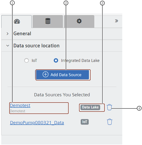
① Data Source names are hyperlinked. Click a name to open the View/Edit Data source page.
② Add Data Source
③ Badge indicate the origin of the Data Source.
④ Delete
About Configuring Data Sources
Here are some helpful points to be aware of when configuring data sources:
- Widget Library: often the widget library is hidden by the configuration tabs; if you don't see it, click the double chevron.
- Data Sources: configuration options depend on the data source and widget involved, so each configuration is unique. OI Dashboards comes with default visualization settings that you can accept, or you can tap into the myriad options for customizing widget data and appearance.
- Select All: where lists of objects appear, often there are check boxes near the top that allow you to 'select all' or 'select none'; this comes in handy when you want to include almost all, or exclude almost all attributes, filters, etc.
- Toggle: used in many data source pop-up windows, toggles appear gray when inactive:
 ; and turn blue when you side the dot to the right:
View Data Source Page Example
This example of the Data Source View/Edit page is annotated with explanations about various features:
Jump to step-by-step instructions on How to Configure an IDL Data Source.
Jump to step-by-step instructions on How to Configure an IoT Data Source.
Configuring an IDL Data Source
This topic explains how to configure an IDL data Source for use in dashboard widgets. We highly recommend that you read the Adding Data Sources to a Dashboard Overview topic, if you haven't already done so.
About Adding IDL Data Sources to a Dashboard
Here are some important points to be aware of when adding IDL data sources:
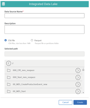
- Data Lake stores both CSV (a row-based storage format) data and Parquet (a columnar storage format) data.
- Files that reside in the IDL "root" folder cannot be used as a data source.
- To view the data source schema, select the folder that holds the data source file and click the filename.
- After adding the data source, you can edit the fields and labels, change data types, and apply other filters, as described below.
- You can add a data source and come back later to configure it or add it to a widget, the dashboard automatically saves it.
Note
When adding a CSV data source make sure to not use spaces or hyphens in the column names or filenames. Also, if the data source has a Date field formatted as, "yyyy-mm-dd", do not convert it to a timestamp data type, as this will cause your KPI to fail.
Configuring an IDL Data Source Chart Widget
While the configuration steps are similar, there are some differences between IoT and IDL Data Sources; this section applies to IDL data sources alone.
Prepare Data Sources and Chart Widgets
Before configuring a data source, if you have not done so already, you must add two items to the dashboard:
- The data source you want to use
- A chart widget or widgets for visualizing the data source
IDL Data Source Selection Pop-up Window Illustration
Here is an illustration of the Integrated Data Lake pop-up window where you select the folder that contains the data source file you want to use:
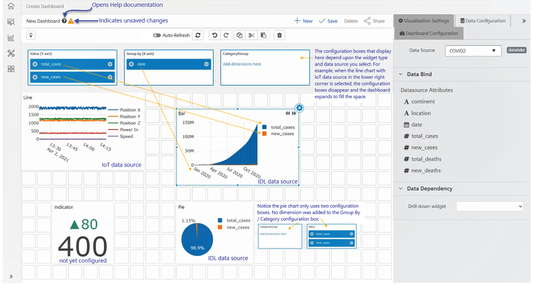
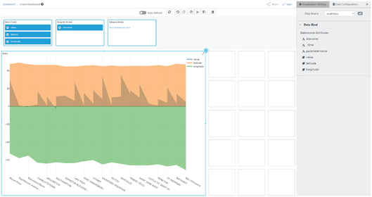
Example of the Data Source Configuration Page for an IDL Data Source
Here is an example of a dashboard with the Configure a Data Source tab open with the Data Source fields displayed beneath "Data Source Attributes":
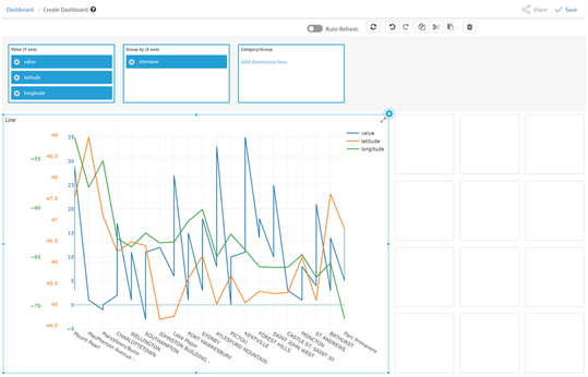
How to Configure an IDL Data Source for a Chart Widget
When you select an IDL data source, depending on the widget type, some configuration boxes may display above the center of the dashboard, allowing you to drag and drop attributes (dimensions) from the Configure a Data Source tab to the boxes. This is especially true for line, bar, and area chart widgets. The image above points out that for a pie chart, for example, the number of configuration boxes is different from line or bar charts above it, and will be labeled differently, as well.
Follow these steps to configure an IDL data source:
- Select the "Widget" you want to add the data source to.
- Click the "Configure
 " icon in the upper-right corner. The Configure a Data Source tab opens and present a drop-down list of data sources you have added to the dashboard.
 - Select the data source you want to use from the "Data Source" drop-down list. The data source attributes display in the Configure a Data Source tab.
- Select the "attributes" you want to use in the widget. A Select "All" check box may display at the top of the Data Source Attributes list; click to select All if you want to use all the attributes in your widget; or select "None" so you can individually select attributes by sliding the gray toggle button to the right. The toggle turns blue, the top of the Data Source Attributes list displays the number of attributes you selected.
- Drag attributes from the Configure a Data Source tab to the "Y-Axis", "X-Axis", and "Group By/Category" configuration boxes at the top of the dashboard space. The widget displays the data according to your selections.
- If you want to "edit" data source attributes, follow this link to the section, Editing Data Sources.
Configuring a IoT Data Source
This topic covers important information about using time series data, how to prepare the data and widget, and how to configure the data source.
About Adding IoT Time Series Data Sources to Dashboards
Here are some important points to be aware of when adding IoT time series data sources to dashboards:
- Use the Search box to quickly find an asset.
- You can add only one asset at a time, but can add an unlimited number of aspects of an asset.
- The aspect list (on the right) populates only after you select an asset (on the left).
- Select the top, or left-most check boxes to select all fields in the aspect list.
- The far right column identifies the data type (string, date, numeric, timestamp, double) of each aspect.
- After adding the data source, you can edit the fields and labels, change data types, and apply other filters.
- If you add a data source and don't want to configure it or add it to a widget, it is automatically saved with the dashboard.
Prepare Data Sources and Chart Widgets
Before configuring a data source, if you have not done so already, add to the dashboard:
- The data source you want to use
- A chart widget or widgets for visualizing the data source
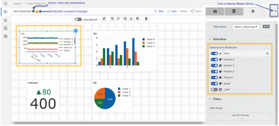
Example of the Data Source Configuration Tab for an IoT Data Source
Here is an example of a dashboard with the Data Source configuration tab open and the IoT Data Source Attributes displayed in the Configure a Data Source tab:
How to Configure an IoT Data Source for a Chart Widget
With an IoT data source, as soon as you select the data source from the drop-down list, the widget populates with the data source fields. You can then expand the widget to see all the attributes and you can also toggle off data source fields you don't want to track in the widget.
Follow these steps to configure an IoT data source:
- Select the "Widget" you want to add the data source to.
- Click the "Configure" icon in the upper-right corner. The Configure a Data Source tab opens and present a drop-down list of data sources you have added to the dashboard.
- Select the data source you want to use from the "Data Source" drop-down list. The data source fields display in the Configure a Data Source tab and also populate the chart.
- Select "All" at the top of the fields list if you want to use all the attributes in your widget; or select "None" so you can individually select fields by sliding the gray toggle button to the right. The toggle turns blue, the top of the Data Source Fields list displays the number of attributes you selected, and the chart refreshes with your field selections.
- If you want to "edit" data source fields, follow this link to the Help section, Editing Data Sources.
Editing Data Sources
You can edit a data source, the fields contained in a data source, and add other features that will assist you later in more complex dashboard and widget tasks.
Once you've added a data source, there are two ways to open the data source to view or edit its properties. You can:
- Click the data source name on the Add a Data Source tab
- Click the Configure icon in the widget
About Editing Data Sources
While you cannot change the name of a field in a data source, you can add an "alias" and display the alias in place of the field name.
Here are some of the main features of data source editing:
- Indicate the unit of measure a particular field uses; this may come from the data, or you can manually enter a unit of measure.
- Add a description for yourself or for other users (optional).
- Change the data type for a field; for example, you may want to change a data source type so you can run functions against it, so change it from 'string' to 'number'.
- Add labels to a data source that can aid you in drilling down into data when field names don't match from one data source to another.
- Toggle on the Format Values slider to view formatting added to data source fields.
- Delete data sources no longer needed.
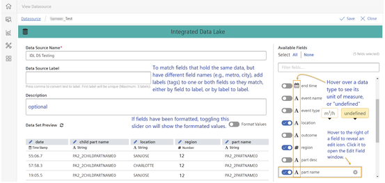
Editing Field Names and Data Type in the Dataset Preview Window
This image illustrates the View/Edit Data Source page:
Editing Data Source Fields
There are two ways to open the Edit Field pop-up window:
- At the top of the Dataset Preview table on the View Data Source page, click the pencil icon next to the field you want to edit.
- On the Configure a Data Source tab, select the field, and hover the mouse over the right side of that row to trigger the "Edit"
 icon to show and click on it. To edit the data source, proceed as follows:
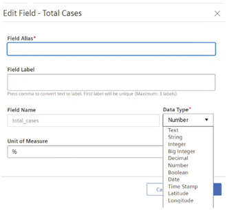
Example of the Edit Field pop-up window
Here is an example of the pop-up window where you can edit a data source field:
Information You can Edit
You can add to or change the following information in the Edit Field pop-up window:
- Edit the Field Alias: while the actual field name cannot be changed, the alias field name can be changed.
- Edit the Data Type for a field: use the Data Type drop-down list to select another data type.
- Add Labels to the Data Source: add up to three labels to the data source; only the first one must have a unique name. Labels can be helpful when categorizing or grouping data sources or dashboards, but their most important feature is to connect fields from different data sources when field names don't match. See the Configuring Data Sources topic for more information.
- Unit of Measure: if not already specified, you can enter the unit of measure the field utilizes. In the above example, the field Total Cases is a "number" data type, and uses percentage as the unit of measure.
Editing Data Source Fields
When you click the edit (pencil) icon next to a field name in the Dataset Preview table (see the image above), the Edit Field pop-up window opens.
About Fields in the Edit Field Pop-up Window
The following fields may be pre-populated by the data source. Some fields can be edited, some cannot:
- Field Alias: the field name you selected to edit feeds into this field, but you can change the Field Alias, while you cannot change the field name itself. Alias names for fields come in handy when you want something other than the actual field name to display on widget charts and dashboards.
- Field Label: field labels (sometimes called 'tags') can be valuable for locating certain data, but they also serve as a way to connect data. For example, if you want to work with two data sources that store city names, but one source stores it in a field called 'Location', and the other stores it in a field called 'Center', adding labels to one or both makes it possible for the system to match the fields.
- Field Name: this value cannot be changed.
- Unit of Measure: sometimes this value comes in from the data source, but you can change it. The value in this field appears elsewhere in the Dashboard UI when the mouse hovers over the symbol for a data type; if there is no value in the unit of measure field, hovering displays "undefined".
- Data Type: data types can be changed easily by making a selection from the Data Type drop-down list.
Example of Changing the Data Type of a Field Example
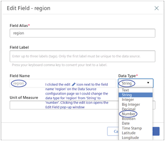
In the example below, the user wants to convert the data type of the 'region' field from string to number so she can group the data numerically, according to the region numbers, because they contain number sequences that indicate which coast the region is in, and whether it is above or below a dividing line in the country. This change allows her to filter on certain number sequences that can capture a group of regions.
Here is an example of the Edit Field pop-up window that shows the field name, "region" in the Field Alias field and indicates "String" as the existing data type, and the drop-down list, where a different data type can be selected:
How to Edit Data Source Fields
Follow these steps to edit fields or in the Dataset Preview table:
- Click the
 "Edit" icon next to any field in the Data Source preview table you want to edit. The Edit Field pop-up window opens.
 - If you want to display something other than the actual field name in your widget, enter it in the "Field Alias" field; otherwise skip to Step 3.
- Enter an optional unique (within this data source) label in the "Field Label" field and press your keyboard 'comma' key. The text turns into a 'tag'.
- Enter text for up to two more "labels" (optional) if needed.
- Enter or change the value in the "Unit of Measure" field (optional). The value in this field displays in the Edit Data Source window when your mouse hovers over the data type symbol.
- Click "Update". The Edit Field window closes and the changes display in the Dataset Preview table.
- If you are finished editing fields, click
 at the top of the Data Source window. The editing window closes and the dashboard displays.
How to Delete a Data Source
Follow these steps to delete a data source:
- Select the data source from the "Data Sources" drop-down list.
- Click the "Delete" icon. An 'Are you sure?' confirmation message displays.
- Click "OK" to confirm the deletion. The system deletes the data source.
Advanced Data Source Configuration Features
Adding an Aggregate Function to Y-Axis Chart Values for Integrated Data Lake (IDL) Data Sources
Working with an IDL data source and a line, bar, or area chart widget, this feature allows you to add and run an aggregate function against Y-Axis chart values. This feature is available for data lake data sources only at this time.
Available aggregate functions are:
- Value
- Count
- Sum
- Average
- Minimum
- Maximum
Illustration of the Value (Y-Axis) Aggregate Area for an IDL-Based Chart Widget
Here is an image that shows the Value (Y-Axis) area of an IDL chart widget where you can add an aggregate:
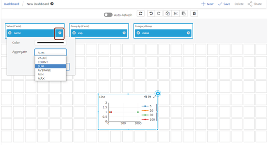
How to Add an Aggregate Function to Y-Axis IDL Chart Values
Follow these steps to add an aggregate function to an IDL-based chart widget: 1. Select the "widget" you want to add the aggregate function to. The dashboard displays the Value (Y-Axis), Group by (X-Axis), and Category/Group area at the top of the dashboard. 2. Click the "Configuration" ![]() icon for the Y-Axis field whose values you want to run an aggregate function against. A configuration pop-up window opens. 3. Click the "drop-down arrow" to expand the Aggregate selection list. 4. Select an "aggregate function" from the list and click "Update". The pop-up window closes and your changes are saved to the Value (Y-Axis).
icon for the Y-Axis field whose values you want to run an aggregate function against. A configuration pop-up window opens. 3. Click the "drop-down arrow" to expand the Aggregate selection list. 4. Select an "aggregate function" from the list and click "Update". The pop-up window closes and your changes are saved to the Value (Y-Axis).
Creating Integrated Data Lake (IDL) Charts with Multiple Y-Axes
Multiple Y-Axes are available for bar, line, and area charts that use IDL data sources. The greatest advantage of multiple Y-Axes is in revealing relationships among multiple fields that are not readily apparent when switching between two or more single Y-Axis charts. They often reveal data trends that otherwise might go unnoticed.
Dashboards supports multiple Y-Axes in the following chart types:
- Line
- Bar
- Area
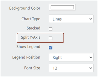
Split Y-Axis Check Box Illustration
The split Y-Axis feature is available as a check box option in the General section of the Design a Widget tab:
About IDL Charts with Multiple Y-Axes
While there is no limit to the number of fields you can add to a Y-Axis, there are limitations that are important to familiarize yourself with, including:
- With the exception of the two cases below, you can add an unlimited number of fields to the Y-Axis configuration box, however:
- When multiple fields have already been added to the Y-Axis configuration box, the system blocks adding fields to the Group By (X-Axis) configuration box.
- If there are already fields in the Group By (X-Axis) configuration box, the system allows only one field in the Y-Axis configuration box.
- While there are no limitations on the data types you can add to the Y-Axis configuration box, when multiple data types are added (e.g., string, numeric), the Y-Axis values will render as stacked. Numeric values, including double, integer, etc., will be combined, but not stacked.
- When the Y-Axis configuration box holds two numeric fields, and the X-Axis configuration box holds one field, the Y-Axis displays a number range that provides for both numeric fields; if an additional field of date or text type is added to the Y-Axis configuration box, the Y-Axis in the chart renders the original number range, plus a range for the stacked text/date with the numeric range.
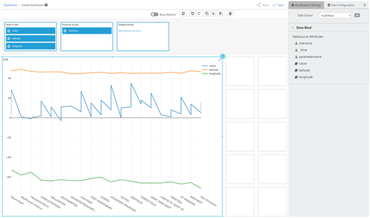
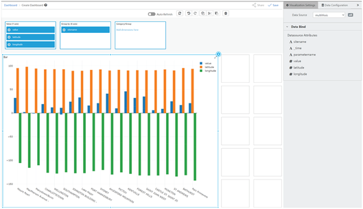
Examples of Multiple Y-Axes Charts
Here are examples of the line, bar, and area charts configured with multiple Y-Axes, and one line chart with a split Y-Axis:
How to Configure a Chart with Multiple Y-Axes
You can configure bar, line, and area charts based on IDL data sources with multiple Y-Axes and split Y-Axes.
Drag the type of chart widget to the workspace, select and configure its IDL data source, then follow these steps to configure the widget with multiple Y-Axes or split Y-Axes:
- Select the line, bar, or area Chart widget you want to add multiple Y-Axes to.
- Click the Configuration icon in the widget. The Configure a Data Source tab opens.
- Enter a name for the widget in the "Title" field, add content to the "Subtitle" field (optional), and the "Description" field (optional).
- Under General, select an option from the "Chart Type" drop-down list, and select the "Split Y-Axis" check box.
- Select the "Show Legend" check box if you want the widget to display the selected fields.
- Drag as many fields from the data source to the Value Y-Axis box as you want. The system displays the field names in the legend the Value Y-Axis list and renders data for each field on the chart's left vertical Y-Axis.
- Continue to enter or select values for the remaining (optional) fields in the "Design a Widget" tab.
- When finished, click the "double chevron" to close the tab.
- Click to save your widget and dashboard. The system displays a Success message.
Adding Labels to a Data Source
When working with data sources that have different schemata, fields can hold the same type of data but their field names can be different. Labels can facilitate matching between data sources.
About Label Mapping Between Data Sources
When field names don't match precisely, even though they contain the same type of data, you can use labels to map field names, which is especially valuable when drilling down into data. The system first tries to match by field names, then by label to field, then by label to label.
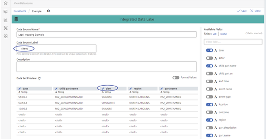
For example, one data source schema may use the field name "plant" to identify which manufacturing facility produces a certain product, and another schema may use the field name "siteno" to identify the same thing, namely which manufacturing facility produced a certain product. Labels can facilitate the field matching and either of the following will work:
- Label to Label: add the label "location" to both data sources, or,
- Field name to Label: add a label to one data source field that matches the field name in the other data source, e.g., add the label "siteno" to the data source that uses "plant" to identify the manufacturing facility, as shown in this example: