Adding Widgets to Dashboards
Widgets Overview
The typical process of creating a dashboard starts with adding data sources, followed by adding widgets to the dashboard, but you can open any dashboard and add widgets to them at any time. For information on customizing the widget appearance, please see the "Designing Widgets" section in this Help document.
This topic covers adding a widget or widgets to a dashboard, and you can follow links at the bottom of this page to navigate to step-by-step instructions for Adding a specific Dashboards widget to your dashboard.
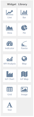
Widget Library
There are more than a dozen widgets in the library, although the widgets that display in your instance of Insights Hub Monitor Dashboards vary according to the apps, subscriptions, packages, and/or services your organization has purchased.
Some widgets are obviously suited to specific data types or the data source; for example, the map widget uses geographic data that typically involves fields like latitude and longitude and is unsuitable for use with other types of data. If your organization doesn't involve machines or manufacturing, you will probably not use the IoT Chart widget or IoT times Series data sources that are used to track and analyze production data from manufacturing lines and machine tools.
Widget Library Example
Here is an example of the Widget Library:
Note
The Pie chart widget is not supported in all subscriptions and offerings. The KPI Analysis Widget in only available if your organization subscribes to Insights Hub Monitor's KPI Analyzer app.
About Chart Widgets
Chart widgets contain some additional functionality within the widget itself:
- Zoom: Zoom in on chart data by dragging a selection rectangle with your mouse around the area you want to zoom in on.
- Scroll: You can also click the double arrows in the upper right corner of a widget to scroll to the right or left along the X-Axis.
- Export: You can optionally display an Export icon on the widget for conveniently exporting the data.
- Auto-Refresh: When you select auto-refresh for a chart widget based on data configured with a relative time range (today, yesterday, last seven days, last thirty days, this month, last month), the chart widget will advance as time moves forward and the widget will refresh according to the relative time range. You may see a progress spinner when data is refreshing.
Widget Action Icons
Widgets are controlled through the action icons at the top of the design space:
Click an action icon to:
- Auto-Refresh—move the slider to the "On" position to continuously and automatically refresh the widget. If you turn on auto-refresh, the system retains the setting and refreshes data automatically.
- Refresh now—refresh widget data (for widgets not set to auto-refresh)
- Undo—undo the last action taken
- Redo—redo the last action taken
- Copy—copy the selected object and place it on the clipboard
- Cut—cut the selected object and place it on the clipboard
- Paste—paste the object from your clipboard onto the design space
- Delete—delete the selected object; this does not place the object on the clipboard.
Widget Settings
When you add a widget to a dashboard, it displays dummy data, and default settings, such as where the legend is placed. Some visualization settings, like the widget name, subtitle, and description, are configured when you add a data source to the widget. The rest of the visualization settings are optional—you can customize the widget appearance in the Design a Widget tab, or you can use the default settings. To open widget settings, click the gear icon in the upper right corner of the widget, then select the Design a Widget tab.
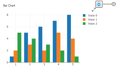
① Click to open widget settings
Default Display Settings for Widgets
If you decide to use the default widget settings rather than customizing the widget, the list below describes what the default settings are. Not all settings are used in all widgets; for example, a map widget will not use settings for vertical and horizontal grid lines.
Here are the default settings:
- Title: generic name, such as "Bar", "Line", "Grid", "Map", etc.
- Title alignment: left, top
- Title color: black
- Title font size: 12
- Subtitle: blank
- Description: blank
- Legend: show
- Legend position: right
- Vertical grid lines: show
- Horizontal grid lines: show
- Maximize widget arrows: show
- Legend position: right
- Show Legend: show
Configuring Widget Settings
Each widget type has unique settings. Click a link to go to instructions on configuring a certain widget type:
- Line Chart
- Bar Chart
- Area Chart
- Pie Chart
- Indicator
- Pareto
- KPI Analysis
- Map
- IoT Chart
- IoT Map
- Grid
- Image
- Text
Line Chart Widget
This topic is for the step of adding a Line Chart widget to your dashboard.
Here is an example of the Line Chart widget icon:

How to Add a Line Chart Widget to a Dashboard
Follow these steps to add a line chart widget to your dashboard:
- Drag the widget and drop it onto the dashboard.
- Click the widget to select it. Borders, drag handles, and the configuration icon display in the widget.
- Click the Configuration
 icon. The Configure a Data Source tab opens and displays a drop-down list of data sources you have added to the dashboard.
 - Select the data source you want to use from the "Data Source" drop-down list. The data source fields display in the Configure a Data Source tab.
- Enter a name for the widget in the "Title" field, and enter an optional "subtitle", and optional "description". The system automatically saves your entries and selections.
- Either accept the default visualization settings for the widget, or proceed to step 6.
- Enter or make selections for the fields in the General, Vertical Axis, Horizontal Axis, and Widget Appearance sections. The system automatically saves your entries and selections.
Click here for step-by-step instructions on configuring a data source for your widget.
Bar Chart Widget
This topic is for the step of adding a Bar Chart widget to your dashboard.
Here is an example of the Bar Chart widget icon:

How to Add a Bar Chart Widget to a Dashboard
Follow these steps to add a bar chart widget to your dashboard:
- Drag the widget and drop it onto the dashboard.
- Click the widget to select it. Borders, drag handles, and the configuration icon display in the widget.
- Click the Configuration icon. The Configure a Data Source tab opens and displays a drop-down list of data sources you have added to the dashboard.
- Select the data source you want to use from the "Data Source" drop-down list. The data source fields display in the Configure a Data Source tab.
- Enter the widget name in the "Title" field, and optional "subtitle", and optional "description". The system automatically saves your entries and selections.
- Either accept the default visualization settings for the widget, or proceed to step 6.
- Enter or make selections for the fields in the General, Vertical Axis, Horizontal Axis, and Widget Appearance sections. The system automatically saves your entries and selections.
Click here for step-by-step instructions on configuring a data source for your widget.
Area Chart Widget
This topic is for the step of adding an Area Chart widget to your dashboard.
Here is an example of the Area Chart widget icon:

How to Add an Area Chart Widget to a Dashboard
Follow these steps to add an area chart widget to your dashboard:
- Drag the widget and drop it onto the dashboard.
- Click the widget to select it. Borders, drag handles, and the configuration icon display in the widget
- Click the Configuration icon. The Configure a Data Source tab opens and displays a drop-down list of data sources you have added to the dashboard.
- Select the data source you want to use from the "Data Source" drop-down list. The data source fields display in the Configure a Data Source tab.
- Enter the widget name in the "Title" field, and optional "subtitle", and optional "description". The system automatically saves your entries and selections.
- Either accept the default visualization settings for the widget, or proceed to step 6.
- Enter or make selections for the fields in the General, Vertical Axis, Horizontal Axis, and Widget Appearance sections. The system automatically saves your entries and selections.
Click here for step-by-step instructions on configuring a data source for your widget.
Pie Chart Widget
Note
The Pie chart widget is not supported in all Insights Hub Monitor subscriptions and offerings.
The steps below are for adding a Pie Chart widget to your dashboard.
Here is an example of the Pie Chart widget icon:

How to Add a Pie Chart Widget to a Dashboard
Follow these steps to add a Pie chart widget to a dashboard:
- Drag the widget and drop it onto the dashboard.
- Click the widget to select it. Borders, drag handles, and the configuration icon display in the widget.
- Click the Configuration icon. The Configure a Data Source tab opens and displays a drop-down list of data sources you have added to the dashboard.
- Select the data source you want to use from the "Data Source" drop-down list. The data source fields display in the Configure a Data Source tab.
- Enter a name for the widget in the "Title" field, and enter an optional "subtitle", and optional "description". The system automatically saves your entries and selections.
- Select whether to display the bar or line chart as the default display. You can switch between them on the widget.
- Either accept the default visualization settings for the widget, or proceed to step 6.
- Enter or make selections for the fields in the General, Vertical Axis, Horizontal Axis, and Widget Appearance sections. The system automatically saves your entries and selections.
Click here for step-by-step instructions on configuring a data source for your widget.
Indicator Widget
This topic is for the step of adding an Indicator Chart widget to your dashboard.
Here is an example of the Indicator widget icon:

How to Add an Indicator Widget to a Dashboard
Follow these steps to add an indicator widget to your dashboard:
- Drag the widget and drop it onto the dashboard.
- Click the widget to select it. Borders, drag handles, and the configuration icon display in the widget.
- Click the Configuration icon. The Configure a Data Source tab opens and displays a drop-down list of data sources you have added to the dashboard.
- Select the data source you want to use from the "Data Source" drop-down list. The data source fields display in the Configure a Data Source tab.
- Enter a name for the widget in the "Title" field, and enter an optional "subtitle", and optional "description". The system automatically saves your entries and selections.
- Either accept the default visualization settings for the widget, or proceed to step 6.
- Enter or make selections for the fields in the General and Widget Appearance sections. The system automatically saves your entries and selections.
Click here for step-by-step instructions on configuring a data source for your widget.
Pareto Widget
This topic is for the step of adding a Pareto chart widget to your dashboard. Go here for information on customizing the widget design.
Here is an example of the Pareto Chart widget icon:

How to Add a Pareto Chart Widget to a Dashboard
Follow these steps to add a Pareto chart widget to a dashboard:
- Drag the widget and drop it onto the dashboard.
- Click the widget to select it. Borders, drag handles, and the configuration icon display in the widget.
- Click the Configuration icon. The Configure a Data Source tab opens and displays a drop-down list of data sources you have added to the dashboard.
- Select the data source you want to use from the "Data Source" drop-down list. The data source fields display in the Configure a Data Source tab.
- Enter a name for the widget in the "Title" field, and enter an optional "subtitle", and optional "description". The system automatically saves your entries and selections.
- Select whether to display the bar or line chart as the default display. You can switch between them on the widget.
- Either accept the default visualization settings for the widget, or proceed to step 6.
- Enter or make selections for the fields in the General, Vertical Axis, Horizontal Axis, and Widget Appearance sections. The system automatically saves your entries and selections.
Click here for step-by-step instructions on configuring a data source for your widget.
Map Widget
This topic is for the step of adding a Map widget to your dashboard. Go here for information on customizing the widget design.
If your intention is to add an "IoT Map" widget, go here, as this topic is for generic map widgets.
Here is an example of the Map widget icon:

How to Add a Map Widget to a Dashboard
Follow these steps to add a map widget to your dashboard:
- Drag the widget and drop it onto the dashboard.
- Click the widget to select it. Borders, drag handles, and the configuration icon display in the widget.
- Click the Configuration icon. The Configure a Data Source tab opens and displays a drop-down list of data sources you have added to the dashboard.
- Select the data source you want to use from the "Data Source" drop-down list. The data source fields display in the Configure a Data Source tab.
- Enter a name for the widget in the "Title" field, and enter an optional "subtitle", and optional "description". The system automatically saves your entries and selections.
- Either accept the default visualization settings for the widget, or proceed to step 6.
- Select or enter values for the fields in the General and Widget Appearance sections. The system automatically saves your entries and selections.
Click here for step-by-step instructions on configuring a data source for your widget.
IoT Chart Widget
This topic is for the step of adding an IoT Chart widget to your dashboard. Go here for information on customizing the widget design.
Here is an example of the IoT Chart widget icon:

How to Add an IoT Chart Widget to a Dashboard
Follow these steps to add an IoT chart widget to your dashboard:
- Drag the widget and drop it onto the dashboard.
- Click the widget to select it. Borders, drag handles, and the configuration icon display in the widget.
- Click the Configuration icon. The Configure a Data Source tab opens and displays a drop-down list of data sources you have added to the dashboard.
- Select the data source you want to use from the "Data Source" drop-down list. The data source fields display in the Configure a Data Source tab.
- Enter a name for the widget in the "Title" field, and enter an optional "subtitle", and optional "description". The system automatically saves your entries and selections.
- Either accept the default visualization settings for the widget, or proceed to step 6.
- Select or enter values for the IoT Settings and Widget Appearance fields. The system automatically saves your entries and selections.
Click here for step-by-step instructions on configuring a data source for your widget.
IoT Map Widget
This topic is for the step of adding an IoT Map widget to your dashboard. Go here for information on customizing the widget design.
The Map widget uses the coordinates of the asset data. To change them, access them in the Asset Manager.
Here is an example of the IoT Map widget icon:

How to Add an IoT Map Widget to a Dashboard
Follow these steps to add an IoT map widget to your dashboard:
- Drag the widget and drop it onto the dashboard.
- Click the widget to select it. Borders, drag handles, and the configuration icon display in the widget.
- Click the Configuration icon. The Configure a Data Source tab opens and displays a drop-down list of data sources you have added to the dashboard.
- Select the data source you want to use from the "Data Source" drop-down list. The data source fields display in the Configure a Data Source tab.
- Enter a name for the widget in the "Title" field, and enter an optional "subtitle", and optional "description". The system automatically saves your entries and selections.
- Either accept the default visualization settings for the widget, or proceed to step 6.
- Select or enter values for the General and Widget Appearance fields. The system automatically saves your entries and selections.
Click here for step-by-step instructions on configuring a data source for your widget.
Grid Widget
This topic is for the step of adding a Grid widget to your dashboard. Go here for information on customizing the widget design.
Here is an example of the Grid widget icon:

How to Add a Grid Widget to a Dashboard
Follow these steps to add a grid widget to your dashboard:
- Drag the widget and drop it onto the dashboard.
- Click the widget to select it. Borders, drag handles, and the configuration icon display in the widget.
- Click the Configuration icon. The Configure a Data Source tab opens and displays a drop-down list of data sources you have added to the dashboard.
- Select the data source you want to use from the "Data Source" drop-down list. The data source fields display in the Configure a Data Source tab.
- Enter a name for the widget in the "Title" field, and enter an optional "subtitle", and optional "description". The system automatically saves your entries and selections.
- Either accept the default visualization settings for the widget, or proceed to step 5.
- Select or enter values for the General and Widget Appearance fields. The system automatically saves your entries and selections.b.
Click here for step-by-step instructions on configuring a data source for your widget.
Image Widget
This topic is for the step of adding an Image widget to your dashboard. Go here for information on customizing the widget design.
Here is an example of the Image widget icon:

How to Add an Image Widget to a Dashboard
Follow these steps to add an image widget to your dashboard:
- Drag the widget and drop it onto the dashboard.
- Click the widget to select it. Borders, drag handles, and the configuration icon display in the widget.
- Click the Configuration icon. The Configure a Data Source tab opens and displays a drop-down list of data sources you have added to the dashboard.
- Select the data source you want to use from the "Data Source" drop-down list. The data source fields display in the Configure a Data Source tab.
- Enter a name for the widget in the "Title" field, and enter an optional "subtitle", and optional "description". The system automatically saves your entries and selections.
- Select or enter values for the "Image Stretch", "Image Source", and "Image URL" fields. The system automatically saves your entries and selections.
Click here for step-by-step instructions on configuring a data source for your widget.
Text Widget
This topic is for the step of adding a Text widget to your dashboard. Go here for information on customizing the widget design.
Here is an example of the Text widget icon:

How to Add a Text Widget to a Dashboard
Follow these steps to add a Text widget to your dashboard:
- Drag the text widget and drop it onto the dashboard.
- Click the widget to select it. Borders, drag handles, and the configuration icon display in the widget.
- Click the Configuration icon. The Configure a Data Source tab opens and displays a drop-down list of data sources you have added to the dashboard.
- Select the data source you want to use from the "Data Source" drop-down list. The data source fields display in the Configure a Data Source tab.
- Enter a name for the widget in the "Title" field, and enter an optional "subtitle", and optional "description". The system automatically saves your entries and selections.
Click here for step-by-step instructions on configuring a data source for your widget.
Advanced Widget Functionality
Creating Integrated Data Lake (IDL) Charts with Multiple Y-Axes
Multiple Y-Axes are available for bar, line, and area charts that use IDL data sources. The greatest advantage of multiple Y-Axes is in revealing relationships among multiple fields that are not readily apparent when switching between two or more single Y-Axis charts. They often reveal data trends that otherwise might go unnoticed.
Dashboards supports multiple Y-Axes in the following chart types:
- Line
- Bar
- Area
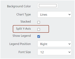
Split Y-Axis Check Box Illustration
The split Y-Axis feature is available as a check box option in the General section of the Design a Widget tab:
About IDL Charts with Multiple Y-Axes
While there is no limit to the number of fields you can add to a Y-Axis, there are limitations that are important to familiarize yourself with, including:
- With the exception of the two cases below, you can add an unlimited number of fields to the Y-Axis configuration box, however:
- When multiple fields have already been added to the Y-Axis configuration box, the system blocks adding fields to the Group By (X-Axis) configuration box.
- If there are already fields in the Group By (X-Axis) configuration box, the system allows only one field in the Y-Axis configuration box.
- While there are no limitations on the data types you can add to the Y-Axis configuration box, when multiple data types are added (e.g., string, numeric), the Y-Axis values will render as stacked. Numeric values, including double, integer, etc., will be combined, but not stacked.
- When the Y-Axis configuration box holds two numeric fields, and the X-Axis configuration box holds one field, the Y-Axis displays a number range that provides for both numeric fields; if an additional field of date or text type is added to the Y-Axis configuration box, the Y-Axis in the chart renders the original number range, plus a range for the stacked text/date with the numeric range.
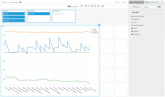
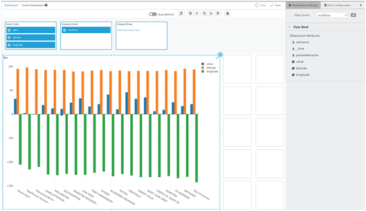
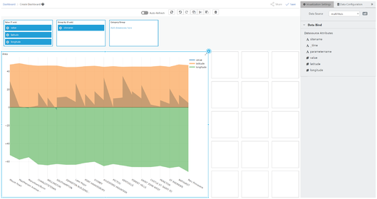
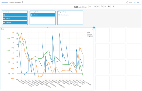
Examples of Multiple Y-Axes Charts
Here are examples of the line, bar, and area charts configured with multiple Y-Axes, and one line chart with a split Y-Axis:
How to Configure a Chart with Multiple Y-Axes
You can configure bar, line, and area charts based on IDL data sources with multiple Y-Axes and split Y-Axes.
Drag the type of chart widget to the workspace, select and configure its IDL data source, then follow these steps to configure the widget with multiple Y-Axes or split Y-Axes:
- Select the line, bar, or area Chart widget you want to add multiple Y-Axes to.
- Click the Configuration icon in the widget. The Configure a Data Source tab opens.
- Enter a name for the widget in the "Title" field, add content to the "Subtitle" field (optional), and the "Description" field (optional).
- Under General, select an option from the "Chart Type" drop-down list, and select the "Split Y-Axis" check box.
- Select the "Show Legend" check box if you want the widget to display the selected fields.
- Drag as many fields from the data source to the Value Y-Axis box as you want. The system displays the field names in the legend the Value Y-Axis list and renders data for each field on the chart's left vertical Y-Axis.
- Continue to enter or select values for the remaining (optional) fields in the "Design a Widget" tab.
- When finished, click the "double chevron" to close the tab.
- Click
 to save your widget and dashboard. The system displays a Success message.
Drilling Down Into Data in a Chart Widget
This topic covers the Insights Hub Monitor dashboard feature that allows you to drill down into successive layers of data from a widget. If you haven't done so already, please read the Adding Labels to Data Sources to Facilitate Drilling Down Into Data topic in this Help.
Creating a widget that depends on another widget's data is another way of saying, "create a 'child' widget". In such a scenario, you add a data source to a chart widget which you can configure with the dates and attributes involved in the process or object you are tracking, then select a data point to view the attributes that make up the data point you are interested in. That requires some preparation so that when you click a data point in the 'parent' widget, the 'child' widget is able to display the attributes that make up the data point in the 'parent' widget.
This topic covers several aspects of the dashboard drill-down functionality. Follow a link below to navigate to a specific section:
- Data Dependency—Setting up the relationship between 'parent' and 'child' widgets
- Label Mapping Between Data Sources
- IoT Chart Widget—Behaviors and limitations
- IoT Chart Widget Drill Down Example
- IDL Chart Widget—Behaviors and limitations
- IDL Chart Widget Drill Down Hierarchy in Group By (X-Axis) Box Example
- IDL Chart Widget Drill Down Example
Multiple X-Axis Fields Scenarios
While there are different requirements for the X-Axis fields for both IDL and IoT chart widgets, there are some scenarios, in general, that are important to be aware of about multiple X-Axis fields in a chart, including:
- When you add more than one field to a chart's X-Axis, this step actually turns on the drill-down functionality. Clicking a data point in the chart makes the widget drill down into its own data.
- When multiple X-Axis fields are present, each drill-down zooms into the X-Axis fields sequentially, in the order in which they were added.
- With one widget selected, adding a widget as a 'child' in the 'data dependency' section connects the two, so when you click a data point in the first 'parent' chart, the drill-down results are written to the connected 'child' widget.
- You can turn on the drill-down functionality by adding multiple fields to the chart's X-Axis, and select an existing widget from the drop-down list in the 'Data Dependency' section. These selections, combined, creates a scenario in which when you select a data point in the first 'parent' widget, both the 'parent' and 'child' widgets reflect the drill down.
About Drilling Down Into Data
You can drill down from data sources derived from the data lake (IDL) and select an IoT chart to visualize the details, and vice versa. Drilling down into data in a chart widget is roughly the same for both IoT and IDL data sources. The Behaviors sections below describe how the drill down feature works for both IDL and IoT data sources and describes the features, prerequisites, and limitations.
In both IDL and IoT chart widgets, you can use the hyperlinked breadcrumb trail at the top of the 'child' widget to navigate back to any layer of the drill down:
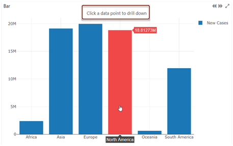
- As long as the widget meets the prerequisites discussed below, you can drill-down. Also, two visual indicators signal a chart widget can serve as a parent for drilling down:
- "Click a data point to drill down" displays at the top of the chart, as shown in the image below.
-
When you hover your mouse over a data point (such as a bar in the image below), it turns red.
Prerequisites for Drilling Down for both IoT and IDL Chart Widgets
These conditions affect whether you can drill down into chart widget data:
- Data sources must contain at least 5,000 records. Records for the CSV data source type means the number of rows; for Parquet, it means the number of columns.
- IDL charts must have two or more fields in the Group By (X-Axis) configuration box.
- These types of chart widgets with IoT or IDL data sources support drilling down:
- Line
- Bar
- Area
Drilling Down: Setting Up 'Parent' and 'Child' Widgets
The Drill-down widget drop-down list displays the names of all the widgets that appear on your dashboard. To create the relationship between the 'parent' and 'child' widget so you can drill down from one to the other, you have set up the relevant widgets with the asset / aspect and/or folder / file you want to use; once you have those set up, then you can select the 'parent' widget on your dashboard. With that widget selected, select the 'child' widget from the drop-down list to create that connection.
This image shows the drop-down list where you select the 'child' widget; the 'child' widget depends on the 'parent' widget's data:
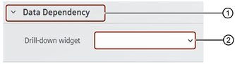
① Select the parent widget on your Dashboard
② Select a widget from the drop-down list to serve as the 'child' widget
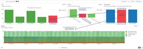
Example of an IoT Chart Widget Drill Down
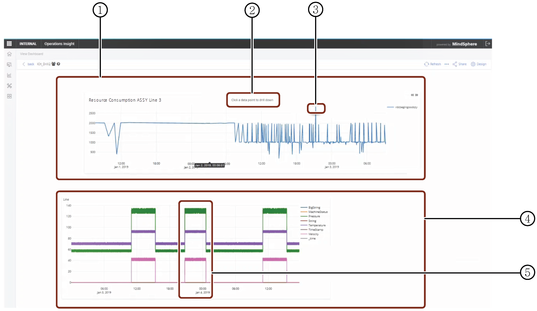
In this example, a user wants to see the details of a machine on an assembly line when that machine hits a peak in consuming resources during a manufacturing run. The user wants to see the status, pressure, temperature, and velocity data at a particular time.
Two chart widgets should be set up for the drill down: one (the parent) displays the amount of resources consumed during a manufacturing run, and the second (the child) displays the aspects of the asset involved for the data point you select in the 'parent' widget.
Drilling Down: IoT Chart Widgets
When using IoT chart widgets for drilling down into data, please be aware of the following limitations and behaviors:
- One level of drilling down is supported for IoT chart widgets.
- In configurations in which further drill downs are allowed, the drill-down cannot drill deeper than a one minute time increment.
- You cannot select a time range of more than 90 days for IoT drill downs.
- The time stamp data of the parent chart carries through to the child.
- When you select time ranges of:
- 1 - 90 days, the results are aggregated and values display as days.
- 1 hour - 1 day, the results are aggregated and values display as hours.
- Less than one day, the results are aggregated and values display by the hour.
- 1 - 90 days, the results are aggregated and values display as days.
- When you select:
- 1 hour, the system displays aggregated values by the minute for the hour selected.
- Ranges of less than one minute (To value) to less than one hour (From value) the time displays by minute.
Ranges of less than one second (To value) to less than one minute (From value), the time displays as IoT TS raw data.
- 1 hour, the system displays aggregated values by the minute for the hour selected.
Drilling Down: IDL Chart Widgets
When using IDL chart widgets for drilling down into data, please be aware of the following limitations and behaviors:
- You can drill down into IDL data an unlimited number of times, but certain factors affect the number of drill downs you can perform, such as:
- Drill down depth is limited by the number of attributes you drop into the Group By / X-Axis configuration box.
- Attributes that display in 'child' charts is determined by the order in which you add the attributes to the Group By / X-Axis configuration box of the 'parent' chart widget.
- Use drag and drop to rearrange attributes in the Group By / X-Axis configuration box.
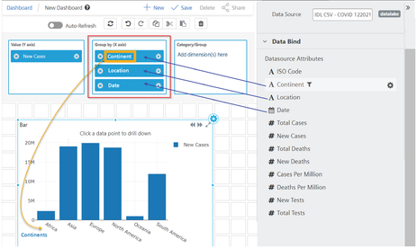
Example of a Group By (X-Axis) Drill Down Hierarchy
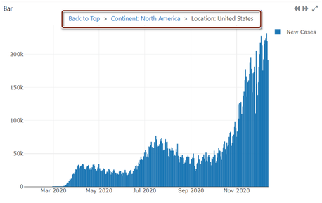
This image demonstrates the hierarchy in IDL chart drill downs—'Continent' was the first field added to the Group By / X-Axis configuration box in the 'parent' chart, therefore, the drill down 'child' chart displays the Continent field attributes, namely, the countries data that make up the continent field. When you drill down into one of the bars (continents) in the 'child' chart, the subsequent chart will display the attributes of that bar, namely, "location", and so on, as you continue to drill down.
Example of an IDL Chart Widget Drill Down
This image illustrates the relationship of each drill down iteration, from left to right, then bottom, if no more than 1 X-Axis field is included: